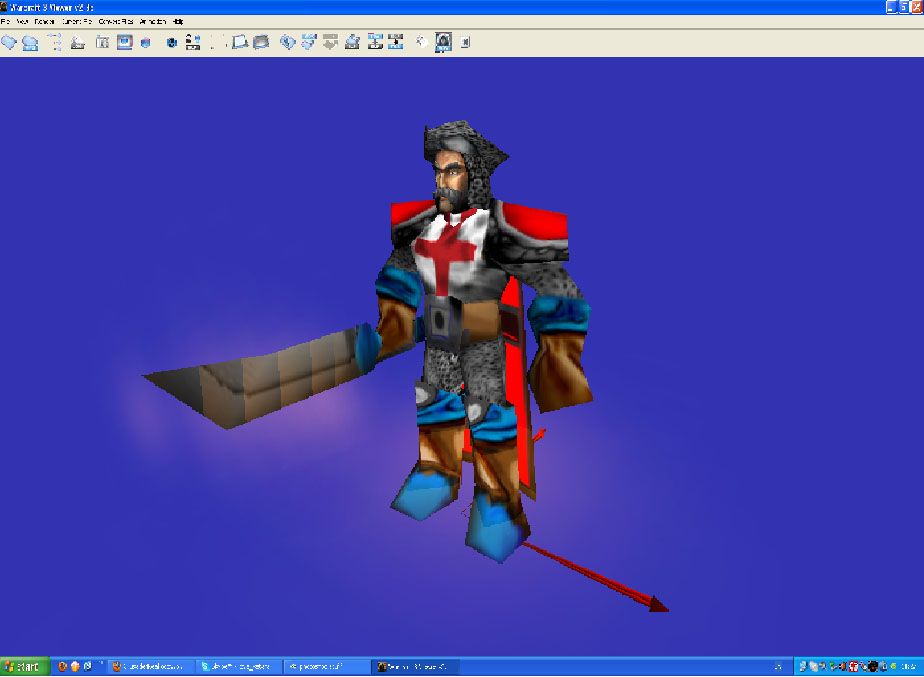
ok i like the concept. but some things might need to be changed before this gets approved. first off, some of the plate armor looks very awkward. (especially on the lower legs.) Since he is a real crusader and not a cyborg, possibly try giving him some leather boots instead of random plate metal all over his feet. same for the hands. some leather gloves wouldn't hurt. ;P
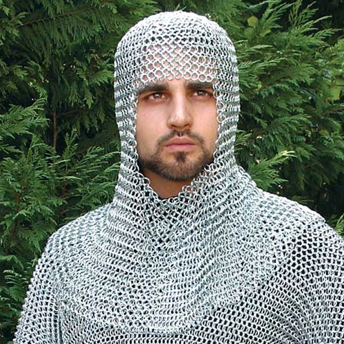
The chainmail looks good for a start, but it needs MORE HIGHLIGHTS. it looks very dull and plain right now.
as you can see on this example, the chainmail is brightly coloured and shiny
")
The chest plate looks like he's wearing suspenders xD if its a shirt and not plate metal, try adding some shading and details to make it look like a shirt. (ex. a shirt is never flat, it always has SOME kind of wrinkle in it when it is being worn. Personally, i think it might
look better with plate armor and the cross engraved in it. but thats just me.
The cross on the head, as some people may have said, is very weird. It is probably best if you got rid of it. The hat, i see you made blue. Not a good idea since it clashes with the TC (Team Colour). and i really think the blue along the rest of the skin looks a bit unneeded. (Bright blue sword, bright blue belt.) try to find a different colour that doesnt look awfully different from this skins tone.
1.7/5 Lacking
This skin has a good idea. i like the concept but the execution needs a bit more work. But keep trying. Try reading some good
tutorials to improve your skills further. Good Luck!
~Dentothor

 Approved
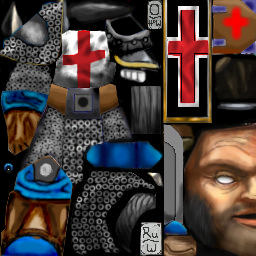


 But i'll rework the other thing you suggested.