- Joined
- Apr 24, 2012
- Messages
- 9,781


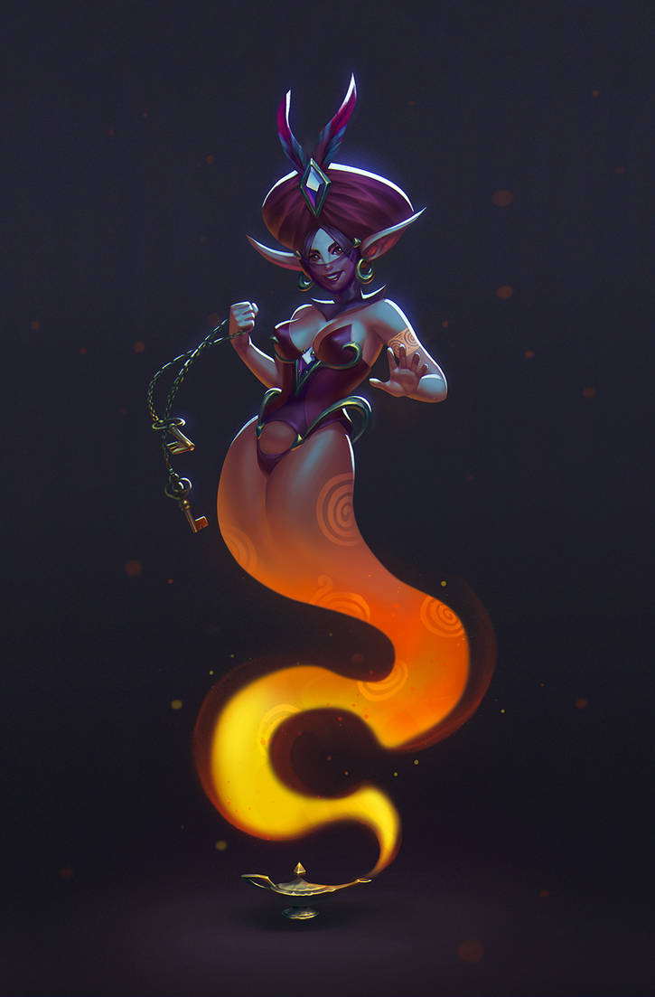
Image is courtesy of iSOLence
Create a Genie and its container. The character should NOT be based on a narrative universe that already exists (Aladdin, Harry Potter, Dragonball, etc.). The concept-art must portray the character of the Genie coming out of its container (lamp, chest, bottle, etc.): Think of a Misty Fox figure trapped inside a music box or a fire looking demon stuck in a microwave. Get wild with your ideas, anything is possible!
")
What is a Genie?:
A spirit of Arabian folklore, as traditionally depicted imprisoned within a bottle or oil lamp, and capable of granting wishes when summoned.
- First Place: 50 reputation points and your entry on the award icon
- Second Place: 35 reputation points and an award icon
- Third Place: 20 reputation points and an award icon
- Judges: 5 reputation points
Theme | Does the artist take advantage of the theme, or is the vision unfitting? | /10 |
Execution | Does the artist display the design in an effective manner, or is it hard to tell what is what? Are artistic techniques used effectively to make the character interesting, or does the style deteriorate the concept? Is the appearance of the design objectively pleasing, or is it of low quality? | /25 |
Concept | Does the design offer a new creative approach, or is it generic and cliché? Does it have character, or is it just another boring design? Does the design make sense and fit the description, or is it necessary to read the title to understand? | /40 |
Realism | Does the design balance, or are the proportions impractical? Is the anatomy or construction correct, does it allow the character to move as it should, or is functionality disregarded entirely? | /25 |
| Total | /100 |
Theme 10/10
Wild wild wild indeed with the imagination here.
Execution 11/25
Given the air of a half finished piece, the image is alright for a starter. You need to buckle up and see to your manner on how to execute different layers of textures and volumes. It needs more work suffice to say.
Concept 31/40
The idea is fine and dandy but I need to look at the description first to know what I’m looking at. On the other hand, it has plenty of character and demands attention. The genie would look more menacing if the execution would’ve been better.
Realism 8/25
Your effort is commendable so far.
First things you need to portray in an illustration are the pose, perspective and story.
Now, the story seems like the classical sacrifice for wishes…but there’s room to improve here. The anatomy seems off for the green character; as in size, joints and look.
The ‘steam lake’ I think need more depth and a bit of transparency, same for the ‘fog’ that’s emitted by the genie.
It needs for textural work, light source clearing and perspective to give it depth, a mysterious air and more variation of color overall.
Total 60/100
Theme 10/10
Well done.
Execution 21/25
Good technique. Though this looks subpar compared to your other works dear morbent.
You used some fine motives here and define the genie. I think that it looks fine and all but it lacks that WOW factor that you usually put into your pieces. It is a bit too monochrome and bland.
Concept 27/40
Something tells me that you watched too much Alladin lately.
If I would know I’d tell that you rushed your concept quite much. Right now, this looks a bit too generic for it to be something new. Not really digging it.
Realism 22/25
Your genie tells me that he’s in dire need of attention. The areas that need more work are the chest, like defining that torso with light and texture, perhaps some scars and tattoos…and the hands. Yeah…I’d make them glow even more and perhaps of a darker hue like violet or crimson with scars.
The perspective is alright. Good work on it.
Total 80/100
Theme 10/10
Good.
Execution 12/25
You need to work more on your style. It’s rather to hard line focused and not enough with transparency. I think that classes on ArtStation and other related sites could help miles with your style.
Concept 21/40
I enjoy seeing a genie that’s more alien in nature as opposed to the human faced ones.
The pot concept could use more work though. It is a bit bland and lacks substance.
Realism 10/25
Your piece lacks a proper perspective, volumes to the character, layers of transparency for particles and light shows. As you drew you character in the scene, it makes one wonder if he’d trip over when hover above the pot.
Better proportions are needed for your character. Fine job though.
Total 53/100
Theme 5/10
Classic good genie actually being bad. On point though.
Execution 9/25
This is more of an unfinished piece. Quite good though.
Concept 10/40
It is a bit plain when it comes to originality.
Better luck next time.
Realism 12/25
Given that this is an unfinished piece, the anatomy seems about right, same for the pose.
Shame that there’s not much to look at.
Total 36/100
Theme 10/10
All good so far.
Execution 14/25
You would’ve been better off if you had it done. It’s alright for an unfinished work at least.
Concept 34/40
I like it even for an unfinished work. I haven’t seen this approach yet. Maybe something on ArtStation could help with the idea further. It’s okay.
Good luck next time.
Realism 17/25
Anatomy and perspective even if basic seem fine. I just feel sorry for the lack of an overall scene.
Total 75/100
Theme 10/10
I love the idea. Sunflower genies need more love.
Execution 19/25
You’ve come a long way with illustrations and overall techniques on how to do them.
Honestly, the genie’s mist part throws me off a bit. Might be the diffuse particles that need better perspective. You need to better define the volumes.
Concept 37/40
Mighty fine approach I say. The ‘flower part’ needs more work.
I am pleased to see something that’s not remotely inspired by Alladin or some other movie. I love it that he has a god-like appearance.
Realism 19/25
The proportions are fine and dandy. However the abdomen needs more depth like the flower garment and his mist parts. What I’m beating at here are the insufficient shadows for his body, the lack of more transparency for the mist and his torso lacking more beef.
Otherwise the piece is pleasing to look at.
Total 85/100
Theme 10/10
Excellent. I like it.
Execution 22/25
Nice. I think that you went a bit too hard on defining the cloth parts and you haven’t added stronger shadows behind the ‘cage’. Alas, aside from that, I dig.
Concept 38/40
Might I say grotesque in approach? It has that oomph and flavor needed for traditional pencil drawings.
I like the story, it fits the character well. I just think that the 3 eye sign on his left shoulder could use more love.
Good job.
Realism 22/25
The genie’s pose would be almost perfect….aside for the head. Something seems odd with its volume and position. Perhaps a slight rotation to the right, moving his gaze toward the viewer could’ve been better. Lovely piece so far.
Total 92/100
Theme 10/10
Lovely.
Execution 23/25
I like all the layers of depth and color added to the artwork.
The background contrasts quite well with the centerpiece giving it an eerie and ominous air. It is obvious that due to the lack of time and perhaps other things, the genie lacks more sharpness and details.
Concept 39/40
Now, the oriental mixed with middle eastern portrayal work in your favor very well here.
Realism 23/25
Your anatomical work is something to be quite proud of, same goes for the perspective and poses. The few problems here are the volumes that are in need of stronger shadows and differentiation. What I’m saying is that the foreground blends a little too well with the background. Last but not least are the smoke/mist effects themselves. A little more work and they’d be quite believable. Great work either way PeeKay.
Total 95/100
Theme 10/10
Amazing take on the theme.
Execution 20/25
I think this looks great and gives out that scary factor.
It just needs more pencil work for shadows and to give it a pleasing and understandable look.
Concept 32/40
It definitely has that air of a Kaiju creature. In your character I can see some synthesis between the aforementioned Kaiju inspiration and the decepticons. Great take on it.
Realism 20/25
The genie’s anatomy is fine but the face…our main point of focus needs better care.
It is rather confusing to discern how it looks and functions as a whole.
As mentioned above, more pencil work is required to have better volume, clarity, shadows and overall likeability.
Good job nonetheless.
Total 82/100
Theme 10/10
Alright.
Execution 6/25
Fairly fine for a work in progress.
Concept 12/40
This reminds me of the Mummy for some reason. Egyptian genie gone bad.
This would’ve turned out well if finished.
Realism 9/25
The genie seems fine with its anatomy and perspective.
Try to manage your time better next time. Good luck.
Total 37/100
Theme 10/10
I like the approach. We need more beer genies here!
Execution 19/25
If only people could become beer genies after they die. Yeah.
You seem to have some minor problems with hard colored contours for the character. It’s almost as if they are cartoons.
Concept 32/40
Lovely character. If only he’d be more chubby.
You also need more beer spilling around for the scene to have more flavor.
Realism 20/25
The anatomy is fine and all but the right shoulder seems a bit dislodged for his arm, or was it the other way around…
I can’t really tell but it looks like the cloths are either glued on him or he was born that way. What I mean is that his attire lacks depth and differentiation to make is seem smooth and believable.
Still, beer belly…heh quite good.
Total 81/100
Theme: 8/10
Execution: 16/25
Concept: 30/40
Realism: 16/25
Total: 70/100
I like the concept and how it connects to this genie theme. The execution could've benefited from more depth and shadow-work, so that the characters and scenery look more 3D and less flat. I like how you did the dorso of the giant genie: it has various intensities of shadows (not just 2 or 3), so he looks more realistic. The details give an interesting flavor to the scene, like the two parrots with hats, the green haired dude and the treasure pile on the genie' head.
Theme: 8/10
Execution: 25/25
Concept: 25/40
Realism: 25/25
Total: 83/100
Thematically/concept-wise there's not much to say, kinda standard, so it sure does fit the theme. Execution is great, the main areas are nicely rendered, while secondary areas have a bit less refinement. The anatomy of the main character and general lighting / shading are also great. It does look a bit rushed here and there, however it's doubtlessly a very good piece of well-executed concept art. The general art style reminds me of early 2000's Magic The Gathering illustrations, it had a bit of a nostalgia feel for me hehe.
Theme: 8/10
Execution: 19/25
Concept: 30/40
Realism: 20/25
Total: 77/100
I like how you went for a not so intuitive look on him. That sort off alien head caught me a bit off-guard for a genie concept, which is good. Execution is a bit messy/rushed, we can clearly see you can do have some good control on your techniques, however you didn't have the time to perfect them up for this piece.
Theme: 8/10
Execution: 5/25
Concept: 15/40
Realism: 8/25
Total: 36/100
Well this one is sure a rushed piece. I hope we can get you to submit a fully finished entry next time, because this one is really in its initial states. The idea is nice and we can see you'd be able to bring something good if you had the time. Better luck next time though!
Theme: 8/10
Execution: 10/25
Concept: 20/40
Realism: 8/25
Total: 46/100
This is an unfinished entry. We can grasp the technology-related theme and the situation in which the other characters are in. I like the idea and what I see so far from the preliminary execution, however there's much still to be done. I hope we can see some finished entry next time!
Theme: 8/10
Execution: 25/25
Concept: 30/40
Realism: 24/25
Total: 87/100
Great entry. Not only the execution top-notch, but also the theme is fun and instigating, it alone made the piece stand out a bit more from the rest. Now getting to the technique itself, it's really good in its own style. It may not be the most realistic all around, however all of it looks intentionally executed. IBy that I mean, you do have some blurry bits around the piece, however they do not give the feel of unintentional mistake - on the contrary, it does add to the somewhat graffiti-oriented aesthetic. Great work!
Theme: 8/10
Execution: 22/25
Concept: 28/40
Realism: 21/25
Total: 79/100
Really cool entry we got here! Thematically it's the traditional genie-in-the-lamp thing, however it has that additional flavour concept-wise that makes it way more interesting and also stand out a little more. The execution is good, stylish and has a nice feel. The spectator can really see you do know what you're going for when you draw your lines. Unfortunately it could really benefit from some good coloring, as the black and white gives a rough, unfinished feeling to the spectator, specially considering nowadays digital drawing standards. Nice entry either way, loved the grim aesthetic.
Theme: 8/10
Execution: 22/25
Concept: 30/40
Realism: 21/25
Total: 81/100
That's some very impressive imagery on this entry. There's a nice touch to the thematic, which makes the concept interesting. Execution is good and suggests the author does have a certain accuracy in his methods and in what he's trying to portray, however we do get a lot of unfinished or rough edges here and there. I expect this negative effect would be much inferior if you published the final piece as a smaller picture instead of the full 2480x3508 image, so we as viewers won't be bothered by looking at the rough edges. Amazing piece anyway, good work!
Theme: 8/10
Execution: 18/25
Concept: 30/40
Realism: 15/25
Total: 71/100
This entry has a cool, strong theme with a different approach, which keeps me as a viewer interested. Good work on that. Execution-wise we can see the author has a nice flow and can be precise where he wants, however this can be compared to a rough jewel: good potential, but still too much of a unfinished, work-in-progress vibe that makes it feel lacking. Wish I could see this piece in a more finished state in future!
Theme: -
Execution: -
Concept: -
Realism: -
Total: -
RedLord seems he isn't a participant in this forum anymore.
Execution: -
Concept: -
Realism: -
Total: -
RedLord seems he isn't a participant in this forum anymore.
Theme: 8/10
Execution: 23/25
Concept: 30/40
Realism: 23/25
Total: 84/100
Nice entry, an unexpected concept and a good execution. Though the theme reasonably understood as nothing too much out of the box, it's still a refreshing concept top be seen amongst other genies. The execution shows you have good control of what you're doing, and is able to portray good volumetric impressions and coloring all around. Some places (specially on the edges of the genie) could've benefitted from a bit more work to give a better 3d impression: shoulders and hands for example. Other parts here and there can feel a bit rushed if the viewer can be very nitpicky at it. Welp, nice entry and good work nonetheless!
- Judgement: 70%
- Poll: 30%
Contest | Poll
Last edited:


