• 🏆 Texturing Contest #33 is OPEN! Contestants must re-texture a SD unit model found in-game (Warcraft 3 Classic), recreating the unit into a peaceful NPC version. 🔗Click here to enter!
  • It's time for the first HD Modeling Contest of 2024. Join the theme discussion for Hive's HD Modeling Contest #6! Click here to post your idea!

[COMPLETED] Terraining Mini Contest Reload #2 - Machinery

Status
Not open for further replies.

fladdermasken

Off-Topic Moderator
Level 39
Joined
Dec 27, 2006
Messages
3,688
TERRAINING MINI CONTEST RELOAD #2

Let's step it up a little bit. Time to play with cogs and gears.


Participants are to create a scene centered around a piece of machinery.

There are some pretty good models to do machinery, but few complete wholes. So in this run, constructing a machine out of doodads will very likely be your main goal.
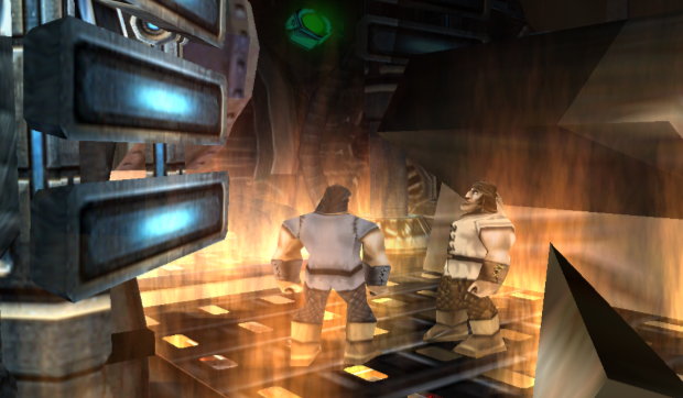
Some inspiration.

machine1.jpg machine2.jpg machine3.jpg machine4.jpg

And for something done in the WE, check out Cogs by raid1000.

RULES
  • Submissions must follow the contest theme and the rules laid out here.
  • Submissions may not be started before the launch of the contest.
  • Image editing software (PhotoShop, GIMP, etc) may not be used to enhance the final product. You may however use them to crop the image and e.g. add borders.
  • You are allowed to use The Ultimate Terraining Map 4.0 but can base it on whatever map you want as long as no other rules listed here are violated.
  • Only publicly available resources may be used. A link must be provided if it isn't found in the Hive or WC3C database.
  • Teamwork is not allowed.
  • Post at least one valid (unfinished) work in process to show that it's your own work.
  • The final entry must contain a screenshot of your entry. You may include the map if you want to share it, but it is not required.
  • The final entry must be posted before the deadline.

SCORING

I will score the entries myself. You are at my mercy.

Creativity Includes how the theme was interpreted and portrayed. Does your machine do anything that is apparent in the picture or is it just scraps of doodads thrown together? Note that there's a fine line between creative and completely offbeat. /10

Detail
Level of detail in the picture. Impurities like disorder, ill-fitted details and poor placement will take away points. /10

Tecnique
How good the execution is, and a measurement of the techniques that got you there. Good construction work will get you higher scores. /10

Aesthetics
How good your entry looks as a whole, nothing else considered. An entry can lack both detail and technique but still have an overall nice look to it. /10

AWARDS

First place gets 20 rep and a spot in the winner sticky thread.


DEADLINE

All entries must be submitted before March 21st 2018, 23:59:59 GMT.
 
Aww, why did you get rid of the doodad limit? That's what really sparked creativity in the last mini contest in my opinion. What makes it "mini" now? More like "unofficial".
That being said, I'm still interested in what you guys come up with. Probably not gonna participate though, the theme doesn't spark many creative ideas in me.
 
I think that the limit of doodads in this theme will strongly constraint the authors, not giving them creativity.
I'll have to disagree here. Limitation is the main source of innovation and creative thinking, and not just in art. Without problems and limitations to work around and solve, there would be no need for progress.
Ofcourse, with this theme the limit of 20 doodads could be too restrictive, maybe increase it a bit (if you decide to implement it that is).
 
Level 36
Joined
Nov 24, 2007
Messages
4,381
It's called a mini-contest because it's not in the Arena, that's how it is in every section
and how it's always been. There was never anything special about the "mini" prefix related
to the limitation in doodads.

And yeah, doodad limitation made sense in the last contest, but it doesn't for this one, there
is already a limitation in the sense of what you're supposed to centre the terrain around, the
theme.

Limitation is the main source of innovation and creative thinking

No, not always. Freedom to do what you want to do is also important in art, a good mixture
of both is always a nice cocktail. Anyway.

As with the previous one: If something pops into my head, I'll join.
 
Level 36
Joined
Nov 24, 2007
Messages
4,381
[ONGOING] Terraining Mini Contest Reload #2 - Machinery

The fact that the thread says "ongoing" could potentially be a hint, it's started right now.

And you can make the scenery exactly how you want to make it, but there is a criteria in
the judging called "Detail", which you won't score high in if you just dump a finished model
in the middle of the screen. Then again, if you feel confident you can score highly in the
other fields, then by all means, go ahead.
 
Level 28
Joined
Nov 12, 2007
Messages
2,340
Possible WIP. Under heavy modifying. Ideas are there, but fear it's not good enough. =(
Not bad, I like the mood it built and all, but still it isn't impressive! Remember that you guys don't have a doodad limit in this one, so you can go crazy about your machines and create big impressive scenes.

Everyone is welcome to take a look at these examples of machines built with doodads:

By frostwhisper: https://www.hiveworkshop.com/media/frack-yeah-legion.10790/full
By raid1000: https://www.hiveworkshop.com/attachments/cogs-update-png.57738/
By raid1000: https://www.hiveworkshop.com/attachments/s5-jpg.39314/
By fladdermasken: https://www.hiveworkshop.com/attachments/steampunk-afterlife-showcase-png.140856/

Also giving a glance at our terrain galleries is great to get references and ideas of what's possible to do inside WE: Complete List of Terrain Galleries
 
Level 19
Joined
Apr 21, 2013
Messages
1,194
WIP from me! The biggest, baddest, most badass, strongest mining machine in the whole universe! Behold the MinesUranus v1.0

wip1-png.293021


Please do give feedback! Also I'm having trouble importing alpha tiles, even with tutorials :D Any ideas? I import an alpha tile and set its path to some other tile path which should work :S
 

Attachments

  • WIP1.png
    WIP1.png
    3 MB · Views: 1,935
Level 36
Joined
Nov 24, 2007
Messages
4,381
The biggest, baddest, most badass, strongest mining machine in the whole universe!

Yeah...

Jokes aside, that's looking good-ish!

Obviously the ground needs lots of work, but I think you know that.
I would also advice making the background a lot darker, and preferably
with the light source coming from the roof like what you're doing, I think.

Oh, and maybe resize the crystals a bit, might also want to move the one
that is obscuring the screen on the left. There are some really good, or better
looking, crystal doodads in Tobyfat's Sc2 conversion pack. You should have a
look at that.

Keep working on it! :)
 
Level 19
Joined
Apr 21, 2013
Messages
1,194

Ahahah, size doesnt always matter :ogre_hurrhurr:

Jokes aside, that's looking good-ish!

Obviously the ground needs lots of work, but I think you know that.
I would also advice making the background a lot darker, and preferably
with the light source coming from the roof like what you're doing, I think.

Thanks! Im trying to change the groud tile with an alpha tile whichll help me add depth to the whole scene but i failed importing the tile :s

Hmm, about the lighting ill try what youve suggested. Itll look even bigger with that way. I also want the crystals to radiate a weak light as well. Ill add a lot more on crystals on the ground.


Oh, and maybe resize the crystals a bit, might also want to move the one
that is obscuring the screen on the left. There are some really good, or better
looking, crystal doodads in Tobyfat's Sc2 conversion pack. You should have a
look at that.

Keep working on it! :)

Ill do that! Thanks for all the tips n suggestions, be on the watch for new wips :p

-----

Btw, would you suggest increasing the machine's size or does it look good? Im going to add more details on it in further updates too.
 
Level 36
Joined
Nov 24, 2007
Messages
4,381
Composition-wise I think the size is good as is, it doesn't take up too much space in the terrain,
leaving it open to other details, but it is also prominently settled in the middle, setting it up as the
centrepiece of the image. But in the end it depends, do you want the drill to seem massive or normal
sized? If you want it to seem massive, I would suggest you scale the other doodads appropriately small
instead of scaling it up, and well, if you want it as is, you just keep everything the size it currently is ;)
 
Level 19
Joined
Apr 21, 2013
Messages
1,194
Hehe youve surely got a good eye. I think ill scale down other models bcz currently the machine looks good as it is now. I might just have to lower it down a bit once i successfully import alpha tiles because of the lower screen gap but we'll see it later :p

Thanks again senpai!
 
Level 19
Joined
Apr 21, 2013
Messages
1,194
Sorry for double post, but not so sorry as well, where are more participants? Anyways here's another WIP series. Still open for any feedback! What do you guys think of the fog color and density, how can I make it better? How about the lighting? I tried making the upper areas brighter but how can I make lower parts darker? etc... I'll fill up the place even better in a few days.

I might even add a few tiny aircrafts around the machine to show that its epic size!

wip2-1-png.293147


wip2-2-png.293148
 

Attachments

  • WIP2.1.png
    WIP2.1.png
    3.1 MB · Views: 1,070
  • WIP2.2.png
    WIP2.2.png
    3.2 MB · Views: 1,096
Level 11
Joined
Nov 25, 2014
Messages
526
Sorry for hibernating. I admit I've ran out of ideas on this. I thought I can do it, but I can't. I have completed and deleted repeatedly more than 20x. Seriously. It's taking the flame out of my heart. So here it is:

The City is a place for living... and a living place. Deep beneath the core of the City lies the Heart - a crystallized, pulsating heart that believed to power the City's psyche. Without the Heart, the people would fall into disarray and currency would surge and plunge overnight. The Heart has been lying there for eons and nobody knew its creator but one thing is for sure - it's dying.


But, what exactly is the HEART?

Heart 2.png
 
Level 11
Joined
Nov 25, 2014
Messages
526
I've got frustrated over this. LOL, not because of the contest, but because of my limited capability and time. I have a grander design in my thoughts but I can't pour it out and weave it into art. Urgh. Well, I have an instinct I won't win it either way. LOL.
 
The models used for this is found here: http://chaosrealm.info/forum/3127451/

A quick overview:
So the centerpiece is the droid but those generators are also made with at least 2 doodads and so is the base around it and I chose the angle of the camera to mimic one of the builder bot to be flying into the robot to do its job.

arachnid-droid-png.294464
 

Attachments

  • WIP 3.jpg
    WIP 3.jpg
    727.8 KB · Views: 384
  • Arachnid Droid.png
    Arachnid Droid.png
    1.1 MB · Views: 803
Last edited:
Level 11
Joined
Nov 25, 2014
Messages
526
I am seriously running out of time and ideas. I have decided to stick to the original post. So here's a WIP for the Clockwork Heart, a Centrepiece for a City in a steampunk world and a final version.
 

Attachments

  • Clockwork Heart WIP 1.png
    Clockwork Heart WIP 1.png
    699.6 KB · Views: 272
  • Clockwork Heart.png
    Clockwork Heart.png
    918.7 KB · Views: 314
Level 28
Joined
Nov 12, 2007
Messages
2,340
@NightStalker the concept is cool, and the main thing in the middle too. Now to your question on how to make it fuller, you should work on the background and lighting.

Play with lighting and fog more, you can make wonderful things with them. Just by taking a look at Neruvatar's terrain you will see some good ideas and uses of custom light/fog.

Another thing is your background. It is made of a couple big sized hq doodads. This reduces the epic effect - it looks kinda bland. Work with a larger number of smaller versions of those doodads, along with experimenting with other things.

@Neruvatar looks nicee
 
Level 19
Joined
Apr 21, 2013
Messages
1,194
@NightStalker the concept is cool, and the main thing in the middle too. Now to your question on how to make it fuller, you should work on the background and lighting.

Play with lighting and fog more, you can make wonderful things with them. Just by taking a look at Neruvatar's terrain you will see some good ideas and uses of custom light/fog.

Another thing is your background. It is made of a couple big sized hq doodads. This reduces the epic effect - it looks kinda bland. Work with a larger number of smaller versions of those doodads, along with experimenting with other things.


I am now working on the background, trying to add more of smaller pieces to make it look more realistic and even bigger if possible. Throwing just big ones makes it look dull, just noticed! I am not very good with lighting :S any tips? Other than black fog any color seems to ruin the atmosphere, i am still open for more suggestions here :p
 
I am now working on the background, trying to add more of smaller pieces to make it look more realistic and even bigger if possible. Throwing just big ones makes it look dull, just noticed! I am not very good with lighting :S any tips? Other than black fog any color seems to ruin the atmosphere, i am still open for more suggestions here :p
My suggestion for this would be, improve the lighting with the crystal, make the light from above more seamless and this is just my own opinion but a light effect from below would be really cool, like the drill has dug too deep and found lava. For the fog part you could layer more "filters" to improve the effect.
 
Level 19
Joined
Apr 21, 2013
Messages
1,194
Here's a new WIP, I hope this looks better. Tried experimenting with fog and lighting and adding more details. I'll add a short description of the entry further tonight and maybe do some editing too. I wish I could do more things with lighting tho. I would like it more if the lower parts were less bright with a blue shine while the tops were brighter with reddish tones.

wip4-png.294539


---------------------------------------------------------------------------------------------------------------------
FINAL ENTRY
MinesUranus

A huge creation made by future scientists, to dig through toughest mountains in alien planets. It uses fusion power and high level technology blasting laser beams, diminishing anything in its desired path to get the precious ores.

final-entry-png.294566


Attachments

  • WIP4.png
    WIP4.png
    3.5 MB · Views: 702
  • Final Entry.png
    Final Entry.png
    3.5 MB · Views: 677
Last edited:
Level 36
Joined
Nov 24, 2007
Messages
4,381
Alright guys, sorry for the delay, I really don't have any other excuse than that I didn't get around to doing
this before now. But anyway, here goes:

First I want to say some general words about all three entries. While I know finding good looking models
for this kind of contest is difficult, I do feel a need to point out that when you make terrains like the ones
you've created it is paramount that there is as little stretched or otherwise blurry textures as possible,
this is generally achieved either by down-scaling the models and using more of them to build what you
intended rather than blowing them up and using simply one, zooming far out or using fog/glow models
to "blur" them out so that the textures aren't as visible. That said, let's get on to the individual judging.

NightStalker

I've already said a lot about this entry, considering I commented a lot on it during the contest, when
I wasn't aware that I would judge it. But the final result, I would have to say, looks decent. The drill
itself and the chains holding it suffers a lot from what I mentioned above, blurred and stretched
textures, and when that is the case for the centre-piece of the terrain, well. That's not good. There
is also a scaling issue, I feel like, where the hole itself is far bigger than it seems it should be
compared to the size of the drill, which in effect makes the drill look small, when I reckon the intention
was to make it seem massive. Otherwise there is an issue with the walls of the hole seeming "flat" due
to general lack of variation and those few rocks you did add in for the sake of variation seems to be a
bit too much on the "floating" side of things.

Creativity: 6/10
Detail: 5/10
Technique: 4/10
Aesthetics: 6/10
Total: 21

Neruvator

Is your screen really that small or did you down-size the image?

I love the idea, and the overall aesthetics of this terrain had a pretty great potential. You take us into
the depths of a machine and present us the beating heart of a god or some such, that in itself is a great
premise for a terrain, but the way you made everything like a flat painting, with a silhouetted nature,
really adds to the style. However. While yours is the terrain that suffers least from this, it still does
suffer quite a bit from texture problems, especially the vanilla pipe textures. I also find myself thinking
the screen is far too cluttered with stuff up front, this makes the terrain seem like it only consists of
foreground. I would love if you had given it a bit more depth, removed some of the gears, or just
moved them further back and then added some ominous fog to really capture the eeriness of this
idea.

Creativity: 8/10
Detail: 7/10
Technique: 5/10
Aesthetics: 7/10
Total: 27

nightelfbuilder

I'm going to be frank: I'm not entirely sure what I'm looking at here. I can see that a lot of thought and
detail went into the centre piece of the terrain, and considering it's named "arachnid droid" I assume
it's some kind of spider-legged moving fortress or city or something. See this is where I get confused,
there seems to me to be a jarring sense of confusion about the scale. The windows in the background
gives the terrain an overall "miniature" kind of feeling, as if the droid and the buildings and everything
is toys. Anyway, while I normally love and advocate the dutch angle, I don't know that I think it fits for
this terrain, there's nothing especially "weird" or "scary" about this scene that makes me feel like the
tilted camera is justified, so it just leaves me thinking "why?" I also feel like you skipped a great
opportunity by having the background simply "fogged", adding a sky-line, some trees, and potentially
a setting sun behind those windows would really add to the overall feel of this terrain. And while I do
think the foreground area is a bit too flat and empty, and most of the lights are far too intense and
bright for the otherwise monotonous and "grey" feeling of the rest of the terrain, I do appreciate the
level of detail and thought that went into the creation of this piece, even if I don't fully get it.

Creativity: 7/10
Detail: 8/10
Technique: 7/10
Aesthetics: 6/10
Total: 28

So there you have it, it's nice to see that even now, even after we just recently had a mini-contest,
there are still people who are willing to participate in this age-old art style. Thank you all for participating
and I do hope to see you around, making more terrains ^^

Oh, and before I forget, the winner is:


Huzzah!
 
Status
Not open for further replies.
Top