Avahor
I like this. It's a pretty ballsy low angle shot and it works well to play up the size of the naga. The unit placement is well thought out too. The shine is a little too intense in some spots however (bottom right), and the gray dust clouds in the upper half of the scene don't coalesce with the warmer colors in the bottom half as well as they could. I won't say that your choice of models helped you out in the aesthetic department either, but I will say that you did a pretty great job with with what you had to work with, and that it doesn't look even remotely as bad as it could have done. Also, probably the best looking thumbnail in the contest.
Creatiity 9/10
Technique 6/10
Aesthetic 6/10
Total: 21/30
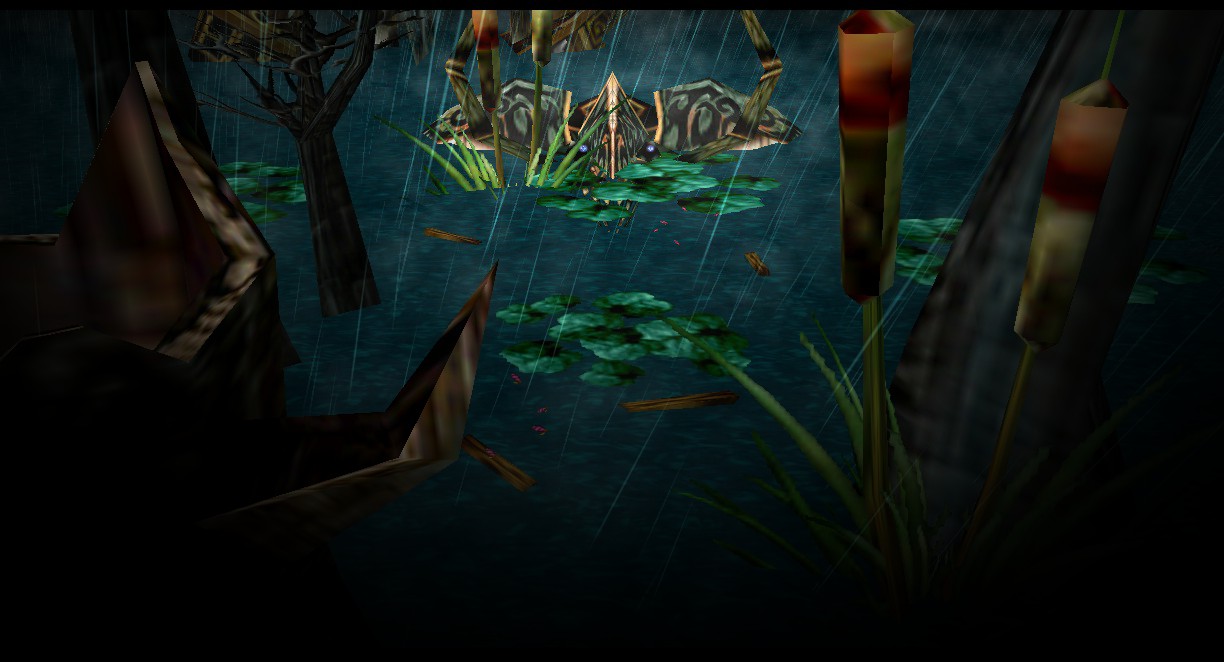
Ungoliath
H̜͓̪̹̲̰̘E̱̤̻̭̯̤ ̣̞͕̺̼̲ͅC͓͖͇̪̤̘͎͠O͏̗̹̫͔͖̲M͍͝E͟S̟̠̰.̷̠̗̙,
Good, good, good. Great choice of scene, and a pretty decent execution too. It's too bad that the tentacles coming out of the fog can't be more smooth. e.g. the one just above the fishing boat. I think you could go darker though without losing details. By reducing the tint on the cloud models they could blend more seamlessly too I bet. Another thing to work with would be the water to sky transition.
Creativity 9/10
Technique 7/10
Aesthetic 7/10
Total: 23/30
Blood Raven
It's an alright scene
. The scaling looks good, the water effects are nice, and the fog effects work okay as a whole while albeit lacking in some details. The sun looks good, but its reflection is not really working. Given the waves and fog it would be more distorted. Also not sure about the shape of the mountain to the right, or its place in the scene. If you build on it and maybe used your remaining doodads to construct the outlines of a shore, it could work.
Creativity 5/10
Technique 7/10
Aesthetic 6/10
Total: 18/30
Arrr
The idea is nice and I like the lore inclusion, but the execution is lacking. Why do the tiles end straight after the foreground? You can see a faint tree and a floating rock behind the scene. I don't know mate, but I know you need more time and thought to get this up to par. Keep trying.
Creativity 6/10
Technique 3/10
Aesthetic 2/10
Total: 11/30
Kristopher
Oh I see what you did there. The foreground looks good, and I like how the ferns match the tiles perfectly. The tree placement works to frame the scene too. But you could have gotten waaaay more out of the fog/lighting. e.g. the lighthouse could have been a great light source to boost up the lacking contrast between the fog curtain in the backdrop and the fogless foreground. Also, while probably not your fault, the girl in the foreground is in a very awkward pose.
Creativity 5/10
Technique 6/10
Aesthetic 6/10
Total: 17/30
Keiji
Take note, people. This is how you work the cloud model. All transitions are pretty much seamless and the tiny wave-like details around the boat are stellar. Personally I'm not sure about the inclusion of orange, but it works and doesn't take away from the whole I guess. The floating stars inside the fog bed are questionable though. Most of them are too dim and look weird. What are they supposed to be? Also, the lantern could have been a good lighting detail to play in with the mist colors.
Creatiity 9/10
Technique 10/10
Aesthetic 8/10
Total: 27/30
nightelfbuilder
The smoldering effect you get with combining orange glows with the cloudfx model is very nice. As for the rest of the scene, I think your idea is working against you. It was a very creative idea to begin with, but with too many elements mixed into it. You can tell the process of creation changed many times over while you were working with it. Sometimes, simple ain't bad. I'm also not sure the Eiffel Tower was your strongest choice given how many steel beams there are and how much light they have to collide with. It also looks very flat and two dimensional this close up.
Creatiity 6/10
Technique 5/10
Aesthetic 5/10
Total: 16/30
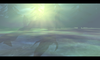
Neruvatar
This could have been pretty cool if you didn't mess things up with the light from above doodad. All the effects you gained from the blue lights are lost by the intensity of the white, and the details and focal points are blocked out and/or lost in the process. I'm not saying smooth is always better, but try to do smooth transitions at first and then play around with intensity later. It's also brave to use the underground mushroom trees, but they just don't work scaled up this big and definitely not in the foreground. It's a good try and it's great that you experiment with lighting, but you definitely need more practice with it.
Creatiity 5/10
Technique 5/10
Aesthetic 3/10
Total: 13/30
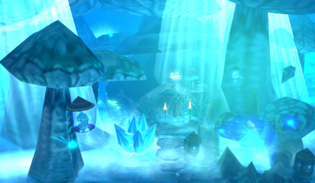
gusanomental
Nice one! The wall doesn't actually look half bad despite being so close to the camera, and the interior looks alright as a whole. The outside could do with some work though. Purple is the right way to go, but the intense white spots play down the spooky effect you probably want to go for. The trees block out too much of the view. In this case I think I'd substitute some pines for ground details like ferns/grass. It would work great with a darker backdrop. If you want to go next level, I'd try blacking out the scene with
animated DNC light models and add light sources manually to the foreground. You could get some pretty cool shading effects out of that.
Creatiity 7/10
Technique 6/10
Aesthetic 6/10
Total: 19/30
MadMax
The cave execution is actually not too bad. You need to watch out for the bad texture wrap on the felsen though (right hand side). The pine on your left is too big and too close to the camera. It could maybe work with a different model, but as a rule of thumb it's too close when it looks gross and pixelated. The use of tiles looks decent from what I can see, and the fog fade is alright if maybe a bit too sharp. Good attempt.
Creatiity 4/10
Technique 6/10
Aesthetic 5/10
Total: 15/30
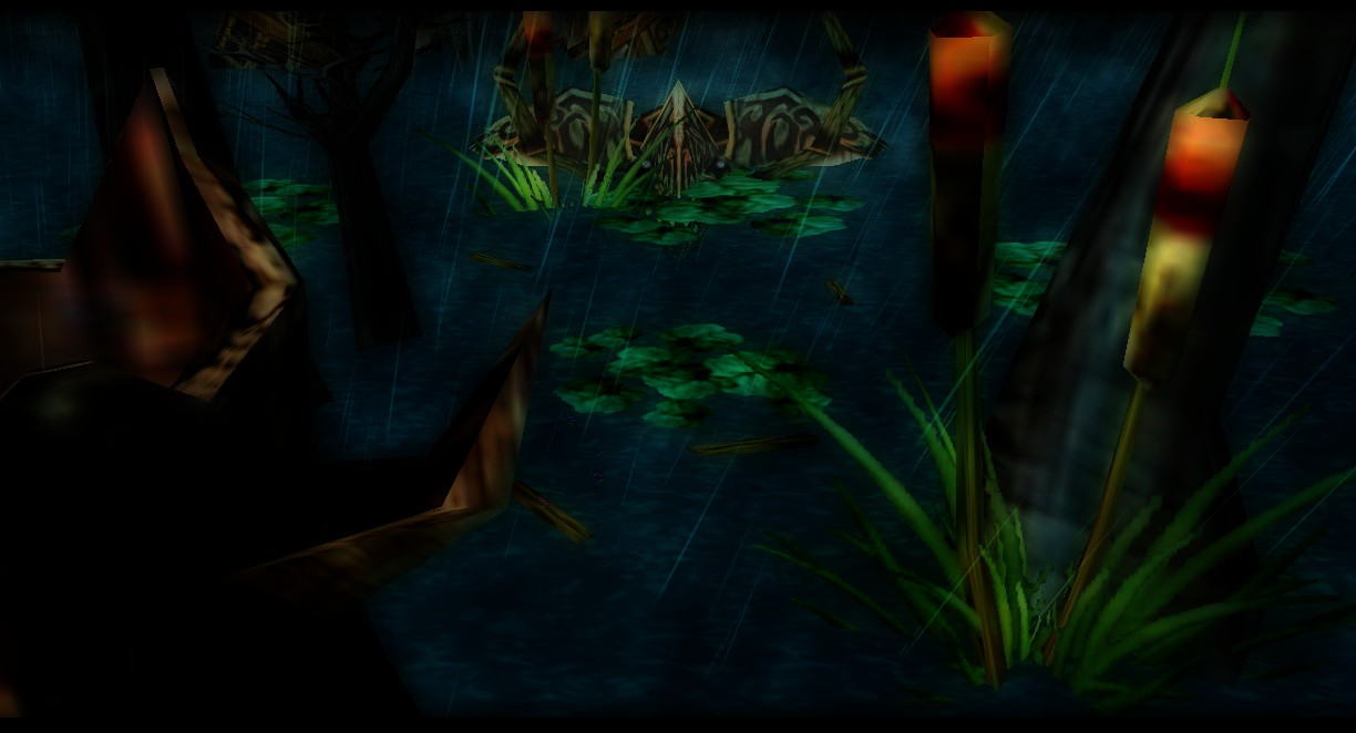
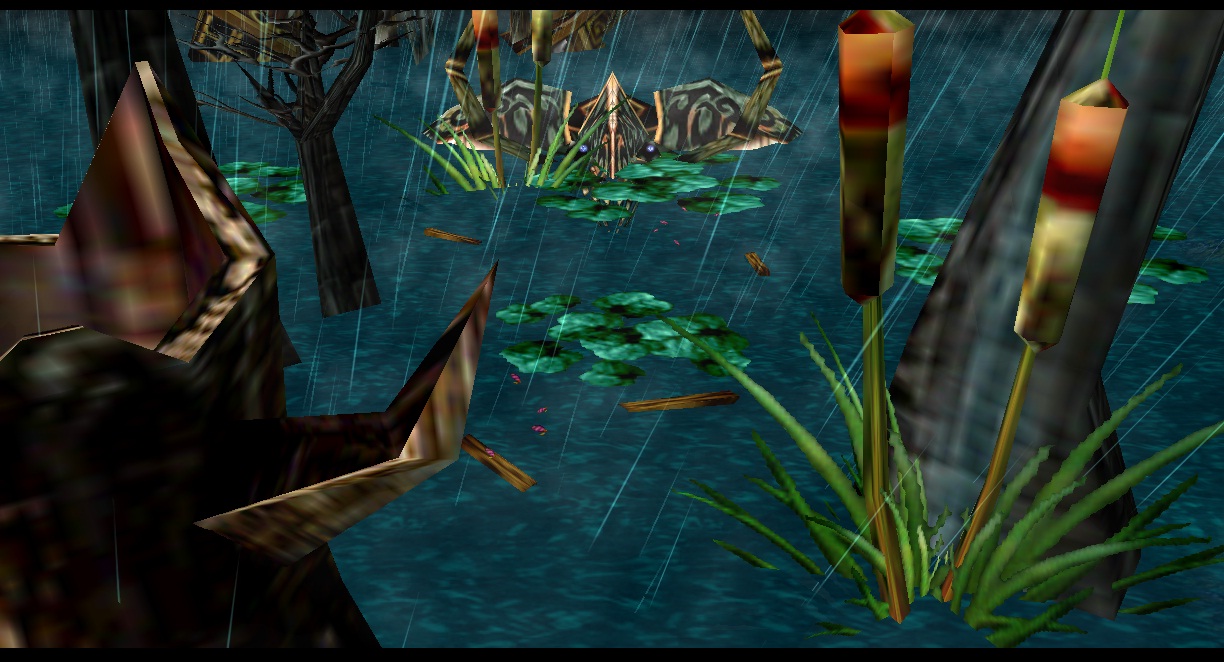
PrinceYaser
I'm not completely sure what I'm looking at to be honest. Are those roots in the water? It's a foggy scene like asked for, and the lighting and water is actually nice, but it's pretty much just that. It looks good as a whole, but it has no spice. On a technical note, the tree choice works against you. They look too pixelated like silhouettes. I'd go for pines with a thicker foilage, e.g. the Stone & Sword versions.
Creatiity 4/10
Technique 7/10
Aesthetic 7/10
Total: 18/30


")