• 🏆 Texturing Contest #33 is OPEN! Contestants must re-texture a SD unit model found in-game (Warcraft 3 Classic), recreating the unit into a peaceful NPC version. 🔗Click here to enter!
  • It's time for the first HD Modeling Contest of 2024. Join the theme discussion for Hive's HD Modeling Contest #6! Click here to post your idea!

BTNWeaponThrow

This bundle is marked as useful / simple. Simplicity is bliss, low effort and/or may contain minor bugs.
Three different kind of ninjutsu weapons being thrown forward. A kyoketsu shoge, a kusarigama and a sai. I personally think it turned out quite well (looks better on the big though). I like the PAS version :)

Credit me if you use it in a map.
Don't edit my icons without my permission.
Feedback is appreciated. I'm Still in the process of learning.

Keywords:
Sai, knife, throw, sword, kunai, ninjutsu, shuriken, bujinkan, ninja, weapons, blade, tip, sharp
Contents

BTNWeaponThrow (Icon)

Reviews
14:53, 12th Sep 2010 Pyramidhe@d: Some parts of objects have perspectives while some are face on with the viewer. 19th Sep 2010 Pyramidhe@d: No changes made.

Moderator

M

Moderator

14:53, 12th Sep 2010
Pyramidhe@d: Some parts of objects have perspectives while some are face on with the viewer.

19th Sep 2010
Pyramidhe@d: No changes made.
 
Level 11
Joined
Feb 2, 2010
Messages
487
I Think it's pretty nice and could be in use !
But the knife in the middle doesn't feel right...
It's not a bad knife :D but it looks like it pasted there, meeh hard to explain but you should like try angle it so it's not just straight, meh hope you understand.
Good Work :)
 
Tried to get the feeling from the original throw icon from blizzard but mine didn't go too well.

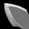
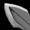
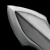
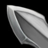
Because guys are pro and it is not hard to simulate. I made fast example.
1) Dodge sharp area
2) A new layer with transparent black color (to do not ruin shading on sharp area)
3) Smoothing transparent black color and adding shading (as smoother it is, so thin is the blade. So if the blade is fat, black will be less transparent and less smooth)
4) Defining of the sharp part by dodging edges of the area (in and outside, but on shaded side of blade)

Note: Sharp part is not same color everywhere, but to get clear image, try to do not smudge on sharp area like I did.
 

Attachments

  • wip1.jpg
    wip1.jpg
    30.4 KB · Views: 49
  • Wip2.jpg
    Wip2.jpg
    34.4 KB · Views: 55
  • Wip3.jpg
    Wip3.jpg
    37.3 KB · Views: 53
  • Wip4.jpg
    Wip4.jpg
    37.5 KB · Views: 54
Level 25
Joined
Mar 23, 2008
Messages
1,813
I Think it's pretty nice and could be in use !
But the knife in the middle doesn't feel right...
It's not a bad knife :D but it looks like it pasted there, meeh hard to explain but you should like try angle it so it's not just straight, meh hope you understand.
Good Work :)

Ah, i think i understand what you mean there. Yeah that is a bit true, my original idea wasn't this, just the middle knife with some cool glow. So it wasn't angled from the beginning, and i was lazy so didn't redo it when this idea came up in my mind :p
 
Level 25
Joined
Mar 23, 2008
Messages
1,813
Simply gorgeous. I love the way that all three weapons look slightly different one from another, making it usable for even more performances. Maybe you should try a little glow around the weapon, to make it more impressive and dramatic.

I think i'll probably create icons of each weapon later, if this gets approved, with some nice glow on them. :)
 
Top