
 Approved


Moderator
M
Moderator
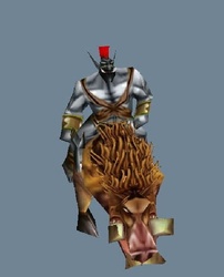
Sin'dorei300: The face needs better definition and the left tusk looks a bit too big.
12:51, 20th May 2014
Sin'dorei300: Define the face better from the background.
10:53, 11th Apr 2015
Sin'dorei300: Could be useful.


