Moderator
M
Moderator
23:29, 11th Feb 2012
Pyramidhe@d: This is messy and not very well defined.
Pyramidhe@d: This is messy and not very well defined.

(0 ratings)
 Approved


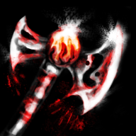
All of icons way too blurrish. Don't be lazy, fix it with, spend more time, but do it right, or just no post. Can u show us big pictures? I guess they will look like a couple of blurish lines, that are far away from something looking like a axe with a sharp edge and etc.
I mean that most of your last works are realy-realy bad, don't hear these people that say 'cewl, you're god'. Only criticism and a understand of a low quality, and good exploration will help you increase your skill.
The few of a fine enough icons are looking in comparison with, for example, morbid's or kola's ones like a kid daub. For example your last lynx icon. Did you think is enough good and fine shows us a lynx? Did it has a proper skull anatomy and perspective + shading? Should it be rated "recommended" or in comparison with CR's icons it should (for a justice) be rated as "unacceptable" as a way to low quality icon?
Try don't take it as offence, but please, surf some sites, read some 2D tutorials and try to paint beutiful and proper show of some object. Your icons currently looks blurrish and flat. Such unnaturalism can be loved as a art style, but only, when it is pointed as a style, and looks like style, and accepted like style. You're is accepted like a low quality, not as a some sort of unique artisting style, rly.
At least i recommend you buy a graphic tablet (i use tablet that worth 20$), after that buy or download photoshop and for a examples (technique, process) check some speed painting videos at youtube.
With no offense, Peekay.
Use then, please, black sharp brush for remove a messy blurryness on the icons.
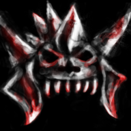
About every your icon i can say that it has broken perspective. Look at the headdress; you don't see that it is assimetrical and left part is different than a right part?
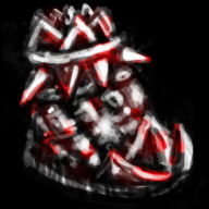
You don't see that this boot don't looks like a human boot and looks like everything, but not a boot? You don't see that a handle of axe is angled? And you don't see that these icons looks realy mess and not with the sense that it was a idea (making messy looking items)?
Thats are a problems. Try spend at least 1 hour on a icon and show us your best.
Also, you use mouse or tablet?


- Ok, i will try to make it not so blurry
- The point is that they are not usual destorted, they are perspective destorted, a lot of , my icons are turned in some diagonal amount of degree, so if you think that it look straight on you, you see it with different sizes of left and right parts, broken proportions and etc. The example of what i say is :
the example of my icons with angle :
yes , you are right they are angled, i make it for artistic purpose
- I use mouse, plan to purchase tablet
- The problem that i still have is blurrrrrrry and balance with tones, but i have some experements )
- Thank for feedback and criticism ^) here on the hive there are some people who inspire me, and you're one of them

Well, if you use a mouse, there is some not big troubles around a harder detalisation. For a best results i recommend you use low flow state on a brush config in photoshop (on upper config, when you choose a brush). That gives some specific results.
About artistic angle and poses, i meant that a handle of a axe is angled (when in any angles it will be straight and angle difference will appear in a light reflection that changes size depends of angle).
The other moment - i know what perspective means and in any way perspective you tried shown on a boot is broken cuz it should be shown not only by a formfactor, but light\color intensivity on the parts and be shown as a perspective aswell. Check NFWar's early icons, they has proper perspective and proportions, and, aswell, shown in the artistic angle (some of em ofc). Anyway, i recomend you check people's classic works where are some items shown in different and intresting angles. Compare your axe with thisfor example.
Also, i strongly recommend you draw in at least 600*600 size and clean up all messy parts with strong black or a background color aswell.