• 🏆 Texturing Contest #33 is OPEN! Contestants must re-texture a SD unit model found in-game (Warcraft 3 Classic), recreating the unit into a peaceful NPC version. 🔗Click here to enter!
  • It's time for the first HD Modeling Contest of 2024. Join the theme discussion for Hive's HD Modeling Contest #6! Click here to post your idea!

Am I doing this right? Feedback appreciated!

Status
Not open for further replies.
Level 24
Joined
May 20, 2007
Messages
3,283
Hello!

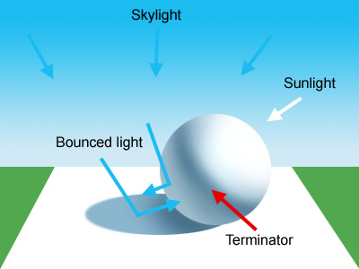
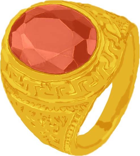
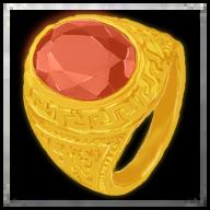
So I've spent some time today to paint this with the intention to make it into an icon. Now, the catch is that I only have loose notions of handpainting, mostly from what I've learned on Youtube and I've never committed to finishing a drawing.


So, this is it.

45627136_286353865334800_4435114544179707904_n.jpg

45572598_330519404417281_636354496447905792_n.jpg


Now, I really need and would greatly appreciate your advice. Thank you!
 
Ah.. golden ring, one of my fav icons! That surely has a lot of potential to become a beautiful icon!

Well, I won't comment on the shape (as it is a bit off, you can rotate the image horizontally and easily understand what I'm saying).

You might have noticed yourself, that this needs a lot of more/proper shading, just like a normal Wc3 icon or an artistic icon made by our Hive users. The better shading, the better contrast it brings. Try to understand where comes the light (where the lightsource is), and then try to implement some nice shadows with purple gradients (I'm saying purple because it fits beautifully with the golden color).

I'm sure we have some good tutorials on how to shade properly. If not here, then there are plenty of them out there at the art websites.

Would really love to see this improved!
 
Last edited:
Level 24
Joined
May 20, 2007
Messages
3,283
Ah.. golden ring, one of my fav icons! That surely has a lot of potential to become a beautiful icon!

Well, I won't comment on the shape (as it is a bit off, you can rotate the image horizontally and easily understand what I'm saying).

You might have noticed yourself, that this needs a lot of more/proper shading, just like a normal Wc3 icon or an artistic icon made by our Hive users. The better shading, the better contrast it brings. Try to understand where comes the light (where the lightsource is), and then try to implement some nice shadows with purple gradients (I'm saying purple because it fits beautifully with the golden color).

I'm sure we have some good tutorials on how to shade properly. If not here, then there are plenty of them out there at the art websites.

Would really love to see this improved!

I just can't get enough of your comment. Thank you for the kind words.:grin:

I'll continue to put in work and, most definitely, shading is an area I'll look to improve!
 
Level 28
Joined
Nov 12, 2007
Messages
2,340
Yes it looks really good! Specially considering this:
I only have loose notions of handpainting, mostly from what I've learned on Youtube and I've never committed to finishing a drawing.

You pulled out a very nice shading on the gem surface. It looks as a rock hard, polished surface - exactly as it should be.
Now the metal part isn't as good. PrinceYaser's advice is on point: don't fear going for stronger highlights and shadows on your metal surfaces - that's exactly what they need to actually look like metal. Good work anyway, NearbyHermit! Glad to see you back at the Hive.
 
Level 24
Joined
May 20, 2007
Messages
3,283
Yes it looks really good! Specially considering this:


You pulled out a very nice shading on the gem surface. It looks as a rock hard, polished surface - exactly as it should be.
Now the metal part isn't as good. PrinceYaser's advice is on point: don't fear going for stronger highlights and shadows on your metal surfaces - that's exactly what they need to actually look like metal. Good work anyway, NearbyHermit! Glad to see you back at the Hive.

The man himself, Naze!

Thank you for the feedback. I'm glad the gem turned out good. And, I got into contact with PrinceYaser and he was kind enough to share a custom made PrinceYaser-approved tutorial about metal highlights and shadow. When I'll get time off from work, I'll get to it.

Thanks for having me, it's good to be back. :grin:
 
Level 10
Joined
May 20, 2008
Messages
433
Use shadow to create contrast, maybe that will help you. PrinceYaser's example uses dark shadows in the engravings to have them stand out against the brighter gold. But also, if you want people to focus on the gemstone and the engravings around it, you can add shadow to darken the less important areas. Look at PrinceYaser's example again: the edges of the ring are in shadow so you want to look more at the bright, shiny, coloured gemstone, whereas your ring feels very flat because you use very similar shades of gold everywhere. The gem itself is done very well.

While you should worry about realistic shadows and the light from a light source, at this point I think using shadow to properly draw the eye to the gemstone first is where you'll see big improvement on this piece. I don't have a specific tutorial to give here, I'm just referring to my knowledge of the Principle of Design, which may be helpful to look into.
 
Any particular shading tutorial I should look into?

I just can't seem to understand the whole deal with how light functions.

01-intro-01.jpg

Study this, understand this. meditate on this, apply this ;)

What you need to know.

Tip #1 - For every Light source there's a shadow being casted in the exact opposite direction of the subject under the light.

Tip #2 - Light, bounces. because potons bounces of. more reflective is your material, more light (photons) will be bouncing of. What does it do? = #1 The highlights are stronger, more white. because Light is white.
2# all surrounding objects receives those bouncing photons. Sooo if you have a highly reflective material that is red, you have to expect the surronding items may be tinted red a little.

Tip #3 - Think of drawing 1 light source at a time. Then the more you add light sources, more you can think about how they blend.

Tip #4 - Find reference pictures, and study them. Understand where the light is coming from, understand how the shadows are recting to it, understand the material, why are they that color, why are those details that way, etc.

Good luck! have fun!
 
Last edited:
Level 7
Joined
Apr 18, 2007
Messages
247
01-intro-01.jpg

Study this, understand this. meditate on this, apply this ;)

What you need to know.

Tip #1 - For every Light source there's a shadow being casted in the exact opposite direction of the subject under the light.

Tip #2 - Light, bounces. because potons bounces of. more reflective is your material, more light (photons) will be bouncing of. What does it do? = #1 The highlights are stronger, more white. because Light is white.
2# all surrounding objects receives those bouncing photons. Sooo if you have a highly reflective material that is red, you have to expect the surronding items may be tinted red a little.

Tip #3 - Think of drawing 1 light source at a time. Then the more you add light sources, more you can think about how they blend.

Tip #4 - Find reference pictures, and study them. Understand where the light is coming from, understand how the shadows are recting to it, understand the material, why are they that color, why are those details that way, etc.

Good luck! have fun!

Now I only knew how to play with light source. Im poor at it. Thank you Mr.Goblin
 
Status
Not open for further replies.
Top