- Joined
- Aug 29, 2016
- Messages
- 372
It's just an incrustation of the Critical Strike and Finger of Death icon... Icon Submission Rules

(3 ratings)
 Approved
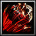


I love creative reworks/recolors/mashups of Blizzard icons, so I want to love this... But I gotta be honest, I'm having a hard time deciphering it. I see the blade, but the skull (?) is a toughie. :<
Yes I know and I've looked at other blizzard & blizzard-edit icons. One of which was a recolor of a default wc3 icon and it was approved due to usefulness but set to substandard just this August.
Your comment on the rules isn't needed because it isn't up to you whether the icon is good enough.
Besides, the combination of the two icons produces something new and looks badass. I don't care if this is a 5/5 or 1/5 because any amount of people are going to like it and would want to use it. I think that amount of people will be pretty decent with how well it turned out and that it can be used in many situations; any melee passive or as a melee ability. It has 9 downloads on the day 1 so people are definitely finding it useful. On top of that, I searched for existing icons that would be similar and did not find any.
Lol you know some icons are more than 100 downloads a day ? Go here to post this type of resource. I myself experimented to post my simple resources on icons section, but people judged that too simple... and we can find some alternative of your icons, but free-hand. More: It taken me few seconds to recreate your icon from BTNCriticalStrike and BTNCorpseExplode:
View attachment 287667

How to be a Prick 101:
3.) Copy someone else and say it took a mere few seconds