• 🏆 Texturing Contest #33 is OPEN! Contestants must re-texture a SD unit model found in-game (Warcraft 3 Classic), recreating the unit into a peaceful NPC version. 🔗Click here to enter!
  • It's time for the first HD Modeling Contest of 2024. Join the theme discussion for Hive's HD Modeling Contest #6! Click here to post your idea!

For ElvenDemonHunter

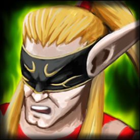
New Icon drawn for this mod: Demon Hunters and Derivatives by Ujimasa Hojo

Thank you so much for your time for advice Sir Murlocologist, XD It took me a long time to reply and I made some big changes. :) So far here is the new update.
1_by_artisticbang09-db79o19.png
Old Version
2_by_artisticbang09-db79o1o.png
New Version
In case your wondering about the darkened edges: its the part where i put the Frames. So yes, that part will be gone once the frames are placed in BLP. :)
Contents

For ElvenDemonHunter (Icon)

Reviews
Murlocologist
Hair is much better in new version and overall image gained a certain glow with this update. I appreciate the effort, approved.
Level 50
Joined
Mar 22, 2016
Messages
588
Nicely drawn, style is very fitting to warcraft. However, at the moment it appears to be too bright. Add some more contrast for hair. Try to come up with more defined shading. Some parts are too much blending together, for example, his hair and forehead, and details of mouth, nose, wrinkles in icon size aren't as visible as in full size. Of course, many details get lost in transition, but try to make them more defined. Green effect in the background in my opinion is overwhelming. Maybe make it thinner with adding more black to the background.
 
Level 50
Joined
Mar 22, 2016
Messages
588
@Don Valentino
I see you put updated version in description. Even though new is better difference is really minor. And it should be zoomed in more.
btnelvendemonhunter_by_artisticbang09-db4xqki.jpg
latest
latest
latest
tone.png


Take a look at above icons. Skin color is at the moment too saturated. Spell breaker's tone is something you should go for. I posted the base color of his face, of course it comes with different shades and highlights. This is not a big issue, but it would surely be good edit. Second is Demon hunter, take a look at definition of hair falling down on his shoulder, it is very ordered, and shaded properly. His ponytail is an element very cohesive with the main object- head so in the end we get a very nicely stylized shape, something characteristic for style of wc3 icons. Also, his face features are reduced but important ones for archiving realism and style of wc3 are present- cheekbone defined and shaded, wrinkles emphasized etc. Robe of magi is here for green background effect.
 
Top