• 🏆 Texturing Contest #33 is OPEN! Contestants must re-texture a SD unit model found in-game (Warcraft 3 Classic), recreating the unit into a peaceful NPC version. 🔗Click here to enter!
  • It's time for the first HD Modeling Contest of 2024. Join the theme discussion for Hive's HD Modeling Contest #6! Click here to post your idea!

Dalaran maze

This bundle is marked as useful / simple. Simplicity is bliss, low effort and/or may contain minor bugs.
  • Like
Reactions: StoPCampinGn00b
Please do not judge strictly this map.

On the map is:
4 Goldmine - 2x 12500 gold & 2x 10000 gold.
2 Shops goblin
1 Tavern
1 Fountain of Life
1 Market
1 Mercenary Camp

Features: 2 players
1 red creep camp
7 orange creep camps
8 green creep camps

All Map Screen:
image641797.jpg


Keywords:
Melee, GGoblin Melee, Warcraft classic, 1 vs 1, 1x1
Contents

Dalaran maze (Map)

Reviews
18:55, 14th Jun 2014 Orcnet: Needs more work
Short Review
1. The map looks sad at this point. Maybe you can add some more structures, doodads, decorations or even more of environmental doodads.
2. This is a little balanced but I am not comfortable with the very close location of the center goldmines.
3. You can actually replace those green creep camps guarding the goldmines and replace them with orange or red.
4. You can also add some critters to spice up the whole area.
5. I think, item drop is OK, IMO.
 
Level 5
Joined
Dec 24, 2013
Messages
34
:)))

Short Review
1. The map looks sad at this point. Maybe you can add some more structures, doodads, decorations or even more of environmental doodads.
2. This is a little balanced but I am not comfortable with the very close location of the center goldmines.
3. You can actually replace those green creep camps guarding the goldmines and replace them with orange or red.
4. You can also add some critters to spice up the whole area.
5. I think, item drop is OK, IMO.

I fixed, thank you :goblin_yeah:
 
Level 5
Joined
Dec 24, 2013
Messages
34
Okay

I like the idea. But the execution is really lacking so far.

Improve the follow:

Tile brushing
Cliff manipulation


Why bother placing 3 gold mine for each player if you can just place 2 per player and increase the gold? Its not like the Map is so big in the first place.

Also the terrain design could use more love.
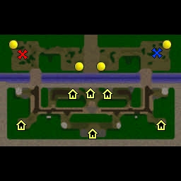
I add market and mercenary Camp instead 2 goldmines.
Slightly changed the landscape and added more scenery
 

Remixer

Map Reviewer
Level 31
Joined
Feb 19, 2011
Messages
1,956
Remixer's Quality Control
Terrain
The edges of the map look very weird. Even though the map ends and the player cannot enter some area does not mean she/he can't see it. The forests look abit too squarish? Maybe that was wanted but the wild grass does not support the idea. Map is filled with different stuff: shops, trees, cliffs, creeps yet it gives feeling that something is missing. I think the decoration doodad using is lacking in this map. And the symmethric placement of cliffs, trees and... everything? does not really work so well for you.


Neutrals
I have never thought that filling passage(s) to enemy side with creeps is a good idea. And it ain't it now either. I somehow like the idea of the map lay out however the execution could be a lot better. The only 1 way to enemy isn't so great idea especially as the players does not have anything to fight for (expansions are in their own bases). I honestly think there are too many shops in the map. The map is literally filled up with them. Not sure if they are just placed too close to each other. The creep drops seem okay however it makes me think if the item drops are too random. (You might end up with 6 permanent items). Also the harder camps could drop a bit better items.


Summary
Overall the map lay out is really interesting but the execution lacks a bit. Improve the things I mentioned and it gets good. Tile using and height variation is okay, though the cliff usage could be improved.

Scores:
Terrain: 2/5
Comment: The map is too filled up with different things, reduce the amount of trees and add some rocks&shrubs. The squarish placing of trees isn't so great idea. You should also think of solution to move creeps out of the way to the enemy or then make the passage somehow more interesting.

Neutrals: 1/5
Comment: Neutral shops pretty much ruins this. There is too many of them. You could have also added a few critters. I am not sure if the first creep camp is a bit too close to the base.

Generally: 2/5
Comment: Generally the map seems really interesting and unique somehow. Fix the mentioned problems and it'll get approved.

Rating: 5/15 (Bronze)
This map can be improved a lot (changed score due re-valuation of the score system). This map will just barely get approved without changes.
 
Last edited:
Level 5
Joined
Dec 24, 2013
Messages
34
Global update

Remixer's Quality Control
Terrain
The edges of the map look very weird. Even though the map ends and the player cannot enter some area does not mean she/he can't see it. The forests look abit too squarish? Maybe that was wanted but the wild grass does not support the idea. Map is filled with different stuff: shops, trees, cliffs, creeps yet it gives feeling that something is missing. I think the decoration doodad using is lacking in this map. And the symmethric placement of cliffs, trees and... everything? does not really work so well for you.


Neutrals
I have never thought that filling passage(s) to enemy side with creeps is a good idea. And it ain't it now either. I somehow like the idea of the map lay out however the execution could be a lot better. The only 1 way to enemy isn't so great idea especially as the players does not have anything to fight for (expansions are in their own bases). I honestly think there are too many shops in the map. The map is literally filled up with them. Not sure if they are just placed too close to each other. The creep drops seem okay however it makes me think if the item drops are too random. (You might end up with 6 permanent items). Also the harder camps could drop a bit better items.


Summary
Overall the map lay out is really interesting but the execution lacks a bit. Improve the things I mentioned and it gets good. Tile using and height variation is okay, though the cliff usage could be improved.

Scores:
Terrain: 2/5
Comment: The map is too filled up with different things, reduce the amount of trees and add some rocks&shrubs. The squarish placing of trees isn't so great idea. You should also think of solution to move creeps out of the way to the enemy or then make the passage somehow more interesting.

Neutrals: 1/5
Comment: Neutral shops pretty much ruins this. There is too many of them. You could have also added a few critters. I am not sure if the first creep camp is a bit too close to the base.

Generally: 2/5
Comment: Generally the map seems really interesting and unique somehow. Fix the mentioned problems and it'll get approved.

Rating: 5/15 (Bronze)
This map can be improved a lot (changed score due re-valuation of the score system). This map will just barely get approved without changes.
See All map screen. Thank you.
 
Level 30
Joined
Jul 31, 2010
Messages
5,246
Global map looks very boxy and tight in all quarters, I also don't understand why the supposed structured region should have trees and such? it would be a decent variation if you can just ditch the trees and give in some city-like doodads.

The middle cliff of the map looks like King Leonidas' early fail idea of making the hot gates, which is not very good to see.

Overall, map can be of better use when this is use for practice than a use for upload.
 
Top