• 🏆 Texturing Contest #33 is OPEN! Contestants must re-texture a SD unit model found in-game (Warcraft 3 Classic), recreating the unit into a peaceful NPC version. 🔗Click here to enter!
  • It's time for the first HD Modeling Contest of 2024. Join the theme discussion for Hive's HD Modeling Contest #6! Click here to post your idea!

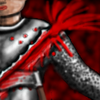
BTNDeepWound

I was making some sort of armor cut effect icon, but people said that it's to random, so I focused to single wound striking trough the chest of an armor.

Could replace critical strike icon or something.


armorcut.png

armorcut2.png

armorcut4.png

deepwound.png

deepwound2.png


There are some, to bad I wasn't saving really often to show some more work from the start :<


Updated:

-Added blade mail on the arm
-Added the axe making the wound

Keywords:
wound, strike, bleed, blood, armor, impact, body, gore, cut, critical, hit, axe, mail, blade
Contents

BTNDeepWound (Icon)

Reviews
10:11, 29th Aug 2009 zombie2279: Creative concept, a good execution. The blood effect is a bit messed up and the splash blends in with the background, you're welcome to fix it.

Moderator

M

Moderator

10:11, 29th Aug 2009
zombie2279: Creative concept, a good execution. The blood effect is a bit messed up and the splash blends in with the background, you're welcome to fix it.
 
looks epic in mah opinion :) gj.

The blood spalt all goes in the correct direction assuming that the sword (or whatever weapon being used) came from the waist and up.

also the blood is toned very well, not to strong and not to light also you have the colour strenght sorted (where there would be more blood there is a darker colour) witch i particually like.

human appears armoured so it doesn't as look as if they have been stuck when they are in a place where they neednot be armoured.

and is genrally gives a very satifing feel

also i cannot find something to pick on in this icon

5/5
 
Level 13
Joined
Apr 15, 2008
Messages
854
w00t. Nice n_n

But it would be even moar awesome if you made a small piece of the axe/sword too.
 
Level 16
Joined
Oct 18, 2008
Messages
825
Lol, new style? I like it.

I like how it's not just ''bleeding'' but ''spitting''. It makes more action in the icon and makes it more interesting.

I see you added the blade mail, looks way better and realistic with it.

The only thing is the red background, it makes the blood bit difficult to see in the upper part.

And the axe is nice, but it kinda cuts on the usefulness of the icon :/
 
Top