• 🏆 Texturing Contest #33 is OPEN! Contestants must re-texture a SD unit model found in-game (Warcraft 3 Classic), recreating the unit into a peaceful NPC version. 🔗Click here to enter!
  • It's time for the first HD Modeling Contest of 2024. Join the theme discussion for Hive's HD Modeling Contest #6! Click here to post your idea!

HappyChappytheclown3.BLP

This bundle is marked as useful / simple. Simplicity is bliss, low effort and/or may contain minor bugs.
It's been a LOONG time since I have submitted a skin.
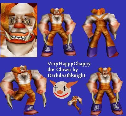
Anyway, this is Happy Chappy the Clown. He is one happy chap.
Happy Chappy has claws which can't be removed by texture, and he has bad wrap on the Hair. One of Happy Chappy's feet has a wierd wrap, which also can't be fixed.
Finally, Happy Chappy doesn't mind if you criticize him, but only if its constructive.
Because of Happy Chappy I had to type on Google "Orange Overalls". I wonder what my internet providers are thinking.
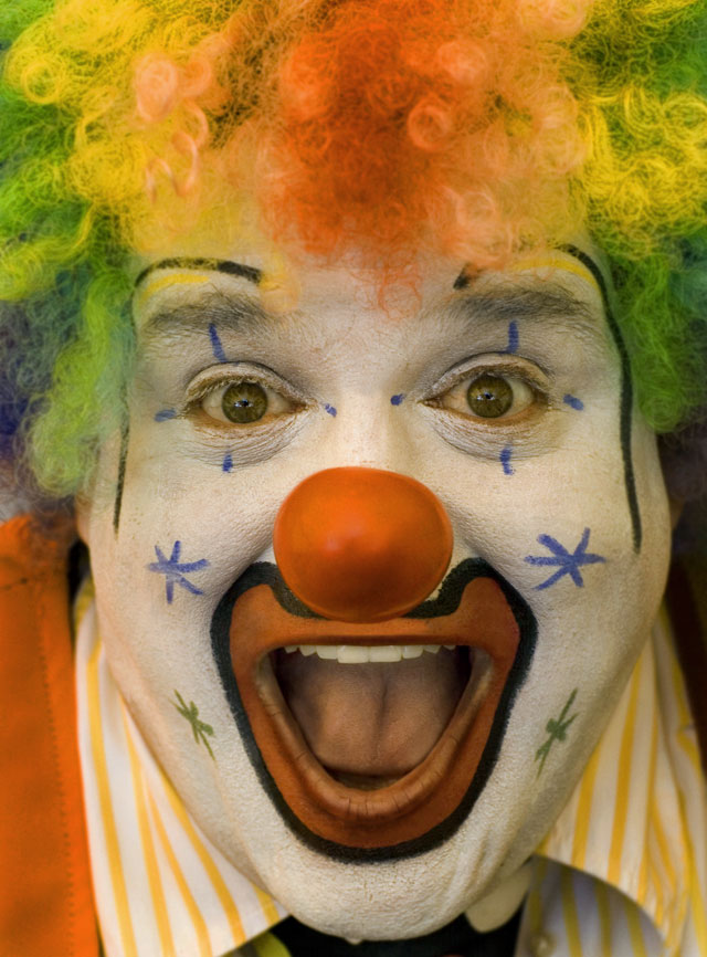
Face is based on this image.
2007_08_07clown.jpg

And the rest is my imagination.
Inspired by the hair on the Chaos Ranged Orc (I don't know its real name)
Now before you say, WTF. This is so stupid as it has no use, think about how many Warcraft maps have a clown in it. NONE. So this city need a new class o' Clown...and I'm gonna give it to 'em.
Side Note: Bob Marley is now Che Guevara.

UPDATED-
Okay I did some shading, Hopefully thats enough, and worked really hard on the highlights of the face (let's hope your satisfied Shiik cos I am!). I put some hair on the arms to make it less scary. Finally, I changed the shoes to two colours, and did not make them PVC. If you don't like the colour of the boots just say so I can change it.
Also please don't accept this until its Reccommended or higher.
UPDATE- I did even more shading. If you want more shading I will not know what to do. I did more crap on the face, now all wrinkles are pretty much brown.
I also did more highlights to make muscle which I'm not too happy about, as the overalls were supposed to have a loose look, now they look like tight clothes. Also, I can't make the eyeballs look like "eyeballs" because the actual model goes in for some reason, but I tried as best as possible. I hope people like this.

Keywords:
clown, fun, happy, chappy, darkdeathknight, makes, children, laugh, orange, jester, Harlequin, Che Guevara
Contents

(Very) Happy Chappy the Clown (Texture)

Reviews
15:00, 15th Apr 2011 shiiK: Cleaning up skins that have been rejected (until updated) for more than a month - moving to rejected permanently due lack of updates since last moderation. No new review of the skin has been made. If you feel that this...

Moderator

M

Moderator

15:00, 15th Apr 2011
shiiK: Cleaning up skins that have been rejected (until updated) for more than a month - moving to rejected permanently due lack of updates since last moderation. No new review of the skin has been made. If you feel that this decission is wrong, or if you want to update the skin, please reply to this PM and I'll work it out for you. As this is a preset message, and I'm just picking up each and every skin in the category, I want to apologize beforehand if this clutters your inbox.

16:30, 15th Dec 2010
shiiK: Moved status to Rejected (until updated) for clean-up purposes and lack of updates the past two weeks. Nothing to worry about.

shiiK: It's getting there, but the shading is not giving your model that 3D look I'm looking for. Have a look at some of our Highly Recommended and Director's Cut skins and see how the shading has been done on those. It should help you get a general feel of what we're looking for in terms of quality here on THW.

Visual Tips

shiiK: I still think you can improve the shading a lot, try to make it generally darker as well, to make the highlights stand out. It's still a very flat skin. Play around with some really dark shadows and try to make pockets and the likes pop out. I honestly think the face needs a lot more work, as well. It's lacking definition, try to make his cheeks stand out more and make his eye holes darker to promote the forehead. The eyes need some shading as well, they are eyeballs. If this is going to reach recommended, you really need to push your limits - and I hope you do. Good luck!

shiiK: I'd like you to work some more on the shading, and I'd prefer if you make a clean preview for this, as well. It's looking awful in the list, and it's hard to make out what the skin really looks like.

Detailed Review
 

Deleted member 157129

D

Deleted member 157129

Extensive review:

* Shading
The shading is a bit weak compared to the average WarCraft texture, and as such make your unit stand out, in a bad way. I suggest you got for a generally darker style, and try to emphasise shadow more. The face is perhaps the most difficult to shade, because it's painted white, but it's also one of the most important parts of a skin (because of the portrait). Try to make the shape of the head stand out more. Exaggerate the shadow rather than hold back.

* Colour
Colours are taken from the concept and work well, but it's lacking contrast. I suggest you change the colour of the shoes, to a dark leather material, and add team-colour if so is possible (I didn't check).

* Concept
Your texture represents the concept well, but I'm not sure how well the concept fits into WarCraft.

* Detail
There's a decent amount of details. I dislike the veins, because they're rather fat and short. They also have very prominent shadow on both sides, which make them look odd. Try to highlight one side and shadow the other. I wish you added some kind of texture to the shoes, they look like PVC.

* Wrap
Seems to function properly. I didn't have a close look, though.
 
Level 11
Joined
Mar 18, 2009
Messages
788
Somewhere in Nevada...

anyway where is the model this skin replaces? was thinking of using it as a random event in my map as soon as I can put it to use :)
(Event Idea: Mad clown escaped from prison, he is armed and ridiculous!)
 

Deleted member 157129

D

Deleted member 157129

Sorry for painting over just like that, without asking, but I felt like trying to demonstrate what I mean visually. When I said the shading needed improvement, I didn't mean the shadows that are already there needed to be darker, but that there needs to be more shadow. I also suggest you make it darker in general (everything darker, not only the shadows) and then apply more highlights afterwards, to make highlights stand out more. I've not done that in my example, I've only tried to demonstrate a bit more 3D-ish shading. Don't mind how the face looks too much, focus on how the shading is different. Also note that I didn't test my mockup on the model, so it might not be accurate. It's just an example of more shading. Especially take notice of the pockets on the dress. Look how I've applied shadow below it and highlighted the upper edges to make it pop out of the flat surface.
 

Attachments

  • paintover.png
    paintover.png
    131.3 KB · Views: 129
Level 9
Joined
Sep 13, 2008
Messages
249
good skin here.
the body is really nice, but i dislike the face it nees more highlights.
the black lines around the lips are really strange. they make it look kinda comicish, which doesnt fit to rest of skin. the same for the teeth, you can work here with more shading and highlight, so you dont need this black lines.
i miss some more color in the face for a real clown and something more funny around the eyes like stars or just creepy black shading(like joker).
i would do the hair and eyebrowns red or in another color. it seems to be the same color as the pants which make it monotone and boring.

Okay. but I won't change the black outline, as its supposed to look "cartoonish". They wear makeup after all. I didn't change the teeth so the black outline is from Warcraft, and I already have a concept which Im basing the face off, so I don't really want to change the design, but the other points you have made I will try to do.
 
Top