 Approved


- Joined
- Feb 19, 2015
- Messages
- 891
I find this useful, tho it uses a lot of CnP.
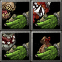
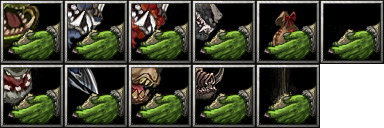
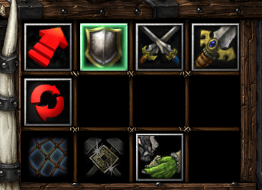
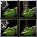
Also I have questions to some of this Icons - for me wolf seems to be unreadable at all, Kodo looks more like gorilla (why don't you pick Kodo Devour Icon, I believe it will suit better), and OrcTameOrc ... well , I'm not here to judge. I would also suggest to narrow the flow of that dust thing on BTNOrcFill and make it actually falling on top of the pile, because at first this Icon seemed to me like a tree log growing from a hands.
Also I have questions to some of this Icons - for me wolf seems to be unreadable at all, Kodo looks more like gorilla (why don't you pick Kodo Devour Icon, I believe it will suit better), and OrcTameOrc ... well , I'm not here to judge. I would also suggest to narrow the flow of that dust thing on BTNOrcFill and make it actually falling on top of the pile, because at first this Icon seemed to me like a tree log growing from a hands.


")
 Also tried to fix it, hopefully now it looks more dust-like.


