• 🏆 Texturing Contest #33 is OPEN! Contestants must re-texture a SD unit model found in-game (Warcraft 3 Classic), recreating the unit into a peaceful NPC version. 🔗Click here to enter!
  • It's time for the first HD Modeling Contest of 2024. Join the theme discussion for Hive's HD Modeling Contest #6! Click here to post your idea!

Guardian Angel

Icon based on the Resurrection angel model.

143059-0dec4c1e7910f00183c0141ba2e5dbf2.png

Works as a unit/hero icon as well.

This is completely hand-drawn.


Work size, 6 layers.
144157-1a6a8f81c00acd023a73c6ca0e9e9a17.png


Update 1:

Added more texture to the wings, and removed that one spike from the chest in front of the helmet.

Update 2:

Redid shadows, reshaped helmet a bit and removed some details which made it messy ingame.

Update 3:

Redid shadows on chest and horns, added some sparks.

143060-8f12f84dd730056330d309697efc492a.png
143134-a63139a4b10b62dc2a3583dd803ffefa.png
144140-133228915de659f881fa06794934910a.png
144141-2bc5b89f6c7a86295f0eab2d97fb8300.png

Keywords: Holy, Guardian, Angel, Resurrection, Yellow, White
Previews
Contents

Guardian Angel (Icon)

Reviews
San
San
The way it reflect light still seems off but the flatness has been fixed. Wing could also benefit from more accurate shading but it's a minor issue. Nice improvement, good job.
Level 8
Joined
Jul 6, 2012
Messages
65
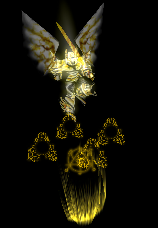
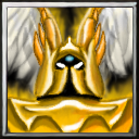
The wings aren't just white, they are cloudy, like fur. I didn't want to make them like feathers because the model in-game doesn't look like feathers either. I can add more texture to it though, but I don't want them to be feathers.

The part at the center is the armor. I wanted to add a sword, but it got too much for the icon, so I ditched that part.
 

San

San

Level 32
Joined
Sep 23, 2012
Messages
1,307
This needs a lot of proper shading, especially on his chest armor.
A proper light source is important, where is the light coming from? Shadows are missing.
Avoid using plain black lines, use darker color of the object to shade instead.
Search for tutorials and references to have a better idea.
119157-c670c58cc5ac64f857e6c2e7c2f7de02.jpg
105384-81cf7955612b8c9718eb19891cbbe96c.jpg
109414-48f3d355e52d6751571b30efb88f28c4.jpg
 
Level 8
Joined
Jul 6, 2012
Messages
65
Updated. The light is supposed to be in front of it. Yes, it was missing some shadows, especially on the wings.

I also re-did the helmet and removed some details, because they, although looking good in 128 and png, turned out very messy in-game

144141-2bc5b89f6c7a86295f0eab2d97fb8300.png
 

San

San

Level 32
Joined
Sep 23, 2012
Messages
1,307
Helmet looks fine, his "horn" on the back could be darker.
His breastplate still need more work, as they lack of proper shading and is looking flat, I suggest you to design and structure the shape properly.
Even if the light is from front, many part of his body should still be darker, leaving only highlights to few external spot, this way it will have more depth and provide a good focus point to the icon.
Also remember to do transition properly, you did them well on the helmet but ignored the breastplate.
upload_2018-8-4_22-48-9.png

I did some rough paintover, obviously the armor doesn't fit but I hope it'll give you a better idea in some way. Take your time.
upload_2018-8-4_22-39-18.png
 

San

San

Level 32
Joined
Sep 23, 2012
Messages
1,307
The way it reflect light still seems off but the flatness has been fixed. Wing could also benefit from more accurate shading but it's a minor issue.
Nice improvement, good job.
 
Top