• 🏆 Texturing Contest #33 is OPEN! Contestants must re-texture a SD unit model found in-game (Warcraft 3 Classic), recreating the unit into a peaceful NPC version. 🔗Click here to enter!
  • It's time for the first HD Modeling Contest of 2024. Join the theme discussion for Hive's HD Modeling Contest #6! Click here to post your idea!

Glaring Beam

  • Like
Reactions: deepstrasz
Icon I made for a custom spell.

Glaring Beam

Unleashes a huge beam of glaring light in a line in front of the caster, damaging enemy units, and disorienting them for some time. Disoriented units are unable to perform targeted orders properly, targeting random points or units instead.


Staff based on the one from Brilliance aura. Rest completely self-drawn.
144172-4d0c4548923156ea98ee2976d6e2c0e7.png


Work size, 6 layers.
145498-f05c954414e8430bc732acf8e2f3e463.png


Update 1: Reduced whiteness of beam, defined scepter more

Update 2: More beam texture

Update 3: More beam texture, amplified colors on the beam, and removed parts of the beam coming behind the staff's gem

Update 4: Redid beam, more straight lines and more colors. Re-oriented lighting on staff

Update 5: Increased staff size

144170-3524c9fb84baedf136444b336a40c1fd.png
144193-4a01b36cb7447c2ee6e31e4e88c9463e.png
144210-3f6af2eeb815c9325f002636e0246bd3.png
144266-c199230678079efc9a9c3917559ad740.png
145506-0ef84d2fa599d9d8487e0a721abe419e.png

Keywords: Light, Beam, Blind, Blinding, Glaring, Glare, Staff, Halo,White
Contents

Glaring Beam (Icon)

Reviews
San
San
A cute and cartoonish icon, not in a bad way. Light effect has been improved but still lacks accuracy, you'll get better after more practices with reference. Approved.

The Panda

Icon Reviewer
Level 57
Joined
Jun 2, 2008
Messages
8,912
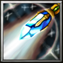
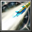
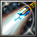
I like the idea but theres too much white, add some grey lines in the middle to indicate a beam is being pushed out of the wand, right now it looks like a big white area. Also the wand also being copied from the original icon, can be defined a bit more since the white area is taking over the wand, needs more definition.
 
Well, one way for the wand to stand out and be defined more is to make it less engaged with the effects. Make just the head of it impact with the effects; this way, it would also seem that there is a beam coming out of the wand. Another thing I have in mind is that why there is no color variation/variety? That's the reason for the icon looking pale in my opinion, use every color you can relate to this type of icon. Some rim light would also be nice if you wanna use this way. Did a rough example showing what I said:

wand-png.303942
-
btnwand-png.303943
 

San

San

Level 32
Joined
Sep 23, 2012
Messages
1,307
The light source from the original and yours is completely different, your shading should be based on the burst of light(a main light source itself) coming out from your staff.
I am not experienced in dynamic lighting, the suggestion I can give is to make the middle part darker, leave only bright side on the edges of your object;
78105-68729eb8a75dd9778caf7fa7031660e4.jpg
58312-e2ad39d63af771976bee399e8243efb8.jpg


The light effect, make the whiteness more solid and flat instead of sketching it with soft brushes, they looks like gasses at the moment.
Try following the effect from these example, I believe it's very similar to what are you trying to achieve;
58186-10e5ca0ca4bc4b0b1f3c8037c512a8f1.jpg
74456-09c22574e7527ddb5ccc96a9d441e710.jpg


Paint the low-opacity side of your light with different variation of colors, don't just stick with white and greyness.
upload_2018-8-31_12-26-3.png
 
Level 8
Joined
Jul 6, 2012
Messages
65
New attempt, redid the beam entirely, and changed light orientation on the staff.

GlaringBeam3.png
BTNGlaringBeam3.png


Im busy with other stuff atm, so this make take some time to get done.

E: Didn't update OP yet, waiting for feedback.
 
Last edited:

San

San

Level 32
Joined
Sep 23, 2012
Messages
1,307
Looks much better in color variation, the shading is also improved, though some people may find it hard to make out the staff for its tiny size, I suggest you to increase its scale(easy if you're working with layers).

Sorry for responding late, Hive didn't notify me about your comment.
 
Top