 Approved

Moderator
M
Moderator
14:19, 26th Mar 2009
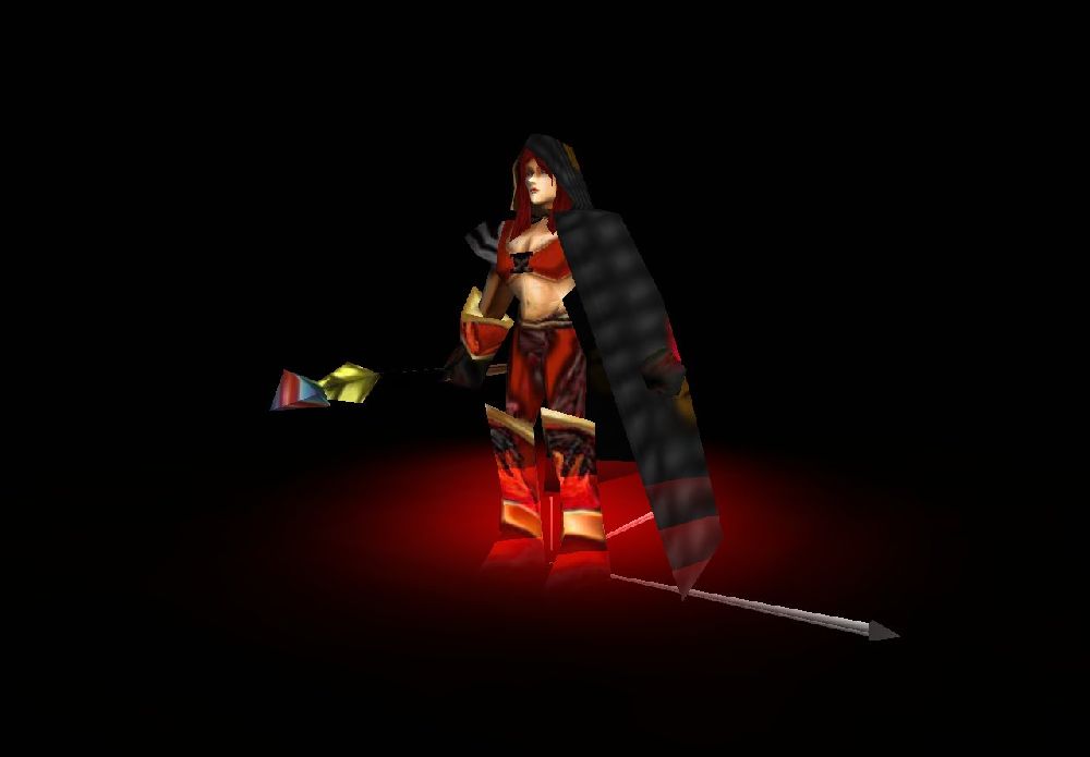
Hawkwing: I'll admit it's better, but it still needs some work. Look at some tutorials and practice some shading techniques. Avoid any filters - there seems to be some on the cape - and try one more time.
Hawkwing: Alright, well, I don't see this ever being approved. Just keep practicing.
Hawkwing: I'll admit it's better, but it still needs some work. Look at some tutorials and practice some shading techniques. Avoid any filters - there seems to be some on the cape - and try one more time.
Hawkwing: Alright, well, I don't see this ever being approved. Just keep practicing.


