• 🏆 Texturing Contest #33 is OPEN! Contestants must re-texture a SD unit model found in-game (Warcraft 3 Classic), recreating the unit into a peaceful NPC version. 🔗Click here to enter!
  • It's time for the first HD Modeling Contest of 2024. Join the theme discussion for Hive's HD Modeling Contest #6! Click here to post your idea!

DemonMage.blp

This bundle is marked as useful / simple. Simplicity is bliss, low effort and/or may contain minor bugs.
  • Like
Reactions: deepstrasz
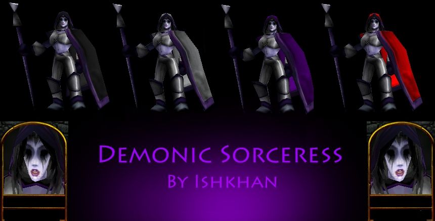
I made this skin a while back for an RPG map. I made the cape and hood be mostly team color instead of the only team color on the, being the runes (in my opinion it looks better). I attempted to freehand the face, but after a good hour, I realized it was better to just recolor the face instead of keep the bad work I ended up doing on it.

I apologize that it isn't too colorful, but I felt it worked better with the larger amounts of team color.


Keywords:
Demon, Sorceress, Mage, Wizard, Demonic, Dark, Darkness, Jaina
Contents

DemonicSorceress (Texture)

Reviews
10:33, 25th Jul 2009 Hawkwing: The armour is way too blurry. Avoid using smudge/blurr. 14:24, 6th Aug 2009 Hawkwing: Much better. However, the design is rather dull. Would it be possible for you to add more than a couple metal plates?

Moderator

M

Moderator

10:33, 25th Jul 2009
Hawkwing: The armour is way too blurry. Avoid using smudge/blurr.

14:24, 6th Aug 2009
Hawkwing: Much better. However, the design is rather dull. Would it be possible for you to add more than a couple metal plates?
 
Level 9
Joined
Dec 4, 2007
Messages
562
Realy cool, the face looks awsome but armor doesnt look just quite as awsome :), cant realy understand it is the same person that did face and armor. :) but If you remake the armor (plate) it will look rly gr8
 
The face is about the only thing that looks good about this model. Also with the team color, it doesnt really look that great as a giant patch. The mage is wearing plain iron armor that seems to follow a purple and gray color theme. A giant patch of any other color would stand out too much. Why not make the cape a light purple and have some sort of glyph as the team color?

And reshade/color/design the armor. It's really.. plain. A trim would be nice and some sort of shading.
 
Colour
Im sorry to say but the colour scheme is not all that well done. most of it is solid colour anyway. you NEVER want to have visible solid colour. Skins need to have volume and depth. Colour and shading are methods of doing this. Another thing, the armour shouldnt be coloured like that. it makes the armour look messy and blurry.

1.2/5

Shading and Highlights

The use of shading and highlighs is... limited. but the times you do use it, it looks very messy. the armour is one of those points. do not do "strings" of highlight/shadow like that. it makes the armour look very bad. it also make it look very blurry.
What happened to the shading on the cape? there looks like there is little or no shading on the cape at all. making it look very flat and boring. the hair looks like you tryed to highlight and shadow, but you smudged it up making it look like a blurred mess. the face and skin shading is good, but the arms look a little solid and not blended in. as well as the shading on the purple armour lining.... well, there is none. fix that.

1.7/5

Originality and Execution
I noticed the fact that it is mostly just a very wird recolour. therefore, quite unorigional. the idea is a bit... dry though. a dark mage. (we havent heard that six thousand times...) but nonetheless, it was a well chosen idea. but unfortunatley, the execution of this whole skin is very poor.

2.3/5

= 5.2/15
= 1.73/5

Rating: Unacceptable

Comments: Fix the above listed than this might turn out to be a fantastic skin. although the downside is... it is quite unoriginal. Keep Trying.

~Dentothor
 
Last edited:
Top