• 🏆 Texturing Contest #33 is OPEN! Contestants must re-texture a SD unit model found in-game (Warcraft 3 Classic), recreating the unit into a peaceful NPC version. 🔗Click here to enter!
  • It's time for the first HD Modeling Contest of 2024. Join the theme discussion for Hive's HD Modeling Contest #6! Click here to post your idea!

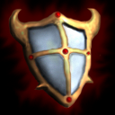
BTNPShieldT3

Tier 3 version of the shield (gems and plates added).

140841-albums1858-picture14655.png


Keywords:
Shield, demon, holy, demonic, magic, defense, defend, upgrade, set, army, weapon, hero, unit, soldier, knight, block,
Contents

BTNPShieldT3 (Icon)

Reviews
11:13, 17th Jul 2009 zombie2279: Great work. Hoping to see the series continued.

Moderator

M

Moderator

11:13, 17th Jul 2009
zombie2279: Great work. Hoping to see the series continued.
 
Level 36
Joined
Jul 1, 2007
Messages
6,677
I'm not gonna review the other ones because they're crappier. I am, however, going to say that making upgrades like this is meh. If you look at the Blizzard techtree upgrades, you'll notice that it isn't just a simple icon that gets new features with every upgrade, it changes color, shape and everything, but it still stays somewhat the same.

Now, as for the icon itself, I find the top of the shield to be kinda messy. The horns could look sharper, the shading is a little messed up as well (top right corner is the light source I assume, you might want to make the background brighter up there as well).

I would like to see another version where you zoom in a little closer to the shield (not TOO much, but a little).

3.5/5 for now.
 
Level 36
Joined
Jul 1, 2007
Messages
6,677
Practically, you simply add a light splash on the top right corner and a dark splash on the lone left down.

To speak out the words, you advice me to increase the contrast between top right/left down in the shadings and to generally darken it?

Make some srsbsns shadows on the left and some brightness on the right. Maybe you could try making a little bloom effect on the highlights as well.
 
Level 9
Joined
May 9, 2009
Messages
536
well Paladon, Ilolaturshields. they look so funny and cute, but yet again awsome and dangerous. still, its a 0.03/(1 x 0.02) which is over the max rating. still, its cartoonish yet 3d, i find this very useful. I demand Director Cut for this icon!
 
Top