Approved
 Don't be too harsh, I'm still a beginner ^^


Moderator
M
Moderator
04:08, 24th Jul 2013
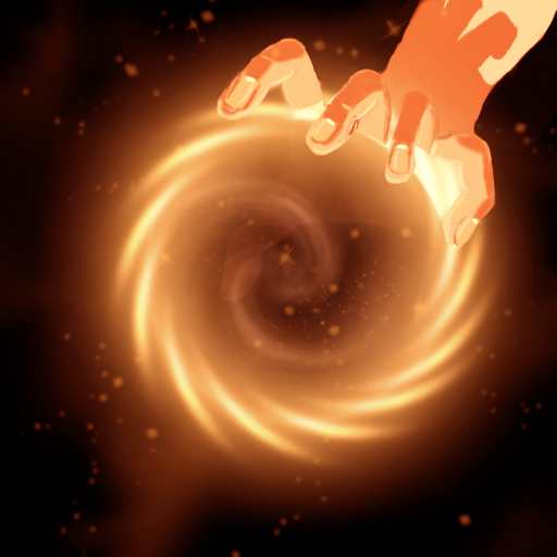
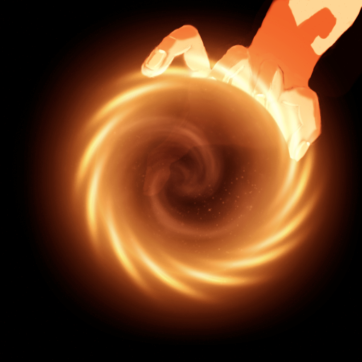
enjoy: Well, you drew the hand. But the element in the hand? You didn't draw that. And if you had to draw that in hand, I am pretty sure that would be 50% of the icon. So this is on the border of not being allowed.
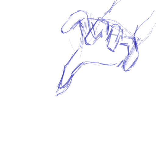
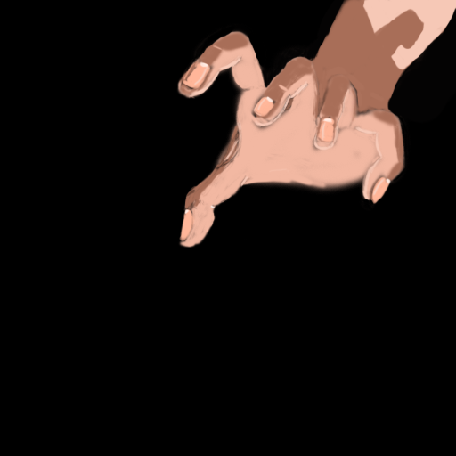
But, either way. The part you did draw, the hand, needs to be fixed. The anatomy is off. I tried to do you pose with my hand, (use a mirror, because trying to do it with your hand facing yourself HURTS. Trust me on this! ) and the fingers would be placed more in a arch. Your fingers are placed on a straight line instead. The fingers in the middle would appear higher up than the other two. It also lacks highlights and shading, and the fingers are too thin. The effect you used doesn't fit with the hand you have drawn at all, and isn't warcraftish. Also, the effect just doesn't look nice.
Rejected. Not to be harsh, but trying again would be easier. And you can always write a pm if you need help with an icon.
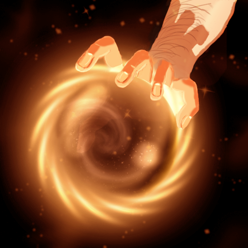
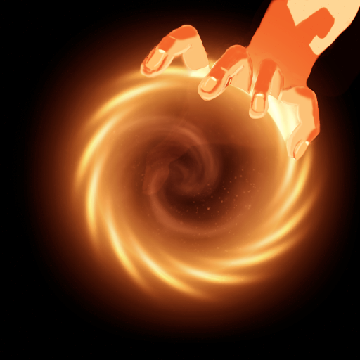
enjoy: Well, you drew the hand. But the element in the hand? You didn't draw that. And if you had to draw that in hand, I am pretty sure that would be 50% of the icon. So this is on the border of not being allowed.
But, either way. The part you did draw, the hand, needs to be fixed. The anatomy is off. I tried to do you pose with my hand, (use a mirror, because trying to do it with your hand facing yourself HURTS. Trust me on this! ) and the fingers would be placed more in a arch. Your fingers are placed on a straight line instead. The fingers in the middle would appear higher up than the other two. It also lacks highlights and shading, and the fingers are too thin. The effect you used doesn't fit with the hand you have drawn at all, and isn't warcraftish. Also, the effect just doesn't look nice.
Rejected. Not to be harsh, but trying again would be easier. And you can always write a pm if you need help with an icon.