Approved


Moderator
M
Moderator
13:04, 17th Oct 2009
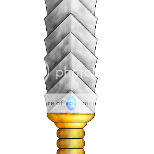
enjoy: this needs stronger highlights and shading. abit cartoonish and simple. Change the colors maybe, for an example, make the orange more goldish. You that by taking a dark orange that is kind of greenish, and then add highlights and yellow on it, but not too much yellow.")
enjoy: The orange is too bright, and makes it look cartoony. I suggest you try finding a gold tutorial.
22:49, 21th May 2010
enjoy: Might be useful.
enjoy: this needs stronger highlights and shading. abit cartoonish and simple. Change the colors maybe, for an example, make the orange more goldish. You that by taking a dark orange that is kind of greenish, and then add highlights and yellow on it, but not too much yellow.
enjoy: The orange is too bright, and makes it look cartoony. I suggest you try finding a gold tutorial.
22:49, 21th May 2010
enjoy: Might be useful.