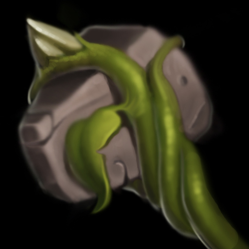
again, well drawn and a great style you have going for you, but this icon suffers from a few flaws, namely:
- lack of texture & detail makes the icon look blurry.
- the top of the hammer has inconsistent lighting with the little spiky bone/rock above it. the former is shaded dark, while the latter contrarily indicates a light source directly above that should shine onto the former too.
- slightly stronger highlights wouldn't hurt
- higher contrast would benefit this greatly


 Approved