
 Approved


Moderator
M
Moderator
08:49, 10th Jul 2009
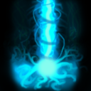
zombie2279: A rather simple piece, but might be quite useful. Make the impact effect and the beam itself more distinct from each other, that could be achieved with making the impact effect more realistic, maybe with using a darker tone and detailing the outlines. I'd recommend using a different, lighter color for the beam, light blue and a bit faint dark blue on the edges. The circular flow around the beam looks a bit distorted and distortive torwards the rest of the icon, shade and highlight it to make it more realistic. Don't forget to add a slight glow around the whole thing.
15th Jul
zombie2279: Rejected until updated.


 btw a quick drawing...? :O *awed into silence*
