Moderator
M
Moderator
11:52, 27th Mar 2014
Sin'dorei300: Great work!
I especially like the red var.
Sin'dorei300: Great work!
I especially like the red var.

(3 ratings)
 Approved

 Blood Red
 Sapphire Blue
 Crystal Teal
 Mysterious Purple
 Banana Yellow
 Molten Orange
 Forest Green
 Fabolous Pink
 Like-the-original-but-worse Grey
 Havn't-I-seen-this Light Blue
 I'm-running-out-of-names Dark Green
 Shitty Joke


Thank you :> Do you have any ideas what color would be better?It's nice. But I don't like that team-color on his helmet. It just doesn't fit there. Anyway good concept.
Sorry for that :I it wasn't easy to draw this.Ugh, I still can't tell what it is without seeing the model.
Looks useful but some critics (not really a good one for I am not an icon maker so feel free to reject some parts if you find fitting and acceptable to):
Maybe you could change the teamcolor of the icon to neutral if that would be possible as what Heinvers suggested on a teamcolor changes but I really think the team color is pretty much fine. And if I am to guess how the icon exactly looks like, the elemental's eyes are those two small lightning space above. I would suggest making it much more bigger or open, give some more emphasis into the eyes. The top head looks too flat and I do know it has thorns, right? You should draw that as well instead of the flat top.
But overall, this is approvable and I give you +rep for the amazing icons you're making so far.
")

If you do not know the person, then a painting of him wouldn't help either; the icon is meant to be like that.Ugh, I still can't tell what it is without seeing the model.
If you do not know the person, then a painting of him wouldn't help either; the icon is meant to be like that.
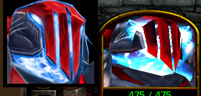
For the icon, the blue outline at the red armor (forehead part) kinda doesn't match in my opinion.


Heinvers said:...But I don't like that team-color on his helmet. It just doesn't fit there....
Umm...Hell_Master said:...Maybe you could change the teamcolor of the icon to neutral if that would be possible as what Heinvers suggested on a teamcolor changes but I really think the team color is pretty much fine. ...
Yeah, while the current "steely gray/blue" is pretty cool, I'm afraid it blends too much with the side-armor. I would definitely go back to a Team Color (Red was a good, simple contrast); most the buildings & several units have TC in their icon (though granted, not a whole lot do; then again, most units don't have TC on the face where the icon is).Looks much better, but u could change the mask's color to red like before, cuz now it's too monochrome.
Also, a good idea will be to make color vars.
I merely stated my opinion of it. Don't get me wrong for that:/Umm...
If you do not know the person, then a painting of him wouldn't help either; the icon is meant to be like that.
For the icon, the blue outline at the red armor (forehead part) kinda doesn't match in my opinion.
I wasn't "getting you wrong for that" (I'll assume you mean "being rude about our difference of opinion"), merely stating that I had a different opinion than you & the other person I quoted.I merely stated my opinion of it. Don't get me wrong for that :/
Blood RedSapphire BlueI-can't-come-up-with-anything TealMysterious PurpleBanana YellowMolten OrangeForest GreenFabolous PinkLike-the-original-but-worse GreyHavn't-I-seen-this Light BlueI'm-running-out-of-names Dark GreenShitty Joke
Let's say you have an altered melee map, and you have this unit ( the icon of Mad ) and you see him but you can't tell what it is, you don't know what you're about to summon. Your point is invalid in this situation
I fully agreeIn my opinion, Mad has done pretty damn good job to make it very similar to the model.

On a side-note, I'm curious; I've heard this "where's the...
When I first saw this model few years ago, I thought to myself 'where the heck is the face?'. But then again the model itself doesn't exist in real life, doesn't even have a features of a real life living object (but rather a concept art), so how would it be recognizable anyway?
In my opinion, Mad has done pretty damn good job to make it very similar to the model.