• 🏆 Texturing Contest #33 is OPEN! Contestants must re-texture a SD unit model found in-game (Warcraft 3 Classic), recreating the unit into a peaceful NPC version. 🔗Click here to enter!
  • It's time for the first HD Modeling Contest of 2024. Join the theme discussion for Hive's HD Modeling Contest #6! Click here to post your idea!

BTNLeaves

This bundle is marked as useful / simple. Simplicity is bliss, low effort and/or may contain minor bugs.
Okay... I'm more familiar with mapping but as I am on a vacation now and I can't map (What a misery.) I decided to mess with Gimp and yeah... never got an icon approved before but this is what I got. (I used the following picture to get the shapes etc.)
2014-09-11-fall-for-feedback-Autumn-Fall-Leaves-HD-Wallpaper.jpg


Please don't yell at me =D

202900-albums5424-picture99760.png

Big image.

I noticed something weird happened when I rescaled the image to 64x64, the layers got somehow messed up and clipped some parts of the image out and yeah... but never mind, nothing major you could notice in game I think.

Update - darkened the background.

Keywords:
Leaf, leaves, leafs, falling, rain, storm, wind, rejuvenation, weather, cyclone, purge, cleanse
Contents

BTNLeaves (Icon)

Reviews
20:03, 8th Aug 2015 Sin'dorei300: Commented.
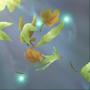
The icon looks blurry and faint.
First of all, i suggest u to zoom it in. A lot of space in the icon is unused, just faded bg.
Then, define those leaves better, using more vivid colors, shading and highlights.
Atm all the colors, shading and details are faint, giving a overall boring appearance.
The bg doesn't help those leaves to stand out.
It'd be preferable to create a contrast between those leaves(foreground) and the bg.
The foreground is made to stand out from the bg by use of contrast, focus, etc. Usually, the foreground colors are more varied and sharper than the bg ones.
So, i suggest u to either darken the background or lighten the background and darken the leaves.
 
Top