• 🏆 Texturing Contest #33 is OPEN! Contestants must re-texture a SD unit model found in-game (Warcraft 3 Classic), recreating the unit into a peaceful NPC version. 🔗Click here to enter!
  • It's time for the first HD Modeling Contest of 2024. Join the theme discussion for Hive's HD Modeling Contest #6! Click here to post your idea!

BTNKargathBladefist

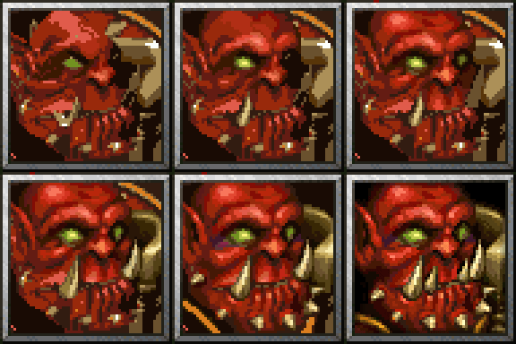
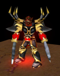
Mister_Haudrauf requested me to make a icon for his model Kargath Bladefist, so here is my attempt.

I'm not sure if I made his head look too wide or something, I was trying to fix it when I already finished polishing, but whatever change I did didn't seem to make big difference. I think there's a bit of a issue with the icon reading more as a strength hero and the model looking more as agility, might be more of a issue with the blue border than without, since the image feels more filled with it.. Or it might be just me.

Here's process image:
yR5qNER.gif


Process image in 192x192 size:
BySTPJY.gif

Edit: some minor changes
zcFdi3q.gif
Contents

BTNHeroKargathBladefist (Icon)

BTNKargathBladefist (Icon)

Level 4
Joined
Jan 16, 2018
Messages
92
Thanks bro, your are a very good helper for making these icons for units which does not has one.
 

SpasMaster

Hosted Project: SC
Level 23
Joined
Jan 29, 2010
Messages
1,969
Alright, so I've been observing your recent work and I have some feedback to provide.

Despite the fact that creating icons for custom models that lack icons is very useful and, honestly, is done in the best way that I've seen for awhile, I have some critique.
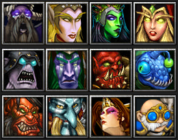
Your icons do have a pretty pixelized look, and therefore, lower quality when standing next to other icons. Unfortunately, even though I like your style and like what you are doing, I (personally) probably wouldn't use most of your icons because of how it would look next to others, in a Tavern for example. I will post a picture showcasing how a Tavern would look if it has some custom icons, some default icons and some of yours:

full


Notice how the pixelized look makes your icons stand out a little bit, as if they belong less in there. Perhaps Gelbin Mekkatorque is the one that suffers least from that issue.
In general, I really like what you are doing and how you are doing it. I just think it requires some improvements quality-wise and then your work would be just perfect to me.

Good luck! :)
 
Level 4
Joined
Jan 16, 2018
Messages
92
Alright, so I've been observing your recent work and I have some feedback to provide.

Despite the fact that creating icons for custom models that lack icons is very useful and, honestly, is done in the best way that I've seen for awhile, I have some critique.
Your icons do have a pretty pixelized look, and therefore, lower quality when standing next to other icons. Unfortunately, even though I like your style and like what you are doing, I (personally) probably wouldn't use most of your icons because of how it would look next to others, in a Tavern for example. I will post a picture showcasing how a Tavern would look if it has some custom icons, some default icons and some of yours:

full


Notice how the pixelized look makes your icons stand out a little bit, as if they belong less in there. Perhaps Gelbin Mekkatorque is the one that suffers least from that issue.
In general, I really like what you are doing and how you are doing it. I just think it requires some improvements quality-wise and then your work would be just perfect to me.

Good luck! :)
Very useful reply, now i can see what he says, mainly Valeera looks weird.
 
Level 22
Joined
Jan 6, 2017
Messages
307
Alright, so I've been observing your recent work and I have some feedback to provide.

Despite the fact that creating icons for custom models that lack icons is very useful and, honestly, is done in the best way that I've seen for awhile, I have some critique.
Your icons do have a pretty pixelized look, and therefore, lower quality when standing next to other icons. Unfortunately, even though I like your style and like what you are doing, I (personally) probably wouldn't use most of your icons because of how it would look next to others, in a Tavern for example. I will post a picture showcasing how a Tavern would look if it has some custom icons, some default icons and some of yours:

full


Notice how the pixelized look makes your icons stand out a little bit, as if they belong less in there. Perhaps Gelbin Mekkatorque is the one that suffers least from that issue.
In general, I really like what you are doing and how you are doing it. I just think it requires some improvements quality-wise and then your work would be just perfect to me.

Good luck! :)

Hey, thanks for the input.
However I have to disagree with a lot that you've stated. I'm not sure though if these icons are displayed this way only on my screen with specific resolution/settings or if this is how they're displayed for everyone, but I've tested every icon I made ingame (not sure if you did the same), it appears the images get blurred, which fixes the issue you're having with the pixely quality.
Here are some example screenshots I took with original heroes to compare:
0bc473c7ef143d143f0d08156b919834.png
95309a399f9f24c83527e0dc420fdb4d.png
yA3izn4.png
Jl6UFaw.png
If this is how the icons display to me due to specific monitor/video settings then I would probably agree, though I'd like to see how they look ingame in proper quality.

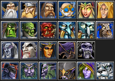
Another thing is that your variety of tavern icons even without my icons wouldn't have consistent quality standard, compare the icon of the archer which is probably just a slightly edited screenshot to the extremely high quality icon right beside it. Same goes for druid of the talon whos icon is obviously mirrored (another screenshot).

Glad you like my work, and I hope this is just a matter of you not having time to test the icons ingame, and that they display better ingame for you. I guess if that was the case you'd consider using my icons in your projects? :D

Edit:
For a better comparison, here's a original Hero to my custom Hero icons comparison file
Ocr3yKR.png
 
Last edited:
Level 22
Joined
Jan 6, 2017
Messages
307
Also Kargath is meant to be a Strength Hero. I just used the animations of the beastmaster, because i am too lazy to animate him myself.

Ahh awesome. I didn't pay attention to animations I was just thinking he isn't all that buff looking for a Strength Hero, but either attribute suits him as he is an orc. Anything you think needs to be improved with the icon?
 
Top