• 🏆 Texturing Contest #33 is OPEN! Contestants must re-texture a SD unit model found in-game (Warcraft 3 Classic), recreating the unit into a peaceful NPC version. 🔗Click here to enter!
  • It's time for the first HD Modeling Contest of 2024. Join the theme discussion for Hive's HD Modeling Contest #6! Click here to post your idea!

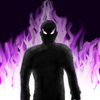
BTNHellfurynew

"Now would be a good time for you to run away..."

Thanks to HappyCockroach for his flame tutorial, and to Shadow Daemon for the icon manager.


==========
Changes:
==========
-Moved silhouette closer (the addition of legs made it look like a huge torso)
-Fixed the right shoulder (the weird bump is gone)
-Added some shading to the figure

Keywords:
fire, flame, blaze, inferno, hell, demon, rage, fury
Contents

BTNHellfurynew (Icon)

Reviews
15:00, 15th Jan 2010 enjoy: I like the purple fire, very nicely done. But the mans propotions are abit off, so try to either look at a picture on google to get the shape right, or try with a tutorial. Rejected untill updated. enjoy: Propotions are...

Moderator

M

Moderator

15:00, 15th Jan 2010
enjoy: I like the purple fire, very nicely done. But the mans propotions are abit off, so try to either look at a picture on google to get the shape right, or try with a tutorial. Rejected untill updated.

enjoy: Propotions are much better now. Now I don't know what a hell furry is, but shouldn't it have fur? Well, it might be useful. You can always update it if it was meant to look furish.
 
You icon was the same general idea of one of my past icons so ill use it as an example.
icons_8910_btn.jpg


same colour highlighs with a low opacity on the sillouette makes for good lighting on the body. such as on the arms and body on the picture you see there. grey is a pretty weak colour to use in this case of colour. \
the body is a tad off in shape and some highlights that accent a bit of the muscles and such can also help in realism and style. as enjoy had said, look up a good picture and try to recreate its anatomy.
and that backround may match the icon but its uncreative and makes it look more boring than it should be. try to add some pizzazz to the BG.
 
Top