Apparently, M0rbid invested his time on both quality and theme. There are certain annoying things here too, though.
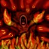
• The icon is too firey and it doesn't fully correspond to the default summoning abilities or units of Warcraft III. I mean, Water Elemental is not having a background full of bubbles, it has some discrete color, that you can actually realize what's depicted.
• The icon would fully respond theme-wise to the summon's master, but, just because the ghost's master is an Acolyte, it doesn't mean that he should have such a summon. This icon would fit mostly an immolation-type effect for Acolyte, rather than an actual ghost summoning.
• The whole idea of the ghost doesn't fit. Ghosts are not known for their elemental powers, elementals are. Certainly though, this one adds a new twist to this.
• You clearly had to remove those meteors and the fire on the bottom of the ghost is too unrealistic, too cartoonish; i mean compare the fire on the summon's hands and the ground's fire.
• Finally, the body should definitely be of another color, to add some contrast in the monotone icon, e.g. blue colored clothing.
• It lacks definition, but this is your 30-minute flaw.
Well, hard to decide, on the first hand, M0rbid's has good quality (compared to 13L4M3's) and the theme is appealing (I like the ghosts' concept), but on the other hand, I prefer the concept of 13L4M3's, although it's kinda overused. Both concepts are actually overused.
My decision will be based on how good they look in-game and how easy would be for someone to realize what they are in-game, so this is
M0rbid

 Approved


") Rejeced untill updated.
Rejeced untill updated.