• 🏆 Texturing Contest #33 is OPEN! Contestants must re-texture a SD unit model found in-game (Warcraft 3 Classic), recreating the unit into a peaceful NPC version. 🔗Click here to enter!
  • It's time for the first HD Modeling Contest of 2024. Join the theme discussion for Hive's HD Modeling Contest #6! Click here to post your idea!

BTNGDIceShatter

12610949.png


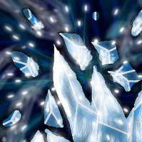
This is a try of my own ability to draw ice - i thouth my cold wand went well so i tried going more in that direction this time. This took me about 1½ hours of work and might need some more. But i like it alot as it is right now.

i don't know if i should darken it a bit or just leave it - give me a commend on that ^^

12610945.png
¨

.-* Updates *-.

1.
- Zoomed
- Removed some layers (too flashy and removed focus from the ice)
- Edited the lighting a little
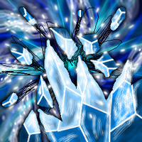
2.
- Removed the Shatters
- Removed some lightings that went "into" the BG
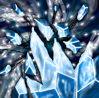
3.
- New Background

Keywords:
ice, winter, snow, frost, cold, explotion, shatter, sparkle, destroy, destruction, ruin, break, Golden, Drake
Contents

BTNGDIceShatter (Icon)

Reviews
I3lackDeath Awaiting UpdateDate: 2013/Apr/08 21:40:02 Reasons:Commented. [TR]Staff Contact Submission Rules 23:47, 8th May 2013 enjoy: Sorry I am not making the fancy review like i3lackdeath! ;) It looks cartoonish, but I like that it is...

Moderator

M

Moderator

I3lackDeath

Awaiting Update
[tr]
Date:
2013/Apr/08 21:40:02
Reasons:

Staff Contact

23:47, 8th May 2013
enjoy: Sorry I am not making the fancy review like i3lackdeath! ;)
It looks cartoonish, but I like that it is a lot more defined now, and you improved. :) Useful.
 
I assume you did not understand what I meant by saying "rework the background".

What I meant was a complete make-over of it.
The current effect is neither visually appealing nor flatters the icon itself.
Ice emerges from the bottom right corner, but the effect is placed in the middle.
That doesn't make sense.

Try diagonal effects, such as in Blizzard Entertainment's original icon for "Blizzard".
blizzard.gif
 
Level 23
Joined
May 19, 2008
Messages
704
Dude :) Imma help ya!

For the background, do not use white with opacity down on black. It's will look grey and dull. Instead, use blueish colors for the one. :) Use strokes of different opacity on top of eachother like you did, and then, blend them out, so it looks smooth. :)
 
Top