🏆 Texturing Contest #33 is OPEN! Contestants must re-texture a SD unit model found in-game (Warcraft 3 Classic), recreating the unit into a peaceful NPC version. 🔗Click here to enter!
It's time for the first HD Modeling Contest of 2024. Join the theme discussion for Hive's HD Modeling Contest #6! Click here to post your idea!
Just add some blue color variations to the fluid.
And to the atmosphere, something like light teal/cyan or a bit to purple, +darkening, lightening it, etc. It's fine otherwise, I like the atmosphere and how it fits in the 64x64 square. Also, the upper glass around the cork is really cool.
i'm not the best artist - and long from crazyrussian. this icon is also a DC so i have to work with what i have - and this is what i've got so far
- i could also make a more materialiced BG, that might be worth it
This is a lot better Drake, maybe you should add some blue color variation to the downer part of the fluid, maybe darken the right-down part, to make it look as if there's some sludge and to add some difference in the colors. And if you have the white glow on the glass of the potion on a different layer I suggest you make it a bit more.. hmm, less blurry, don't use that brush with blurry edges, use a normal circle on small opacity, it might turn out better.
Hmm..otherwise, it's really good now. I'll rate it for 5/5
but aa, update the icon, cuz I still see it the same. (even after reloading the page)
NFWar created a great and compact tutorial for potions.
Unfortunately, his pastebin expired.
Do not change the background colour to a completely different one.
It will look as if it didn't belong to the potion at all.
Check out some potion icons we have in our Icons Section.
The surface of the liquid is always brighter than the rest --> because it reflects light.
Include some minor shading aswell. This will make the liquid look more natural.
The bubbles don't make much sense. If you really want to keep them, you should make them look more "random", not as static as they currently are (focused on one location).
Personally, I wouldn't include them. They don't really fit any potion, unless it's boiling.
Use softer shading on the glass reflections aswell.
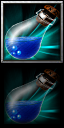
Its looking better. Add some more shadings & highlights to the water to make it seem more realistic. And work on the edges so it doesn't look like a 2D image as much as it is. Harsh & pure white edges deteriorate your icons quality by so much.
Its looking better. Add some more shadings & highlights to the water to make it seem more realistic. And work on the edges so it doesn't look like a 2D image as much as it is. Harsh & pure white edges deteriorate your icons quality by so much.
Looks a hell of a lot better. I'm going to request one last thing. That one big burred stroke doesn't really look like a proper reflection. Don't be too lazy with the reflections. Try to make it more real; that's all this icon needs now.
Wow, now THIS is amazing. I still don't like the white glow on the glass cuz it's way too blurry and not matching with the style of the icon but it's really cool and epic. I love it.
This site uses cookies to help personalise content, tailor your experience and to keep you logged in if you register.
By continuing to use this site, you are consenting to our use of cookies.


 Approved
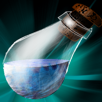


")


