🏆 Texturing Contest #33 is OPEN! Contestants must re-texture a SD unit model found in-game (Warcraft 3 Classic), recreating the unit into a peaceful NPC version. 🔗Click here to enter!
It's time for the first HD Modeling Contest of 2024. Join the theme discussion for Hive's HD Modeling Contest #6! Click here to post your idea!
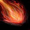
Ok, i made this icon, cause i red some interesting tutorials, and i wanted to figure out what i can do...
This isn't CnP or some shit like that...It's only freehand believe me...
I hope you like it...
I will post the fullsize image (if i can^^)
Enjoy it...
Advices are welcome
UPDATED: I tried to make it better...now it looks a bit more like a meteor... I hope you like it anyway...
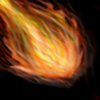
UPDATED: Only little changes... I'm waiting for more advices...
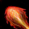
UPDATED: I only rotated it, but it looks much better , hopes you like it
UPDATED: Changed shades...but I think it was better before :/
This more or less looks like messy lines in a shape that could somewhat resemble a fireball.
there is really something about this that i really dont like. it is mostly the fact that it looks very unlike fire. Fire isnt liney or scratchy like you had portrayed in this icon here, but it is a smooth soft powerful flame.
there is also too much flat. this doesn't look rounded off to be properly 3D. try adding some shading and highlights (around the edges possibly) to make it pop out.
You should also fix up the BG. the colour matches the icon, but it looks way random and scratchy like the fireball, and it could turn out so much better.
you definatley made it more 3D, but its still a tad scratchy. looks more like a chicken drumstick. . and why did you remove the BG instead of changing it? it looks worse without it.
And do not double post. use the edit function instead.
you definatley made it more 3D, but its still a tad scratchy. looks more like a chicken drumstick. . and why did you remove the BG instead of changing it? it looks worse without it.
And do not double post. use the edit function instead.
This site uses cookies to help personalise content, tailor your experience and to keep you logged in if you register.
By continuing to use this site, you are consenting to our use of cookies.


 Approved
 , hopes you like it