• 🏆 Texturing Contest #33 is OPEN! Contestants must re-texture a SD unit model found in-game (Warcraft 3 Classic), recreating the unit into a peaceful NPC version. 🔗Click here to enter!
  • It's time for the first HD Modeling Contest of 2024. Join the theme discussion for Hive's HD Modeling Contest #6! Click here to post your idea!

BTNFalchion

So yeah. Been having fun playing with GIMP. This is the second attempt to make a weapon.
Got quite demoralized when I saw the newest icons in the section, but what the hell.
Worst that can happen is that it will get rejected.

So without further ado I present my Falchion icon.

Now shoot.

Update 1:
-Attempt to add texture to the blunt part of the blade
-Blue background glow lessened

Update 2:
-Removed the background glow
-Tried to make the shading more realistic on both the blunt and sharp part

Update 3:
-Redid almost all shading
-Added a bit of shine here and there


Be a sugarpie and give credits if you use this resource in your project.

Keywords:
Falchion, sword, 1h, one, hand, blade, polearm, halberd, shark
Contents

BTNFalchion (Icon)

Reviews
09:58, 28th Jun 2014 Sin'dorei300: The background doesn't helps the icon, either remove it or improve it to help the sword stand out. The shading on the sword needs a bit of improvement, think where's the light source. 13:01, 30th Jun 2014...

Moderator

M

Moderator

09:58, 28th Jun 2014
Sin'dorei300: The background doesn't helps the icon, either remove it or improve it to help the sword stand out.
The shading on the sword needs a bit of improvement, think where's the light source.


13:01, 30th Jun 2014
Sin'dorei300: Useful.
 
Thanks for the comments folks.

...but i think the background doesn't quite fit, and it shows a too small portion of the handle (or a larger portion, or none at all).

Can you describe how the background isn't fitting. I need more info on what would make it better. Like fx. would a glow outlining the blade be better?

And to clarify on the handle issue. I should either get rid of the handle altogether or show more of it?


Edit:
what a minute! 007? is this one of the weapons of medieval James Bond? 0_o

Hah. I guess I forgot to edit the name. No wait, yeah it's James '007' Blade's blade ;)
 

Kyrbi0

Arena Moderator
Level 45
Joined
Jul 29, 2008
Messages
9,492
Wow. This is kinda cool, and reminds me (positively) of the Wheel of Time "ashandarei" (sort of a naginata, a polearm with a sword for a tip).

That being said, you've got good color gradations, a nice even glow in the background, pretty good line-art... Not much of an artist, though I play one on TV. xD No, but anyway, it's just missing that little something to really fit well in-game... Not sure what, though. More contrast? More clarity? Compare to other icons & try to mimic style? Meh.

Good work.

First of all, thanks :)

Secondly.
I have tried fizzling with contrast and sharpness, but because I did the shadowing on the sharp part as I did it turns out quite bad unfortunately.
I think that "feel" is the cartooness of the blade that is lacking. It's like it should "shine" more, if you know what I mean.
 
The darkness is too dark imo. Reminds me of Heinvers. (omg)

Might look better if you dodge it a bit?

E: Also I suggest fully removing the handle or it would take angle changes to keep it.

Wasn't sure you meant the sharp or blunt part, so I made the sharp part brighter.


I have not decided on the handle yet.
 
Appreciated. When you say metal, do you mean the blunt or sharp part?

The blunt, the sharp part always has that withe-like color you used, maybe with some light shadings but still the same color, the blunt needs more work to it, since it looks plastic-mate color, and not exactly metalic, maybe adding some blood to it? xD
 
The blunt, the sharp part always has that withe-like color you used, maybe with some light shadings but still the same color, the blunt needs more work to it, since it looks plastic-mate color, and not exactly metalic, maybe adding some blood to it? xD

Plastic-mate ^^
I'm not going to add blood. I don't want it to be (quoting Kyrbi0), awexome. Too much of that. I want a plain "realistic" sword :)

I'll try to improve the shading.

Edit:
Icon updated
 
Last edited:
Level 23
Joined
Oct 20, 2012
Messages
3,075
It looks too sharp for me. :/

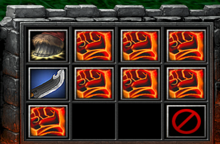
Looking at the ingame screeny, the icon currently lacks that softness of vanilla icons. Oh, and you could also blend the shading on the blunt side of the blade. "Layers" of the shadows are really obvious imo. Still, that's one awesome lookin' blade. :)

EDIT: And I agree with the blue glow being too large. I think making the edges of the glow not be clipped by the icon borders should look fine.
 
Oh, it looks good! xD

Good work!

Thanks man. Glad you like it :)


GreeN!X said:
It looks too sharp for me. :/

Looking at the ingame screeny, the icon currently lacks that softness of vanilla icons. Oh, and you could also blend the shading on the blunt side of the blade. "Layers" of the shadows are really obvious imo. Still, that's one awesome lookin' blade. :)

EDIT: And I agree with the blue glow being too large. I think making the edges of the glow not be clipped by the icon borders should look fine.

Heh yeah and the first poster wanted it sharper :)
Don't know what I'll decide upon there.

I very much agree that the shading on the blunt part can be better. I'll work on it.

About the blue glow. Did you looks at the old or updated icon?

Thanks for the feedback :)


Darkfang said:
Looks better now, it just needs the shading, :3

Yup. And I'll do something about it.
But to be honest I kinda like those shark stripes :p
 
Top