Looks really great although I would upload it as an file if I were you rather than a link and then put it in a [HIDDEN] tag since it's so large.[/QUOTE]
Thanks for hint, hehe, i edited it. The image its large because its on 1920x1080p :)
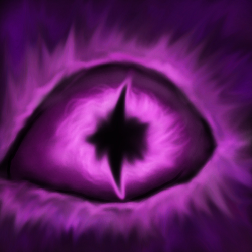
When finish the main concept i upgrade the eye , i don't know the final result :)


 Approved


")