• 🏆 Texturing Contest #33 is OPEN! Contestants must re-texture a SD unit model found in-game (Warcraft 3 Classic), recreating the unit into a peaceful NPC version. 🔗Click here to enter!
  • It's time for the first HD Modeling Contest of 2024. Join the theme discussion for Hive's HD Modeling Contest #6! Click here to post your idea!

BTNDwarvenRing

This bundle is marked as useful / simple. Simplicity is bliss, low effort and/or may contain minor bugs.
Design by my brother, I just painted it.

Give me no rep and no credits. Edit it if you want.

Here's the big version:

209078-albums5714-picture66293.png


Thanks to Vista Sucks who told me to lighten the ring and made an edited version of it. I copy pasted the runes from there (as Vista Sucks recommended me to do) cuz I couldn't make them the correct size -.- Also thanks to stonneash and I3lackDeath


Keywords:
Dwarven, Ring, Circle, Runes, Rune, Runic, Dwarf, Ancient, Old, Medieval, Naga.
Contents

BTNDwarvenRing (Icon)

Reviews
I3lackDeath Awaiting UpdateDate: 2013/Mar/12 22:38:43 Reasons: [TR]Staff Contact Submission Rules

Moderator

M

Moderator

I3lackDeath

Awaiting Update
[tr]
Date:
2013/Mar/12 22:38:43
Reasons:
I3lackDeath;2300292 said:
Get rid of the runes that are located within the indentations.
They don't make much sense there, and add to the somewhat messy look of this ring.

Staff Contact
 
Level 28
Joined
Aug 7, 2011
Messages
1,638
Well, yes, the runes sure do look better but I wanted it to be in such yellow dwarven metal, bronze or something like that (maybe bronze + gold? It would be a nice combination), something like Skyrim Dwemer or such. I'm a bit lazy to change the cracks atm, I'll do it when I'm more into an "editing mood" :D 
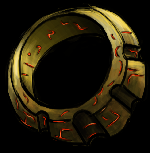
Thank you for doing all that explanation, there was no need to spend any of your time on these stuff but still thanks a lot. I mean, I even tried to make the runes bigger but I made them too big and they sucked so I just trashed the new result. Maybe I should make it more like you did. Thanks Vista.
 
Vista sucks has a valid point. Stronger contrasts will create sharper reflections, depending on what kind of metal texture you want to create.
You can try to increase brightness aswell as saturation (the latter only a little bit), maybe emphasize the edges with brighter shades of colour aswell.
This ring currently looks a bit washed out and too dark.

The issue with the runes is not their surroundings, but their size.
Small details like those will get lost in the icon version.
 
Level 28
Joined
Aug 7, 2011
Messages
1,638
Hmm, about resizing... ok, I've got a nice secret when resizing for icons -.-

And about the darkness BD, yes I guess it needs some more lightening, it's quite dark. But about saturation? I don't know, I like it... it looks more like Gold+Bronze combination... but, since everybody told me to fix the saturation and the runes, I guess I'll have to work on it soon :\ I'm just not in the mood for drawing. I tried making them bigger but they got too big and I got lazy... hmm... Icons aren't what I want to draw atm xD I'll fix it soon I guess.
 
Top