
 Approved


Moderator
M
Moderator
10:34, 6th Dec 2011
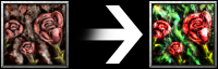
Pyramidhe@d: The background and the roses just melt and blend together. Separate them.
11 Feb 2012
Pyramidhe@d: There is an icon like this already in the warcraft game. For what purpose should the mods accept this icon when it is not on par in terms of quality with the warcraft icons. Show me something great, something special, something worthy to be approved


