• 🏆 Texturing Contest #33 is OPEN! Contestants must re-texture a SD unit model found in-game (Warcraft 3 Classic), recreating the unit into a peaceful NPC version. 🔗Click here to enter!
  • It's time for the first HD Modeling Contest of 2024. Join the theme discussion for Hive's HD Modeling Contest #6! Click here to post your idea!

BTNDarkDualBlade

Hi people, my seconds try, it is not something awesome, but I am noob in iconning, so pls I currently dont like hot it looks like, pls can u give me advice what and how to edit it. Dont say just, add highlight or something like that than some more useful suggestion

Keywords:
sword, twilight, dark, two blades, dual, two, sword, shadow, item
Contents

BTNDarkDualBlade (Icon)

Reviews
I3lackDeath ApprovedDate: 2013/Mar/17 16:53:33 2013/Mar/23 01:42:57 Reasons:Needs more definition. Apply well places highlights to make the sword stand out from the background. Additionally, try to experiment with other colours for the...

Moderator

M

Moderator

I3lackDeath

Approved
[tr]
Date:
2013/Mar/17 16:53:33

2013/Mar/23 01:42:57
Reasons:
Needs more definition.
Apply well places highlights to make the sword stand out from the background.
Additionally, try to experiment with other colours for the background.
Using the same colour for both the background and object of interest causes the latter to blend in with it.
This adds to the blurry looks of this icon.


Changes made.
Acceptable quality.​

Staff Contact
 
Level 14
Joined
Dec 29, 2009
Messages
931
It looks like the sword blends into the background.
Add some extra definition on the edges of the sword and maybe show a little less of the handle and more of the blade.

Other than that, it looks nice. 3/5.

EDIT: Also, on the file, try not to have spaces. :p
 
Okay, I noticed there's something confusing about your icon.
Allow me to elaborate, whether you want to take it or ignore it, its your choice. Im trying my best to give something helpful.

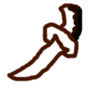
Right now, something is wrong with the shadow.
Let me draw something simple to show the part you shaded
attachment.php

If you look closely at your icon, you will notice that only handle is correctly shaded.

Because of the incomplete shading, it might give people the false impression of your icon's appearance. For example, I mistook your icon into something like this when seeing it for the first time:
attachment.php
Note that I purposely bent the handle because thats how it looked to me for the first time.
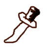
After the update, the sword much clearer so good job for that.

However, something is not right about the shading. You are only applying it on the handle.
attachment.php

What you have done to the blade was adding color tones (for a metallic surface) but you didnt make it react to light source.

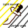
So you could do something like this:
attachment.php
Note that this is just an example on ways to manipulate light source. There are still a lot of ways to do it.

I might be wrong. But Im sure you can take something from this comment.
 

Attachments

  • 1.jpg
    1.jpg
    6.6 KB · Views: 439
  • 2.jpg
    2.jpg
    6.6 KB · Views: 423
  • 3.jpg
    3.jpg
    14.4 KB · Views: 486
  • 4.jpg
    4.jpg
    6.8 KB · Views: 470
Level 12
Joined
Jun 13, 2011
Messages
740
Okay, I noticed there's something confusing about your icon....................................................Note that this is just an example on ways to manipulate light source. There are still a lot of ways to do it.
I might be wrong. But Im sure you can take something from this comment.
/\
Agree!
And what happened to the quillons(crossguard) right corner, it's broken?
 
Top