Wow! Great Cloud Wolf made icon following my tutorial? Holy sh.. I never though you would follow ThIs tutorial ^^
I have a lot to tell about this icon, but now rly now... "I have An AxE to Grind"
")
EDIT: Ok.. the axe Is grinDed
About the icon now...
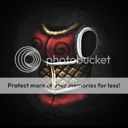
It is too dark from the left side, shadows on chest making it looks too round. The net looks very linear, but segment looks fine.
The colour of material it very stong that makes shading very bright than usual. The white color doesnt seems like to fit well and it is not shaded enough. The armor blends into the background in some places. Also, the armor is small for the icon and have to be maximum zoomed it even if it will cost to hide lower part.

 Approved