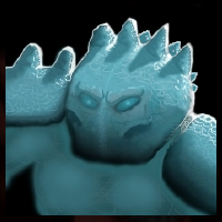
Basic Screen Icons/Drawn Icons
Name came from creating icons from screenshots, or basing yours on some. Generally, people create one huge mistake when they're making icons. They take a screenshot of the model, which is okay, as it provides the best outlines if you can't draw from scratch. However, if you take the shoulders, chest and neck in the icon, it can become very ugly. Why? Well, correct me if I'm wrong, but nearly all unit icons in the Warcraft are displaying face only, with few which display full neck as well. There are some specific examples, such as mechanical units and most buildings. To capture a good icon, you need head only, and an interesting angle. Let's just say that the head looking left or right is overused and not dramatic. But, if you face the camera slightly from above or bellow, or turn it completely by 90 degrees to watch just half of the face, you will get more unique icons. I like to create mixtures: Slightly turning the camera up or down, and then rotating it left or right. You can see my Alternate Jaina Icon for the example or slight down rotation, plus right looking.
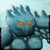
Colors
You can't make a good icon without good colors. Since you created it by using the model, to fit it, you could at least use a picker and use nearly same colors as the model, which would fit it perfectly. Now, what you could also do is to, instead leaving it plane, to add some color variations. I see that on model, there are slight transitions between very light blue, to turquoise and dark teal. Check my Fire Comet icon to see how different colors can match each other perfectly, with both long and short transition distances.
S&H
Shadows and Highlights. In this icon, very distracting and very primitive. The highlights are telling me that there's light source behind him. I think that there's only one or two icons in Warcraft that use that type of light. It's stable and well known that you can never be wrong if you take the "In your face" type of light. However, most icons tend to have that "Sun shines brightly in Noon" light, which means that the light source is coming from above the icon. If your icon is rotated, make sure that your shadows and lights will rotate with icon as well. You can search for live alternatives online to see how this works. Shadows are generally never black, unless it's really dark. They tend to create the same effect the "Burn" tool in photoshop gives, but with much less increase of color's saturation. You can do it easily in new layer, with low opacity dark blue and light blue colors (in your case) and just swish around those points. Look at my Glacial Spike icon to see how it works. Oh, and make sure to apply some glow, cuz everybody likes it. Around the eyes, with low opacity big soft brush. See the glows around the eyes on my Corrupted Spirit Walker icon. One more thing: higher contrast in the icon: more shine and realistic, great feeling.
Background and Details
Your icon has none from both, except the eyes. Making them red, as on the model, would achieve a better effect. When big flashy eyes are done, then some glow is needed. You should outline all the ending facial lines on the icon with thin black brush, to get the Cartoonish Warcraft feeling, and the Sharpen filter when you're done, to make things even better. Background should fit the icon and in most cases, should start with black. Just make some swirles and swishes around the Hero, if there's place. Since the icon is what represents a hero most of the time, it should have a lot of details, such as cracks on the ice, shine and lots of shadows and lights - even if the model doesn't have it: but don't get too much of the difference.

 Approved
")