• 🏆 Texturing Contest #33 is OPEN! Contestants must re-texture a SD unit model found in-game (Warcraft 3 Classic), recreating the unit into a peaceful NPC version. 🔗Click here to enter!
  • It's time for the first HD Modeling Contest of 2024. Join the theme discussion for Hive's HD Modeling Contest #6! Click here to post your idea!

BTNBombardier

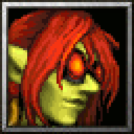
Another model I really liked (might be my favorite Goblin model), is Goblin Bombardier by Norinrad for HandCLAW.

Process image:
wVOi0qt.gif

Process wasn't as smooth as the process image makes it look. ;P

Enlarged 192x192 version
CAoEQgk.png
Contents

BTNBombardier (Icon)

BTNHeroBombardier (Icon)

Reviews
Murlocologist
This one got character and coloring is nicely done. Moderation for: BTNChaosGeneral The color value is true to the in-game icons style. One of your better works. I liked the shapes. BTNKargathBladefist I'd move cheeks higher and reduce the red...
Level 50
Joined
Mar 22, 2016
Messages
588
This one got character and coloring is nicely done.

Moderation for:

BTNChaosGeneral The color value is true to the in-game icons style. One of your better works. I liked the shapes.
BTNKargathBladefist I'd move cheeks higher and reduce the red. Highlights could be stronger on cheeks as well.
BTNFacelessOneCultist Not quite significantly edited, but there was some work and icon looks fitting to model.
BTNGunSlinger Showing move of his hair and moving him more to right may would have been beneficial for balance of icon. He is leaning towards upper edges leaving a lot of space on the right. Problem in balance comes when left and right space come into interaction, one is dominating drawing unnecessary attention. However it looks good and colors are fitting for in-game.
BTNHyppoPriestess From the process gif you posted, moving her lower face upwards was not needed. This is an uneasy perspective to work with and you need shadows to help you in positioning, especially in icon size. So, more contrast maybe would be helpful.
BTNSylvan Enchantress Overall looks fitting for in-game, however the original perspective was altered to front view at some point while leaving cloak in starting perspective.
BTNGoblinPrince Looks good, seems fitting for in-game use, as well.
 
Level 22
Joined
Jan 6, 2017
Messages
307
This one got character and coloring is nicely done.

Moderation for:

BTNChaosGeneral The color value is true to the in-game icons style. One of your better works. I liked the shapes.
BTNKargathBladefist I'd move cheeks higher and reduce the red. Highlights could be stronger on cheeks as well.
BTNFacelessOneCultist Not quite significantly edited, but there was some work and icon looks fitting to model.
BTNGunSlinger Showing move of his hair and moving him more to right may would have been beneficial for balance of icon. He is leaning towards upper edges leaving a lot of space on the right. Problem in balance comes when left and right space come into interaction, one is dominating drawing unnecessary attention. However it looks good and colors are fitting for in-game.
BTNHyppoPriestess From the process gif you posted, moving her lower face upwards was not needed. This is an uneasy perspective to work with and you need shadows to help you in positioning, especially in icon size. So, more contrast maybe would be helpful.
BTNSylvan Enchantress Overall looks fitting for in-game, however the original perspective was altered to front view at some point while leaving cloak in starting perspective.
BTNGoblinPrince Looks good, seems fitting for in-game use, as well.

Thanks for the wave of approval. :p

@ BTNKargathBladefist I was having issues pulling off his cheeks, originally they were even lower down but I guess I didn't move them high up enough. You can see difference between the last frame of the process and the resource icon since I forgot to update the process gif and I updated the icon after having posted it.
@ BTNGunSlinger In the process file you can see he was more to right at the start, but having tested it ingame I noticed when hero levels up the little unused ability point box was kinda covering too much of the important part of the icon so I figured I'd try to avoid that by moving it few pixels to left.
@ BTNHyppoPriestess I'm not sure how to explain it exactly but I was trying to give her a more powerful look, almost divine? As if she's looking down upon the viewer I guess.. Maybe something like this is better?
yduofe5.png
Though those details on sides of her head would have to use different perspective also and those seem even harder for me to pull off.
 
Top