• 🏆 Texturing Contest #33 is OPEN! Contestants must re-texture a SD unit model found in-game (Warcraft 3 Classic), recreating the unit into a peaceful NPC version. 🔗Click here to enter!
  • It's time for the first HD Modeling Contest of 2024. Join the theme discussion for Hive's HD Modeling Contest #6! Click here to post your idea!

BTNBloodOffering

  • Like
Reactions: deepstrasz
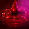
An icon which I made for fun.. Its some sort of a blood pool and some blood dripping, I don't know.


P.S I'm bad at this.


Enjoy.


148677d1442560450-btnbloodoffering-bloodoffering.jpg


Tooltip
Allows the unit to restore a percent of its hitpoints everytime it kills a unit.


Version 1.0 - No glow
Version 1.2 - Added Highlights and Shadows
Version 1.3 - Added Glow


Keywords:
blood,pool,bloodpool,offering,bloodoffering,demon
Contents

BTNBloodOffering (Icon)

Reviews
09:32, 4th Oct 2015 Apheraz Lucent: Even tho it's a little bit too realistic for the Warcraft III, it still looks nice and is very useful.

Moderator

M

Moderator

09:32, 4th Oct 2015
Apheraz Lucent: Even tho it's a little bit too realistic for the Warcraft III, it still looks nice and is very useful.
 

Roland

R

Roland

6GhbHE0.png


Just look beside your resource below the thread tools.
 
Level 21
Joined
Jul 6, 2014
Messages
6,791
As The Silent said,please don't double post.Delete the extra posts and edit the first one.
Moving on,the icon it self isn't bad but what's up with the pink on the right?
Also,it would be nice if you made the blood a bit darker(only a tiny bit)
 

Ardenian

A

Ardenian

Great icon! I am impressed!

Though, I think it misses some three-dimensionality, the bottom part makes it look like a globe, in my opinion. Try not to curve the bottom part that much and see if it looks better/different.
 
Level 12
Joined
May 28, 2015
Messages
382
As The Silent said,please don't double post.Delete the extra posts and edit the first one.
Moving on,the icon it self isn't bad but what's up with the pink on the right?
Also,it would be nice if you made the blood a bit darker(only a tiny bit)

Okay, well the pink on the right is like a second light.. an imaginary light of some sort. I lighten it up a bit because the first version of this one is really dark in game.

Great icon! I am impressed!

Though, I think it misses some three-dimensionality, the bottom part makes it look like a globe, in my opinion. Try not to curve the bottom part that much and see if it looks better/different.
Thanks for the feedback, I agree with the globe thingy and the lack of three-dimensionality part... Well this is just a practice actually, I'm just started at icon making
 
Top