• 🏆 Texturing Contest #33 is OPEN! Contestants must re-texture a SD unit model found in-game (Warcraft 3 Classic), recreating the unit into a peaceful NPC version. 🔗Click here to enter!
  • It's time for the first HD Modeling Contest of 2024. Join the theme discussion for Hive's HD Modeling Contest #6! Click here to post your idea!

Arcuz 1

Description

ArcuZ
Created by Firelord001

Map Info:
A cinematic made by Firelord001. This cinematic reveals the story and journey of Arcuz, the main character in the story. In this episode, Arcuz's journey begins here. It will tell how Arcuz's journey begins.

Storyline:
The story is all about Arcuz. Arcuz is the son of General Arthur, the General of the Sagin. He wants to be like his father so he go on for a journey to train himself. This story is all about his journey, life and everything about him. And his story begins here

Screenshots:


Image Description:
City

224821-albums6975-picture77158.bmp


Image Description:
Freedom Square

224821-albums6975-picture77157.bmp


Image Description:
Castle

224821-albums6975-picture77156.bmp


Image Description:
Night Forest

224821-albums6975-picture77159.bmp


Credits:
Special Thanks:
  • CMarket - For inspiring me to make cinematics.
  • DTS - For insipring me to make a better terrain
  • Kobas - For his Map Description Template


Models:
  • Elenai
  • Fingolfin
  • Tranquil
  • UTM Authors
Musics:
  • Warcraft III Musics
  • How to train your dragon Soundtrack

Author's notes:

If you want more information, take a look at this thread.
Arcuz

Map Description Template Created by -Kobas-
Find more here: Map Description - Templates


Keywords:
Arcuz, Cinematic, Adventure,
Contents

Arcuz 1 (Map)

Reviews
23:10, 22nd Dec 2013 Orcnet: Please add an a trigger, I will then see the results soon. [EDITED]: damn forgot to update, approved.

Moderator

M

Moderator

23:10, 22nd Dec 2013
Orcnet: Please add an a trigger, I will then see the results soon.

[EDITED]: damn forgot to update, approved.
 
Level 21
Joined
Nov 4, 2013
Messages
2,017
U have judged my map, Searing Conflict, so I thought it was appropriate judging ur map!

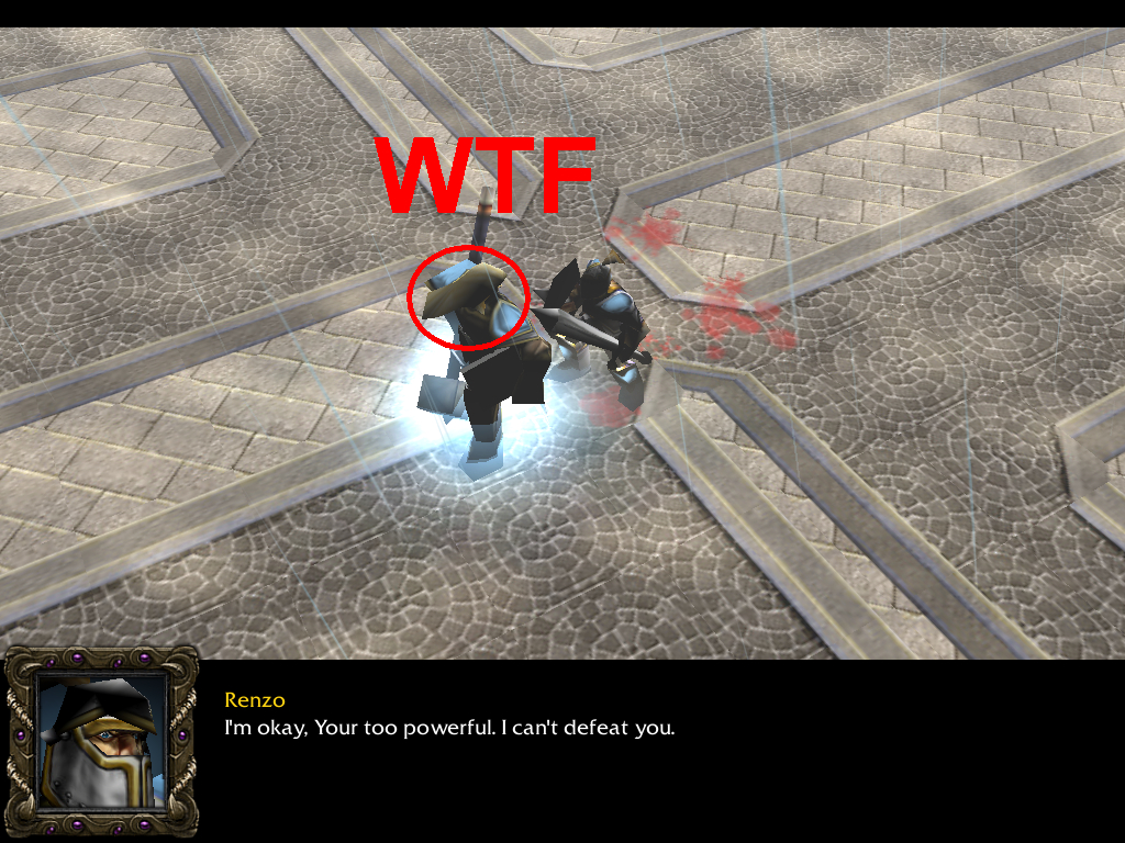
There is something funny, u said my terrain was not good enough, but urs is even worse! The terrain outside the buildings was bad. At least the terrain inside the buildings was pretty nice. The dialogue is really scrap and trash! Mistakes in almost EVERY DIALOGUE! Especially u write "your" and u need to write "you're". The story itself wasn't really amusing, but decent enough. About the 2 fights, they were unlookable! So badly done!

All in all, this map gets or 2 or 2/5 still can't decide. What I'm sure is that I'll rate 2. However, I'll vote for APPROVAL! Sorry dude for the low rating but u need to improve ur English and terrain greatly.
 
Level 4
Joined
Dec 28, 2012
Messages
55
U have judged my map, Searing Conflict, so I thought it was appropriate judging ur map!

There is something funny, u said my terrain was not good enough, but urs is even worse! The terrain outside the buildings was bad. At least the terrain inside the buildings was pretty nice. The dialogue is really scrap and trash! Mistakes in almost EVERY DIALOGUE! Especially u write "your" and u need to write "you're". The story itself wasn't really amusing, but decent enough. About the 2 fights, they were unlookable! So badly done!

All in all, this map gets or 2 or 2/5 still can't decide. What I'm sure is that I'll rate 2. However, I'll vote for APPROVAL! Sorry dude for the low rating but u need to improve ur English and terrain greatly.

Thanks for that. It's ok for me :)
 
Level 30
Joined
Nov 29, 2012
Messages
6,637
The Hive Workshop Official
mr_design_mapreview.jpg


Map Reviewer: Hell_Master
Map Name: Arcuz 1
Map Author: FireLord001


mr_design_mapaspects.jpg


Originality

Pretty much a decent cinematic with a good story about Arcuz who dreams of getting stronger in hopes of leading the army against wars. As far as I know, this is how the story goes.

Score: 58/100

Presentation

Presentation looks good and provides much basic informations needed. Overall, it is pretty much short but sweet presentation.

Score: 69/100

Design

Loading Screen is plainly black which I do think is bad. I suggest use a loading screen for it to better make the game or map's design better. Also, do make an introduction at the load screen by writing something at the load screen. Describe how the story will start like that you are narrating.

No errors found while watching the cinematic.


Score: 61/100

Terrain

Terrain overall looks good but I pretty much think that the Garden part near the castle entrance looks decent, I do think you could use the Crops Tile as the tileset for the flowers in there. It fits well rather than that simple Grass Tile. Also, you could have added some more decorations in there instead of repeating the process of putting flowers all over again such as putting walls or fences on each parts of the garden. Forest looks good though could use some more decorations such as more grasses but do not spam it and also, some tile variations like instead of grasses, combine some more tiles with it.

Indoor terrains looks decent. The castle could have more doodads in it rather than pillars like put some carpets in it, maybe some tables/chairs/bookshelfs and more, and some wall decorations instead of torches. But I like how you did the made the racks as walls at the blacksmithing area but it could use some more doodads once again, such as dummies, forges and such.

Widen up your imagination and I assure you that you can make the terrain better.


Score: 65/100

Triggers

Not the person to judge triggers much so as far as I see it looks good: well-documnted or arranged. Though, I am wondering why you use waits in each unit transmissions. I pretty much think that you can just use the set duration in it.

Score: 69/100

Object Data

Some doodads and units scaling size looks quite wrong. Some are are much bigger than others and the other way around. Also, I do think that the music files takes too much space and they can still be reduced in sizes by using some programs that reduces Music files. It means that your 8 MB size can still be reduced.

Score: 60/100

Gameplay

I will comment here how the story goes and what I think of it. The story to start off looks good though quite common. The way that the story has been told is decent and could be better because you have some grammar mistakes in the map. It involves: wrong spelling, wrong tenses and sometimes it has a wrong punctuation mark. I also agree with what Shadow Fury said about your mistake on "your" and at "you're". You should remember that there is a difference on this one. "Your" is somehow expresses possession or belonging while "You're" in the other hand is the short term for "You are".

Overall, the story is good though the way of it being told could be better by improving your grammar a bit.


Score: 63/100

mr_design_suggestions.jpg

You could use some good or decent loading screen for it and also give some sort of introduction in it. Write something up in the Loading Screen.

You should follow much of my advices at the Terrain part of my review. It will make your terrain better!

Why did you use waits when you have set durations in each unit transmission. I do think it is quite a waste doing that though I might be wrong so do not hesitate to correct me.

There is something wrong with some of the scaling sizes involving units and doodads but mostly doodads. You should fix that.

Music files in the map can be still reduced I think. It is always better to make sure to reduce much size in your map so it will not take long when downloading the map.

You should improve your grammar a bit. Follow my revisions and also do not forget Shadow Fury's advices. It could make your way of telling the story better and the dialogues would be better as well.


mr_design_finalresult.jpg


Final Score: 63.571/100
3/5 Vote for Approval

mr_user_Hell_Master.jpg

Contact: (Visitor Message) / (Private Message) / (Map Reviewers)
 
Level 4
Joined
Dec 28, 2012
Messages
55
The Hive Workshop Official
mr_design_mapreview.jpg


Map Reviewer: Hell_Master
Map Name: Arcuz 1
Map Author: FireLord001


mr_design_mapaspects.jpg


Originality

Pretty much a decent cinematic with a good story about Arcuz who dreams of getting stronger in hopes of leading the army against wars. As far as I know, this is how the story goes.

Score: 58/100

Presentation

Presentation looks good and provides much basic informations needed. Overall, it is pretty much short but sweet presentation.

Score: 69/100

Design

Loading Screen is plainly black which I do think is bad. I suggest use a loading screen for it to better make the game or map's design better. Also, do make an introduction at the load screen by writing something at the load screen. Describe how the story will start like that you are narrating.

No errors found while watching the cinematic.


Score: 61/100

Terrain

Terrain overall looks good but I pretty much think that the Garden part near the castle entrance looks decent, I do think you could use the Crops Tile as the tileset for the flowers in there. It fits well rather than that simple Grass Tile. Also, you could have added some more decorations in there instead of repeating the process of putting flowers all over again such as putting walls or fences on each parts of the garden. Forest looks good though could use some more decorations such as more grasses but do not spam it and also, some tile variations like instead of grasses, combine some more tiles with it.

Indoor terrains looks decent. The castle could have more doodads in it rather than pillars like put some carpets in it, maybe some tables/chairs/bookshelfs and more, and some wall decorations instead of torches. But I like how you did the made the racks as walls at the blacksmithing area but it could use some more doodads once again, such as dummies, forges and such.

Widen up your imagination and I assure you that you can make the terrain better.


Score: 65/100

Triggers

Not the person to judge triggers much so as far as I see it looks good: well-documnted or arranged. Though, I am wondering why you use waits in each unit transmissions. I pretty much think that you can just use the set duration in it.

Score: 69/100

Object Data

Some doodads and units scaling size looks quite wrong. Some are are much bigger than others and the other way around. Also, I do think that the music files takes too much space and they can still be reduced in sizes by using some programs that reduces Music files. It means that your 8 MB size can still be reduced.

Score: 60/100

Gameplay

I will comment here how the story goes and what I think of it. The story to start off looks good though quite common. The way that the story has been told is decent and could be better because you have some grammar mistakes in the map. It involves: wrong spelling, wrong tenses and sometimes it has a wrong punctuation mark. I also agree with what Shadow Fury said about your mistake on "your" and at "you're". You should remember that there is a difference on this one. "Your" is somehow expresses possession or belonging while "You're" in the other hand is the short term for "You are".

Overall, the story is good though the way of it being told could be better by improving your grammar a bit.


Score: 63/100

mr_design_suggestions.jpg

You could use some good or decent loading screen for it and also give some sort of introduction in it. Write something up in the Loading Screen.

You should follow much of my advices at the Terrain part of my review. It will make your terrain better!

Why did you use waits when you have set durations in each unit transmission. I do think it is quite a waste doing that though I might be wrong so do not hesitate to correct me.

There is something wrong with some of the scaling sizes involving units and doodads but mostly doodads. You should fix that.

Music files in the map can be still reduced I think. It is always better to make sure to reduce much size in your map so it will not take long when downloading the map.

You should improve your grammar a bit. Follow my revisions and also do not forget Shadow Fury's advices. It could make your way of telling the story better and the dialogues would be better as well.


mr_design_finalresult.jpg


Final Score: 63.571/100
3/5 Vote for Approval

mr_user_Hell_Master.jpg

Contact: (Visitor Message) / (Private Message) / (Map Reviewers)

Thank you for the review

I'll do the update :)
 
Level 16
Joined
Mar 27, 2011
Messages
1,349
Some suggestions:

Volume Levels - You need to work on dynamics. By this, I mean loud parts and sort parts. Not just in music, but in sound effects and dialogue too. For starters, the music needs to be slightly louder. I was having trouble hearing it. Music can be louder in terrain viewing scenes, and slowly fade in volume as any dialogue or sound effects come in. Music can increase in dynamics in fighting scenes to make things more dramatic. Another example is having footsteps growing in volume as the character comes from far away, then closer to the camera. This pushes the 3D feel of the cinematic.

Random Sounds - At the beginning I hear the child death sound repeated, swords attacking, etc. I don't think they are suppose to be there. If they are, you haven't explained the situation or atmosphere very well at all. Also heard a fire sound inside the castle near the start. Don't think that's suppose to be there. Set fire sounds to 0% using a trigger.

Sound Effects - There's basically no sound effects at all. A cinematic like this needs a LOT. When the father and son are in the tavern, consider adding a crowd talking sound, an occasional guy laughing out loud, a beer spilling over, etc. Add some laughs or growls or angry sounds to dialogue too. You could add a tree swaying sound when passing trees, footsteps, door openings. Sounds sure do make the cinematic realistic. Remember your volume dynamics. Don't play any one sound at 100% volume, unless your trying to shock the audience. Just Google sound effects. Lots of things will pop up, or even record your own.

Dialogue - I found some of the diagloue cheesy, or unsuiting to the character. Lots of cliche' lines, not much originality. One example of poor dialogue is the father and son conversation in the tavern near the beginning of the cinematic. Pretty sure the son must be 25-35 years old. He was saying things a little kid says to his daddy. He didn't sound like a grown man going to war. Add a more realistic personality to your characters.

Grammar - Not much to say. Improve your grammar within the dialogue.

Movement -
Some scenes are boringly still. I noticed some scenes where units may patrol in the background, but try to do more. Maybe when units are having conversations, make the turn. Maybe if the footmen brings bad news, the commander turns his back on him and lowers his head. Make a "sigh" sound effect to play at that moment. Turn the commander slowly back towards the footmen and then make a reply. Just an example. Plenty of scenes need some work.

Making a quality cinematic on a WC3 engine by yourself is very time consuming and difficult. I never have been very into WC3 cinematics because most struggle to make them remotely interesting. If you properly implement the above points, you can start to turn a WC3 cinematic into a proper anime TV show or something. Bring this cinematic to life!

Good luck :)

Edit: Made a cinematic demonstrating sound dynamics and attached it. Triggering isn't hard, but I documented it anyway.
 
Last edited:
Top