• 🏆 Texturing Contest #33 is OPEN! Contestants must re-texture a SD unit model found in-game (Warcraft 3 Classic), recreating the unit into a peaceful NPC version. 🔗Click here to enter!
  • It's time for the first HD Modeling Contest of 2024. Join the theme discussion for Hive's HD Modeling Contest #6! Click here to post your idea!

Hive 2 Feedback

Status
Not open for further replies.
Level 21
Joined
Mar 27, 2012
Messages
3,232
As a long-time hiver I don't like many aspects of the new site. I will probably find something useful that I didn't have before, but so far it has been a bad experience.

*In maps and resources the thing that pops up when I hover over Sub-Repositories doesn't disappear unless I click somewhere.
*The Quick Links in the upper part of the page(Home, Forums, Media...) often don't disappear when I move the mouse away, yet they open simply by hovering on them. They also don't show up instantly when I hover on them. For someone that is as efficient at browsing as me, this is a huge annoyance.
I'd like it more if the Quick Links part didn't exist and instead the subcategories below them(Models, Icons, Packs...) changed instantly based on what I hover over.
*In Notable Members there is a category called "Most Likes". It seems like it should be removed, since it doesn't contain anything.
*New Posts requires hovering on a category and then clicking on something. Feels like 2 clicks instead of the 1 it used to be.
*In Unread Watched Threads the link for going to the last post is on the other side of the screen than the thread's name and other links relevant to the thread. It would be better if there was also one as an image after the name of the thread, like it used to be.
*Watched Threads lists 20 last threads and dumps everything before them. If I were to be away for a few months I'd most likely not be able to keep track of what I have looked at after that. Previously this problem didn't exist.
 
Level 12
Joined
May 9, 2009
Messages
735
You're not the only one. What I want to know whose idea it was to make the model viewer half its previous size. It's not exactly entertaining having to using the browser zoom function to get a better view of the model. Not exactly a big deal, but still annoying seeing as it is another negative this "upgrade" brought.

You must, however, give credit to hive 2.0 for finally solving the "too be updated" resources issue. In old hive there were many many resources that were submitted and then hidden by the moderators because they needed an update from the resource submitter. Many resource submitters decided to fall asleep though and thus the "too be updated" resources grew in number. It was a shame because there were some real gems there which just needed a small ribbon update.

This treasure trove is finally available to us plebians in the "substandard" model section.
 
Beloved User CP button is gone, Not a big deal but.. It feels weird.
Also, In the Profile page, Since Icon size is all the same, Instead of having it put awkwardly in the big box, maybe just make it the size of icon?

Also not sure if is possible, it would be nice if the image is on the centre of the "Vertical Rectangle" instead of awkwardly directly below the title.

In the resource page, especially in model section, Everything looks quite Cramped, it would be nice to have more "breathing space on the website. like in the hive 1 is just nice. It feels a little cluttered now :p The Eye don't know where to look at first and the whole page is shouting for attention, It could make people uncomfortable, at least for me it is.

Resource Filter would be sweeter if it is on the left, As I think these kind of things are usually on top or at left, at the right side would be quite awkward.

Navigation Bar, Would be nicer if it is dropdown menu instead of needing to click the button to bring out the option.

btw, I noticed there is a "Like count" Somewhere, How do I like things btw?

Those are just my personal thoughts anyway, I'm no pro in web design or whatsoever, so yeah :p

Noticed Save Draft, I think this is going to be nifty :D


But anyway, I know ralle spent a lot of time and effort, but would be nice if these things are taken into consideration to tinker though :p
 
Last edited:

EdgeOfChaos

E

EdgeOfChaos

Is there any way to change back to the old style? Like, not the entire hive 1.0 but the coloring, button positions, etc. I don't like the new style at all.
 
My biggest gripes with Hive 2 so far:

1) Stickies are only seperated via a double border from the regular threads. This makes it hard to recognize stickies as such. There has to be a bigger seperation between the sticky and the non-sticky block.

2) Threads with unread posts are marked with a bolt font, I see that; but the difference between the bolt font and the non-bolt font is almost non-existant. There needs to be a stronger difference between bolt and non-bolt thread characters.

3) It's weird that threads show the avatar of the last poster. This makes the board design very colorful and distracting. I think having static symbols for threads is the better option on the long run; especially since many users don't use an Avatar and will display a white question mark as a placeholder.
 
Level 12
Joined
May 9, 2009
Messages
735
Model downloads seem to sub-folder every individual file in the download. This makes managing models and portraits more troublesome than having them in the same folder as before. E.g.

KultirasSailor/KultirasSailor/KultirasSailor.mdl
KultirasSailor/KultirasSailor1/KultirasSailor_Portrait.mdl
 
Level 24
Joined
Aug 1, 2013
Messages
4,657
cLOE18f.png

Those last 3 lines should say enough.
 
Level 15
Joined
Sep 24, 2009
Messages
1,523
My biggest problems are:
- model search,
- all galleries are in the "Media" tab...,
- splitting model portrait to separate file,
- no user CP,
- deleted models appearing,

What I REALLY like: pending models and rejected (not sure for this one) available for download
 
The things Ive noted most as issues (from my perspective)
- Some spell resource descriptions are broken (Almia's Gigadrain for example) where they're cutoff early (and the remaining description which was cutoff simply isn't available even on edit, meaning it can't be recovered)
- You cannot link to specific posts anymore (not that I've found) You can but it's the opposite of intuitive (click the post number next to the "reply" button)
- Almost all links to specific posts became broken (the biggest issue I presently have for this is my entries table for the ongoing poll in the zephyr contest which was used to make all the entries easily accessible and has another week left to vote)
- Messages on your profile have a limit of 140 characters despite there being messages much larger than this already on people's profiles
 
Last edited:
Level 9
Joined
Mar 29, 2015
Messages
470
As of right now, this is terrible. The search feature is confusing as crap and doesn't seem to work. Resources (maps, models, skins, etc.) are very difficult to find/sort through. I liked the old Hive look better, because I could actually find things. I can't seem to do anything with this update
 

Rui

Rui

Level 41
Joined
Jan 7, 2005
Messages
7,550
Since my post on the main thread went largely ignored amidst the praises, I'll replicate it here.

Though many changes are welcome, I think the forum feels kinda bland.
  1. The fill-all-width approach, as opposed to centralizing things.
    clipboard02-jpg.239896


  2. Things really could be more well delimited. See example:
    clipboard01-jpg.239895


  3. Why remove the borders from the forum icons? I thought we had previously discussed this and agreed that they looked cooler with borders. As it is, icons are looking a tad ugly. :(

  4. The color scheme is also slightly irritating to the eyes. I kinda preferred the lighter background. This text looks way too shiny on a dark pane.

  5. Reputation crystals should be smaller and shimmering. The lighting in them is a bit gloomy. They could also be placed tightly together.

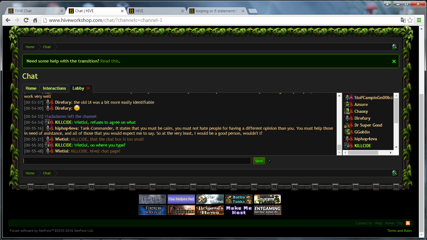
  6. Chat box and font are too small.
 
Last edited:

Kyrbi0

Arena Moderator
Level 45
Joined
Jul 29, 2008
Messages
9,501
I am really impressed with the level of work & detail & concern that has gone into updating this site for future generations; I'm sure many hours went into agonizing over the decision, and overall I think these new forums will offer loads of new functionalities.

I have personal issues with change (to wit: hate it xD, as @Premin will attest), which I have tried to divorce (ha) from an objective consideration of the site's changes.

That being said, I think I most miss the simple functionality of the "User CP" page/page button, along with the "Subscribed Threads" page (I see the "Watched Threads", but there's a lot left to be desired, unfortunately).

One of my favorite parts of the change has been the idea of Bundles; though I'm not hugely a fan of how the Resource section is organized/looks now, the "Bundle" concept does away with all the complicated work-arounds that we had for simply including all relevant files in one place (model, portrait, alternate, textures, icons, etc).
 

Kazeon

Hosted Project: EC
Level 33
Joined
Oct 12, 2011
Messages
3,449
I don't know. But honestly, I don't feel very comfortable with the new site. Because:
- Just like Kybri, I don't like how the resource section being organized. It's kind of, too hidden. I also prefer the old "pending", "need fix", etc. tags to be utilized again.
- It's very hard to edit and fix old threads. Sometimes the rich text editor is bugged as well. Like unable to center contents etc. It becomes even worse that when the rich editor is disabled, the toolbar will vanish.
- Some texts are too small and some are not contrast enough against the background. That makes things are painful to read/see.
- I can't open alert in a new tab.
- Media page takes times to load.

But I like some of the new features tho. Like the new ability to upload multiple files at once and feature to tag somebody.
I like the new look but still, there are somethings still can be improved :)
 

Ralle

Owner
Level 77
Joined
Oct 6, 2004
Messages
10,098
About the search engine. These are the two things I have learned:
1. The results don't have enough information
2. Icon title names are not split between capital letters for the index so words like BTNArrow will not make the word "arrow" searchable.

That's it. "It sucks" is extremely useless. It only makes me sad.
 
Level 14
Joined
Jul 1, 2008
Messages
1,314
I have a hard time with the new hive, and I don't think, that anybody does like it better than the old one, but I think, that we simply have to wait for Ralle and the admins to change everything back to the old comfort, we had in hive 1.0.

I must say, after all the biggest problem is the missing User CP for me. Also because of this lack, the site overall seems very nested, when it was so friendly and welcoming before.

But now for something different, I want to throw in some positive feedback:

It is so much fun to stray around the new substandard forums in the resource section. All these old things, sometimes I remember some resources and go like "Ah, there it went." or "you got to be kidding me, you rejected it simply for that?", or "I dont even know, what is this?".
I think, also for development of new cool stuff, these sections are a real profit for this community. I hope, that having this opportunity eventually leads to the creation of new awesome stuff, even if these resources themselves may be not good enough.
 
Level 20
Joined
Feb 23, 2014
Messages
1,264
2. Icon title names are not split between capital letters for the index so words like BTNArrow will not make the word "arrow" searchable.
I hope that changing this is NOT the solution you want to implement (unless it would only be a temporary one). I've explained why it's a bad idea in my topic, which I really hope you have read.

But in case you didn't.
I saw you use an example of searching for a "Worker" - okay, that somewhat works, but still - for example these two models are not included in the results, because there is a "peasant" and not a "worker" in their title.
http://www.hiveworkshop.com/threads/hd-peasant.264067/#resource-36866
http://www.hiveworkshop.com/threads/worgen-peasant.163454/#resource-29222

And one could think that if someone was looking for worker units, these two should absolutely be displayed to him.

Or - take this:
http://www.hiveworkshop.com/threads/btnhszinrokhv1.269248/

This icon should appear when someone searches for a "Sword" or a "Blade" - but if you just do what I understand your intention to be based on the quote, I don't think it will.
 
Last edited:
Level 14
Joined
Jul 25, 2011
Messages
1,065
Some positive stuff is that it's fully functional on mobile. (I'm using iPhone 6) Back when I was trying to do stuff in HIVE 1.0 with my iPhone, it was simply difficult. Like for example, unable to see some half of the post and unable to scroll and having a very hard time adding reputation to others etc...

I'm really glad that HIVE 2.0 is mobile friendly. It would be a lot easier to see what's going on.

Thank you very much for that :D


Also adding to the search engine issue...

I'm currently working on a campaign map and I search for stuff. So I remember clearly how the HIVE 1.0 search engine worked. Some important features of the search engine is gone in HIVE 2.0

1. Searching under a tab (Is that what it's called?) is a nightmare.

For example, I want to search some models so I type in "whatever" in the search bar in the top right corner. It then shows search results from models. When I don't get the results that I want, I type in another keyword in the search bar. However, this time it has searched the whole site. So it's quite annoying that I have to click the model tab again to do another search.

Also, when you use the search bar, you can't see the details of what you're looking for. Instead, it shows you the icon of the author. So you have to click them all to know what it is. It gets annoying quickly.

2. Tagging is some what broken.

I downloaded a resource from HIVE 1.0 and accidentally lost it. So I came back this time to the HIVE 2.0 and was unable to find the same resource despite searching it with the same keyword. I had to press a link inside the readme.html file after several attempts of finding it via search engine.

3. Some of the filter options are gone.

Like the rating filter. That filter was quite useful when looking for high quality resources. They are some good stuff that isn't director's cut you know.

4. Not really the search engine's problem but the moderator comment position.

It's in a weird spot. And the star is far away from the comment so I can't check the quality of it at a glance.


All of these weren't a issue back in HIVE 1.0

I hope that you'll be able to fix this soon.
 
Level 22
Joined
Sep 7, 2013
Messages
235
I found that the checkbox "Bundles must include all authors" in ressources filters doesn't seem to work.
I tested it with the more recent model with several authors (Footman leader by Direfury and Stefan.k):
- if I type "Direfury, Stefan.k" with the checkbox unchecked, it works as intended (Footman leader appears, along with ressources from Direfury alone and Stefan.k alone)
- if I check the checkbox, the filter returns nothing (while it should return the footman leader)

Playing with this filter by author makes me think a good way to solve the search problem that everyone cries about, would be to add a "Keywords" property to ressource bundles (alongside with "Tags" and "Authors") and then add a "Keywords" field in the Bundle Filters area.
 

Ralle

Owner
Level 77
Joined
Oct 6, 2004
Messages
10,098
1. Yes I can see that being annoying
2. That's not tags. That's search keywords
3. It's in search. Just press "search again" when you've made a search.
4. There is no moderator comment anymore. They're converted to posts and will be posts in the future too.
I am thinking of putting stars into posts like before.
 
Level 22
Joined
Sep 7, 2013
Messages
235
Something that would be cool would be to be able to link matching assets (like model and corresponding icon) not made by the same author.
For example, Sindorei made a nice icon for my Dark soldier model, but it was not possible in old Hive to link them.
I would like to have a feature to do that (probably it would require Moderator level to do that during the review)
 

Ralle

Owner
Level 77
Joined
Oct 6, 2004
Messages
10,098
Something that would be cool would be to be able to link matching assets (like model and corresponding icon) not made by the same author.
For example, Sindorei made a nice icon for my Dark soldier model, but it was not possible in old Hive to link them.
I would like to have a feature to do that (probably it would require Moderator level to do that during the review)
You can link any asset from any resource.
 
Level 5
Joined
Mar 2, 2014
Messages
127
Something as simple as searching for a Campaign via Drop-Down-Menu shouldn't have gone. It is a matter of inconvenienca that will, although I don't hope so, make some people leave and "do something else". Which is kinda sad, really.

The rest of the side seem allright. I went through my pastebin and saw, that the big and bold statements are smaller now in comparison to before.

Anyway, I'll try to figure out how to get to the campaign selection of Starcraft II and see If I can revive "The Hive Journey". Please, if possible, reinclude the drop-down-menu or place some "checkable" catagories of some sort.
 
Level 5
Joined
Mar 2, 2014
Messages
127
Thanks for the Pointer.
Still miss the distinctions. "Map" can be pretty much anything, in the previous version of this site you could actually specifically search for Campaigns/Melee/Whatever as well as place a Genre, which was mainly useful for me when searching specifically RPG-Maps as opposed to strategic Campaigns. It wasn't perfect, even back then, but I miss it.

And after I had written all this, I realized the "Tags" section on the right side and felt stupid. Oh well ^^' Thanks again
 
Status
Not open for further replies.
Top