- Joined
- Mar 23, 2008
- Messages
- 1,813


")


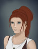
Awesome, I love that red haired girl, more shading and it would be good, keep working
(I'll probably redraw if it comes to that)
 Something feels a bit off with her though, but I can't decide what it is.
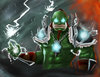
Cool, effective as electrical gun against bad moods
If you made it it's sweet, if you didn't, it's still sweet :>
 The light and shadows are pretty good. Although the hair needs a lil moar attenzion, the color palette used here emphasizes the scene pretty darn good.
I will!
The light and shadows are pretty good. Although the hair needs a lil moar attenzion, the color palette used here emphasizes the scene pretty darn good.
I will!


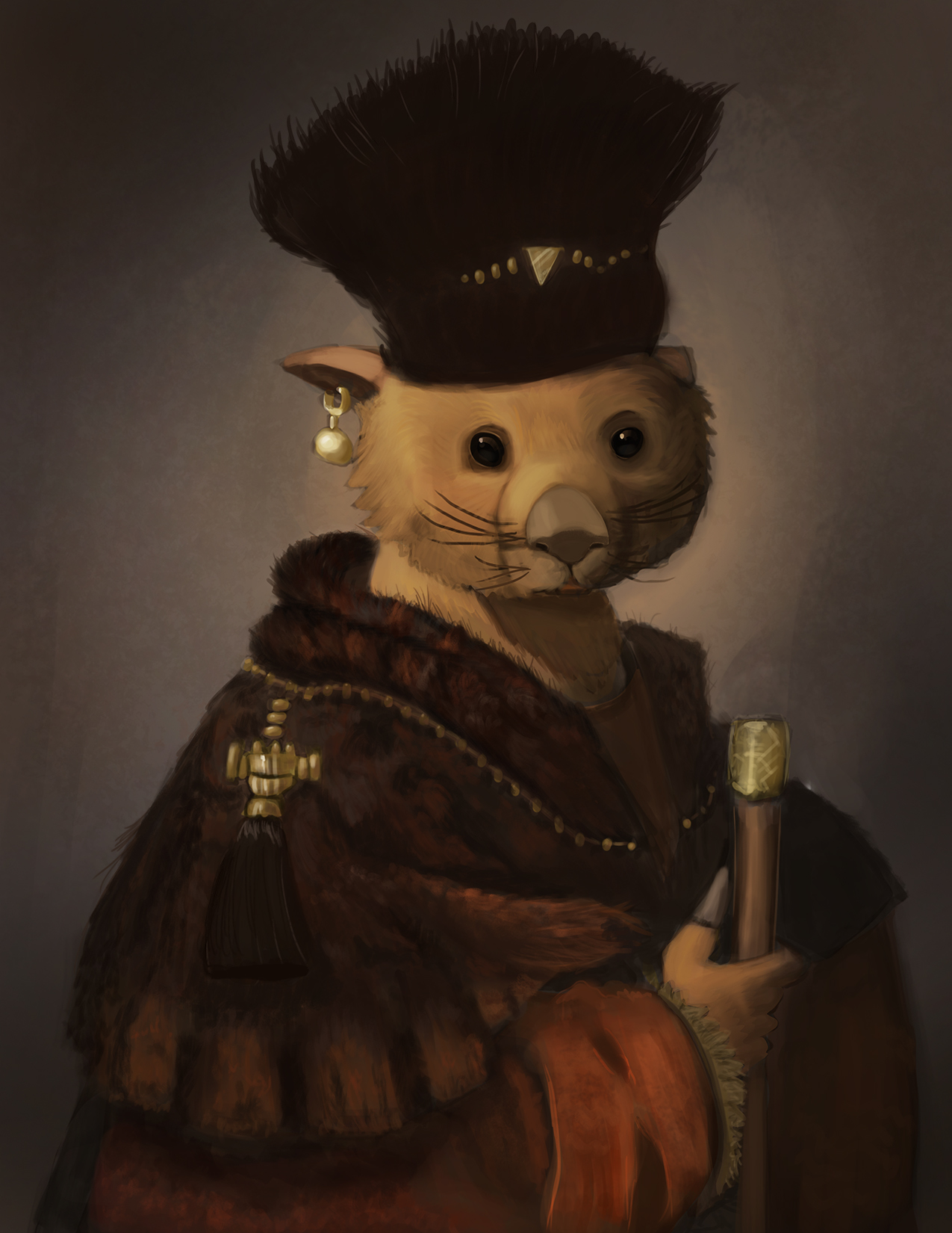
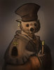
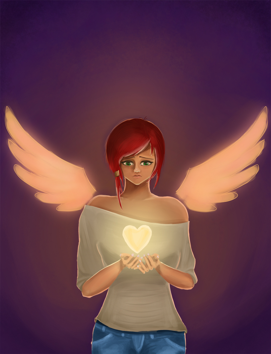
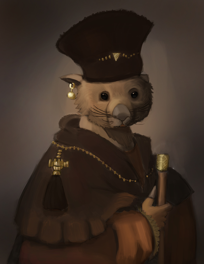
Love the texture, it really gives a sense of nobleness ?
But thanks. 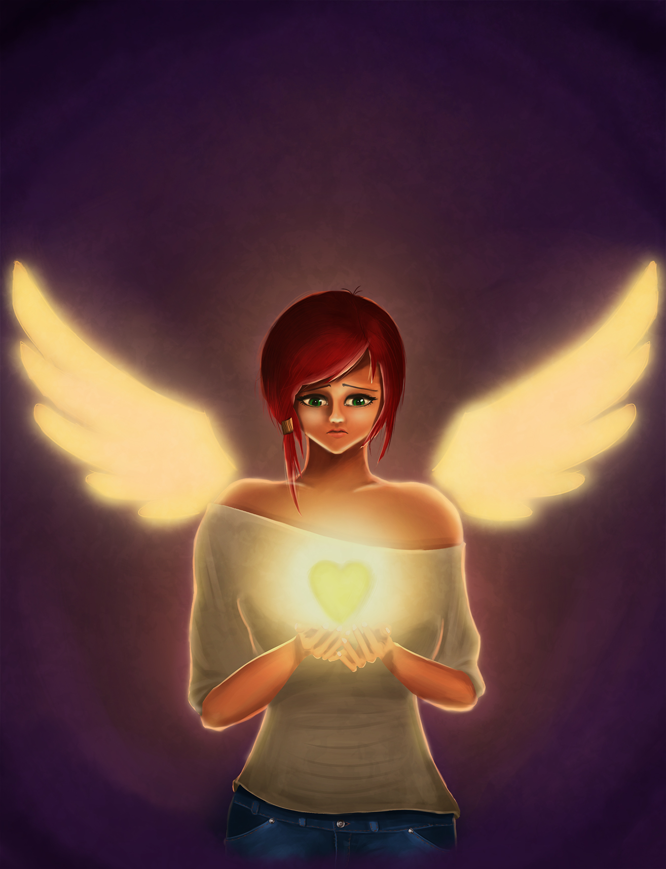
The texturing is awesome! I wish I could do it like that.
*jaw drops* wutttt? that's pure awesomness in thar man <3
The lighting looks cool. Mind sharing tips?
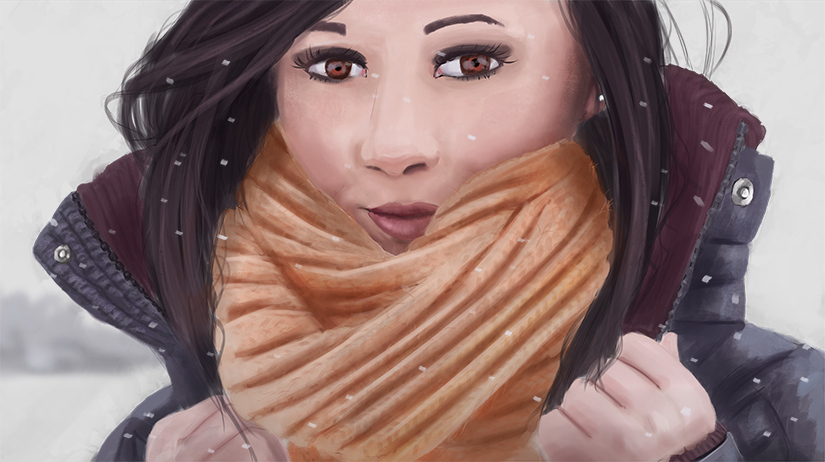
You're my hero. Yay
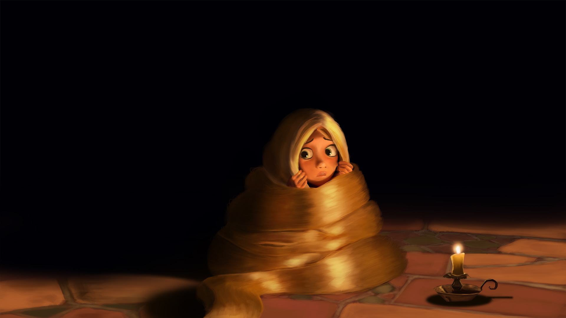
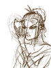
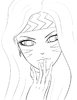
@The scarf girl, I think that the lips could be moved a bit to the left and the scarf would love more shadows and a bit of redrawing :/
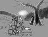
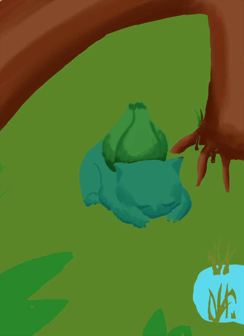
@Sleeping Bulbasaur, I love that you made him like he's sleeping under a tree branch, nothing to criticize or shoot at as of now :>]
I imagine some tall grasses in thar though.
A trial of error and success constantly. I feel you manBut I probably will end up redrawing it once more, because I feel like it destroys the whole image, it really is the weakest link.
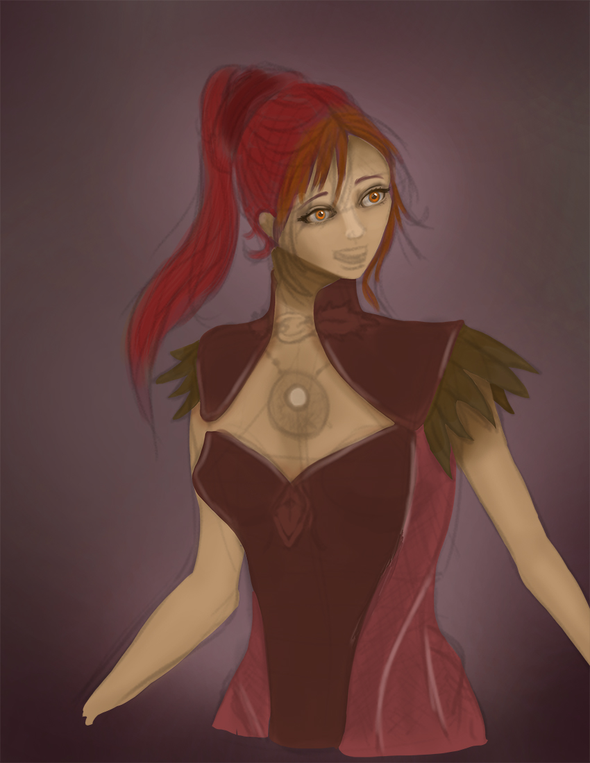
Scarf Girl; right face is a bit empty and wide. Also the scarf itself needs a little bit of outline. Additionally the color layer overlapped on the hair on the right side. Good work though.
That's true but I think the cheek bones or cheeks should be given more details (or shades) in order to fix the misleading perspective as of now. It's up to your imagination Hemske.Like Mythic's comment. Her left face is kinda weird. Also the face looks like looking forward, but the position looks like a little bit left. Well, I guess it's because the lips. And also the ear, should be moved a little forward. It's also too high. That's all only based on my vision though.