• 🏆 Texturing Contest #33 is OPEN! Contestants must re-texture a SD unit model found in-game (Warcraft 3 Classic), recreating the unit into a peaceful NPC version. 🔗Click here to enter!
  • It's time for the first HD Modeling Contest of 2024. Join the theme discussion for Hive's HD Modeling Contest #6! Click here to post your idea!

Starscape

Status
Not open for further replies.
So here's what I've worked on.
Based upon one of Strydy's terrains.
Credits go to StryderZero for starting the terrain :)

Yes, it's a blue giant star and yes that's a space station built onto an asteroid around a gas giant planet. Also it's near a nebula, that's why it's so brightly colored.
The distances between the asteroids/meteorites are greatly exaggerated since in real space the distance between them would be far greater. Happy ? :p
 

Attachments

  • Starscape.png
    Starscape.png
    2.4 MB · Views: 218
  • stars.png
    stars.png
    2.3 MB · Views: 252
Last edited:

Deleted member 238589

D

Deleted member 238589

Very impressive. I like the theme, too.
 
Level 10
Joined
Aug 30, 2007
Messages
270
really nice one! I like it very much.

But I also can understand sonofjay's concerns about the planet-distance/size-thingy^^. I think it's because we have clear vision on the planet, and it seems that nothing is between the planet and the spacestation. What you could try placeing something what normally is recognized as 'really large' in front of the bright planet, so it is only a tiny, black silhouette (well, but still clear and big enough that everybody instanty thinks 'ok the panet must be big if this is so tiny next to it') for example a spaceship.
 
So yeah it lacks details. Moar details yo...

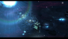
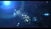
If i were you , i will add more asteroids , it need alot of asteroids and planetoids orbiting or circling around the sun [Asteroid Belt]. There're alot of asteroids in the Models Section here in Hive , pick some then import it to your terrain.

The sun seems not that good,maybe because the centerglow[the white part] of the sun's too powerful , lessen that abit , reduce the white or just make it smaller.

The sun rays seems not directional , i feel like the rays are coming from the wrong source, i dont know.

Remove that big tower at the front , it's really attracting , and is not good.

The planet seems fine for me , it just need some tinting , make it a bit darker. You must also rotate that planet , i know it has a shadow behind. Look at the light source , note that the light source is coming from the topper left [the place where you placed the sun] , not from the camera , so it must face the topper left or the sun.

The flares , i think they are fine, just tint them down abit , lesser visibility.

Nebulas are'nt that good , make more variations of it, more colors! You can also use the Ubercloud as a Nebula if you want.

You can place more planets , maybe add the Jupiter, Earth, Uranus and Mars.

For the positive side , it is great actually , i remember my galaxy terrain [but i didnt released it because it really looks bad]. I like the front part of the station and the stars. I also like the idea of making a dockway for the space collectors.

EDIT:

You can adapt some ideas here
http://www.hiveworkshop.com/forums/members/226575-albums7453-picture88608.html
-Lasers bro , it give details and coolness to space ships and it also shows sci fi feeling.

http://www.hiveworkshop.com/forums/members/226575-albums7453-picture88617.html
-Yo , that's what i'm talking about. You can use the Uberclouds as a raplacement or let's say , they are bigger Nebulas. It also show proper facing of the planets , the lighter part must always look at the light source.


EDIT:
Sorry for bad english :D
 
Last edited:
Level 4
Joined
Jul 1, 2010
Messages
60
The grey and black "base" on the asteroid which has the rest of the station built on to it looks a bit awkward to me, and there seems to be some clipping with the Valhalla windows. Other than that, it looks pretty great.
 
Level 34
Joined
Sep 6, 2006
Messages
8,873
Not sure I like the star/sun. I really mean I'm not sure though. A deep space feel would be cool, but maybe the lighting might not look as good.
 
Level 36
Joined
Nov 24, 2007
Messages
4,381
Yeah, it's definitely the lighting that is off here, and mainly I'd say it concerns the sun.
Those rays looks to be going more downward than they should, as if the light is drawn
by gravity, something which we know there isn't in space :p (Not that light is affected
by gravity anyhow) - It should be more "scattered."

Anyway, save for that, this is a good start. I haven't seen an awful lot of good space
terrains during my time here, and this one looks like it could be shaped up to be one.
Personally I'd like to see something more in the background, I know it's space, and
space is mostly empty, but making it "realistic" doesn't necessarily make it look "good,"
you know.

What about another planet? Or maybe some sort of alien ship of sorts, or both.
Anything, really, to fill in the void at the back of the space.
 
Status
Not open for further replies.
Top