• 🏆 Texturing Contest #33 is OPEN! Contestants must re-texture a SD unit model found in-game (Warcraft 3 Classic), recreating the unit into a peaceful NPC version. 🔗Click here to enter!
  • It's time for the first HD Modeling Contest of 2024. Join the theme discussion for Hive's HD Modeling Contest #6! Click here to post your idea!

A Room With A View

Status
Not open for further replies.
Level 10
Joined
Oct 30, 2004
Messages
330
My first ever (finished) scenic terrain.

Started yesterday evening, finished some details this morning.
And had some great help from Heinvers with the lighting.

Pretty proud how it turned out :)

Updated 21-4-2015
 

Attachments

  • RoomwithaView.jpeg
    RoomwithaView.jpeg
    324.6 KB · Views: 205
Last edited:
Level 36
Joined
Jul 1, 2007
Messages
6,677
Bah, damn those low-res textures! This is an all-out incredibly cool piece.

  • The background is my favorite part. Fog is well-done, the sky fits nicely, the shape of the landscape is really attractive, and that road looks awesome.
  • The midground is not perfect, I think the plants look sort of messy as is, and you could benefit from variating them and adding more detail.
  • The foreground is very well constructed and I don't think it's missing anything other than higher resolution textures (and maybe a mouse poking its head out of a hole in the wall? haha)
Overall, fantastic concept, true fantasy feel - like something out of The Canterbury Tales. Top notch terrain.
 
Level 10
Joined
Oct 30, 2004
Messages
330
thanks, great to hear especially from you :)

My main focus was on the background and the foreground indeed.
(even though that road is actually a river, but the tinting just didnt quite work :p)

I might revisit the terrain to change somethings in the midground
 
Level 36
Joined
Jul 1, 2007
Messages
6,677
I see the river now. Makes sense with the waterfalls and whatnot. Honestly, on a rainy day like that, the color isn't too far off for a muddy river. Maybe there's a way to make it stand out more using SFX?

I know that water.mdx can be frustrating to use sometimes - I've had success in the past by reducing the models' Z (since it's made of layers of transparent textured planes, reducing the Z draws the planes closer together, and mimics deeper water). Also, stacking 2 water models on top of each other at varying Z values so that the layers fit between each other.
 
Level 36
Joined
Nov 24, 2007
Messages
4,382
A gloriously beautiful idea, for certain. And a really nice execution too, at that.

I can agree that it's hard to see that it's a river at first glance, but I would think
it easier to mistake for a valley with mist in it, than a road. In that sense, it does
look more like a river than a road.

While they're not awfully distracting, it is a shame the textures are what they are, but
I think some of them could be fixed by being minimized, such as the floor tiles, if you
made them smaller you'd get a better, non stretchy, execution for the indoors. It might
even help to pull the camera back a little, but then you would like to have to tweak the
outside too, which I guess is more work than you'd like to do.

Other than that, the only thing I don't like too well, presentation-wise, is that the moon
is halfway hidden behind the tree-branch, it's not unnatural, but it would look better if it
was displayed in full, on the back-sheet of a be-speckled starry sky, I think.

Otherwise, this is a lovely terrain! I'd love to see more terrain art from you, Turin ^^
 
Level 10
Joined
Oct 30, 2004
Messages
330
I've had success in the past by reducing the models' Z (since it's made of layers of transparent textured planes, reducing the Z draws the planes closer together, and mimics deeper water). Also, stacking 2 water models on top of each other at varying Z values so that the layers fit between each other.

I actually did both of that, but i guess the distance is to far, maybe i could change the setting a little bit, remove the stars, add a couple more clouds and add a light rainfall.. i'll play around with that idea.


While they're not awfully distracting, it is a shame the textures are what they are, but
I think some of them could be fixed by being minimized, such as the floor tiles, if you
made them smaller you'd get a better, non stretchy, execution for the indoors.
Good suggestion, especially for the floor, and i can probably change the walls a bit aswell.

Other than that, the only thing I don't like too well, presentation-wise, is that the moon
is halfway hidden behind the tree-branch, it's not unnatural, but it would look better if it
was displayed in full, on the back-sheet of a be-speckled starry sky, I think.
I personaly like the half cover moon, because not every picture has to be picture perfect ;). But i might just move it a little bit so its less covered up.


Thanks for the feedback guys, i'll probably revisit this piece tomorrow. and i'll incorperate it in the next piece im working on. (Although that might be to ambitous to actually finish.. we'll see)
 
Level 36
Joined
Nov 24, 2007
Messages
4,382
...because not every picture has to be picture perfect ;)

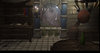
You are right, of course, and I agree that sometimes a deliberate abnormality in general
composition of a piece of art can have a lifting effect on the overall presentation. But in
this scenario I do not agree, I'd find the image much more satisfactory if the window
could have been mistaken for a wall-painting at first glance, I think it would enhance the
terrain overall. But, then, it is a small detail. I will not continually chastise you to
change it if you do not want to.

But if you are going to keep it half-hidden, might I suggest you use subtle glow doodads,
maybe even flares, to slightly enhance the transfixing effect of the moon?

Come to think of it, I think you would also get a better indoors impression if you used the
black glow doodad to slightly frame the edges of the terrain, to indicate that the room is a
little darker where the window isn't at.
 
Level 10
Joined
Oct 30, 2004
Messages
330
Come to think of it, I think you would also get a better indoors impression if you used the
black glow doodad to slightly frame the edges of the terrain, to indicate that the room is a
little darker where the window isn't at.

The left side is framed with it already. the right side a little less because there is a chandelier hanging there (althought you dont see the actual candles..)

EDIT:
Minor updated...
 
Last edited:
Status
Not open for further replies.
Top