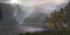
I like the shine on the water
I would agree to this, if only I could localize where it... Comes from.
That, and I really don't like the bubbles, they don't bother me when
I don't look at them, but when I do, I can only ask "Why are they
there?"
And whoa, I don't often disagree this much with flad, but this time
I actually do quite a lot: I don't think trees instead of the mountains,
I actually think the mountains are one of the strongest points this
terrain has going for it, but yeah, there could be more forest in
addition, and since you chose that as a compromise, I won't hold it
against you.
Getting rid of the white sun would make the glow on the water make
even less sense than it currently does, I'd say, tone the white one down
a couple notches, currently it doesn't look as much as a sun as it does
look like a tiny explosion of some sort. That, and change the redness
to something more complimentary to the whiteness of the sun.
(Or vice versa)
There's also the jarring texture mashup with different sets of rocks that some like
Really? Could you point that out for me? Because I'm not seeing it.
I'd also like to call out those waterfalls, they are really, certainly,
very too much white. Either remove them or make
them less... White. They also look unnaturally straight, in and angled
fashion, which should be addressed as well.
Overall, though, I generally agree with my fellow terrainers here, it's
really nice. And I'm having trouble putting my finger on what exactly
makes it nice, as there are no particular wow-factors about it: The
castle is decent, the doodad placements is decent, the lighting is a bit
off and there are some minor details I'd like see fixed or changed.
I guess it's the general composition and scaling, it has a very "epic"
feel. And especially the scaling, I think, should be brought out here,
you guys really did a great job there.


")