 Approved
Moderator
M
Moderator
11:09, 22nd Jul 2013
Orcnet: sonofjay's review:
Orcnet: sonofjay's review:
sonofjay;2382954 said:Review:
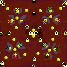
Ripple is a huge melee map for 12 players which is so rare this days. As the author said, it is the same layout as his other 12 player maps which is a downer in my opinion.
The terrain layout for me is much simple but I give you props for making it consistent for a large scale melee map like this. But since you have more room to operate with the 176x176 playable area, I would have prefer if you made a more complex layout than this. But overall its nice and ideal for large scale strategy players.
The designing for me is pretty much inconsistent and that is mostly given for large scale maps like this, but you could have done way better than this. The middle part for me is probably the best spot here with the good use of Spires and floating rocks and I also like the idea of the Dragon Roost. but other than that almost everywhere hit the rock bottom. To hide the emptiness of a vast terrain like this you have to focus on the little things like adding rocks, arc, obelisk, maybe even grate and try to combine them to make some unique designs. Also you can some cool things with the cliff tools and the spires so try to experiment. Anyway, lets just to another topic and that is the way you brush the tiles. Its looks pretty weird for me and really unrealistic. Some place looks well brushed, some place looks bland and some looks like a jigsaw pieces. Try to be consistent with it and don't rush it. Tiles most of the times kills the emptiness of the terrain itself.
Anyway, it looks fine and I love the way gate to tavern idea. Voting for approval. I want to rate it 4 but the inconsistency on many aspects makes me rate it to 3.

