• 🏆 Texturing Contest #33 is OPEN! Contestants must re-texture a SD unit model found in-game (Warcraft 3 Classic), recreating the unit into a peaceful NPC version. 🔗Click here to enter!
  • It's time for the first HD Modeling Contest of 2024. Join the theme discussion for Hive's HD Modeling Contest #6! Click here to post your idea!

noob134 Sketches

Status
Not open for further replies.
Level 9
Joined
Jan 17, 2009
Messages
372
ok i started drawing recently which i havent done in a long time and i would like to know what you think of them. I am using an instructional book to help me.
NOTE: i used photoshop to crop and use contrast to make pencil lines more visible.
 

Attachments

  • Creature Sketch.jpg
    Creature Sketch.jpg
    277.7 KB · Views: 191
  • Sketch Gnome.jpg
    Sketch Gnome.jpg
    106.1 KB · Views: 190
  • Sketch Dog.jpg
    Sketch Dog.jpg
    215.8 KB · Views: 188
  • Sketches Page.jpg
    Sketches Page.jpg
    252.8 KB · Views: 163
  • Goblin Sketch.jpg
    Goblin Sketch.jpg
    293 KB · Views: 196
Last edited:
Level 9
Joined
Dec 17, 2008
Messages
312
ok i started drawing recently which i havent done in a long time and i would like to know what you think of them. I am using an instructional book to help me.
NOTE: i used photoshop to crop and use contrast to make pencil lines more visible.

So you do them by hand then scan them? If so, they are pretty good. Lacking detail, but that can be a technique if it needs to be.

Good work.

Btw: There are gray fuzzy areas around the pictures which are kind of... in the way, drawing your eye away from the actual art lines.
 
Level 9
Joined
Jan 17, 2009
Messages
372
So you do them by hand then scan them? If so, they are pretty good. Lacking detail, but that can be a technique if it needs to be.

Good work.

Btw: There are gray fuzzy areas around the pictures which are kind of... in the way, drawing your eye away from the actual art lines.

Yes i scan them, i am sorry for the fuzzy grey areas they are a result of brightness/contrast editing because the scanner does not pick up pencil lines very well.
Thx for feedback!
Also, i finished a drawing out of an instructional book today hope you like it!
 

Attachments

  • Hydra Sketch.jpg
    Hydra Sketch.jpg
    298.1 KB · Views: 390
Level 9
Joined
Jan 17, 2009
Messages
372
i like it now time for colors =D

unfortunately, i am not that great at coloring because i have a hard time with shading, i am currently a little inactive but i will try to make more drawings soon.
Edit: thanks for feedback icecreamofdeath!
Edit 2: ok decided to scan some drawings i made before i made the thread (they dont have any shading whatsoever) and some new. I hope you like them!
 

Attachments

  • wierd man.jpg
    wierd man.jpg
    243 KB · Views: 121
  • random sketch 1.jpg
    random sketch 1.jpg
    169 KB · Views: 115
  • Octopus creature.jpg
    Octopus creature.jpg
    850 KB · Views: 126
  • Creature.jpg
    Creature.jpg
    597.6 KB · Views: 107
  • Catfish.jpg
    Catfish.jpg
    561 KB · Views: 125
  • Wierd creature.jpg
    Wierd creature.jpg
    617 KB · Views: 133
Last edited:
Level 9
Joined
Jan 17, 2009
Messages
372
bump, and i think i should mention some stuff goblin, dwarf, dog and hydra are the only drawings i used refrences for everything else is outta my head. I need to draw more but i have a page out of my sketch book, Comments of any kind are appreciated.
 

Attachments

  • Sketch book page.jpg
    Sketch book page.jpg
    211.9 KB · Views: 146
Level 24
Joined
May 9, 2007
Messages
3,563
I really like some of your work, but I do have a few suggestions. Decide on a light source, and add lots of emphasis. I'll take for example, the picture of the hydra.

68331d1256691857-noob134-sketches-hydra-sketch.jpg


The twisting of the necks looks a little off because the necks themselves are shadeless. Try darkening certain regions (in accordance with the light of course!).

Also, I'd try to darken your lines, which should hopefully really define the works more.

This said, these are some pretty nice sketches, and with practice you could be amazing!
 
Level 9
Joined
Jan 17, 2009
Messages
372
@Midnighters: I dont mind at all if you color my sketches, but if you use them anywhere make sure to give me credit and notify me.

@hawk900 thanks for advice i might try to touch that up, by the way that was drawn with help from an instuctional book so i cant take full credit.

thank you both for the comments/feedback.
 
Last edited:
Level 11
Joined
Aug 22, 2009
Messages
152
most people draw in pencil and it scans it very poorly at times with its deep contrast...

I prefer a medium blue erasable colored pencil or a red... It doesn't smudge as much as a pencil or smear and also it gives a soft nice feel... When scaned it you change it to grayscale and it looks like a nice soft pencil drawn sketch...

This makes it easy to work with in photoshop or other art programs being that the outline isnt to dark and fuzzy.
 
Level 9
Joined
Jan 17, 2009
Messages
372
well i havent updated this thread in a while so here we go.
sketches mainly from concept art contest, you can really see where i started studing human anatomy...
C&C plz
69942d1258683612-concept-art-contest-4-evolution.jpg

70877d1260111188-concept-art-contest-4-evolution1.jpg

EDIT: picture below added
71077d1260389483-concept-art-contest-4-evolution-color-copy.jpg
 

Attachments

  • Practice 5.jpg
    Practice 5.jpg
    315 KB · Views: 144
Last edited:
Level 11
Joined
Aug 22, 2009
Messages
152
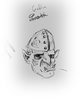
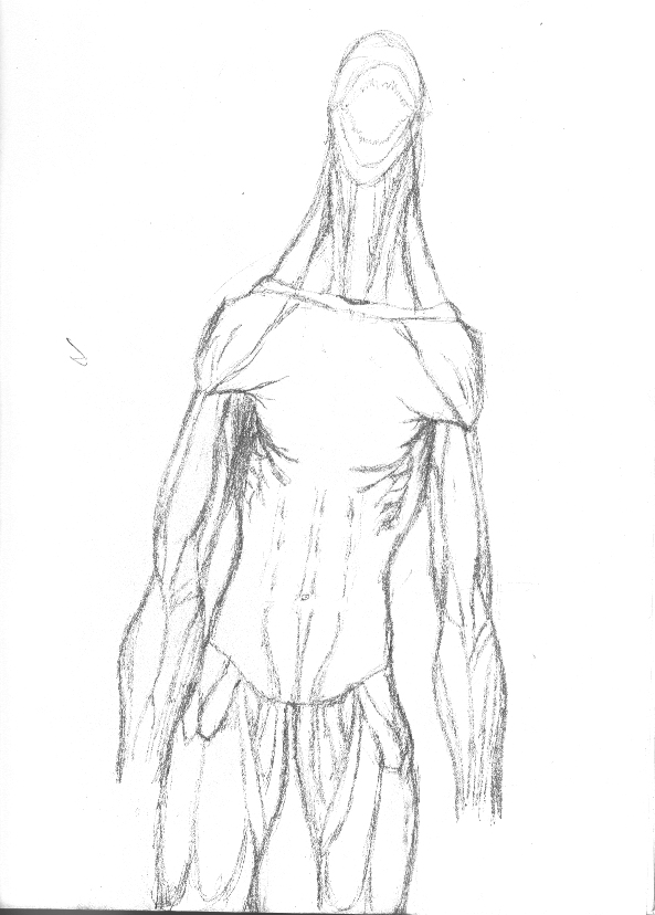
Your stuff is very smeary which probably means you erase a lot.. or just rest your hand on the paper... I suggest drawing softer until you have it how you like it then real fine darken the proper lines...

I suggested erasable colored pencils cause they smear less but still get shading like a pencil.. plus when scanned in as greyscale they look nice and clean. (You probably don't have any but they are real cheap :) )


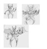
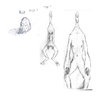
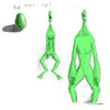
Look how comic artists do it.. they draw understructure before laying in the details, because if you get fixated on doing one area perfect it will be unbalanced in other areas.

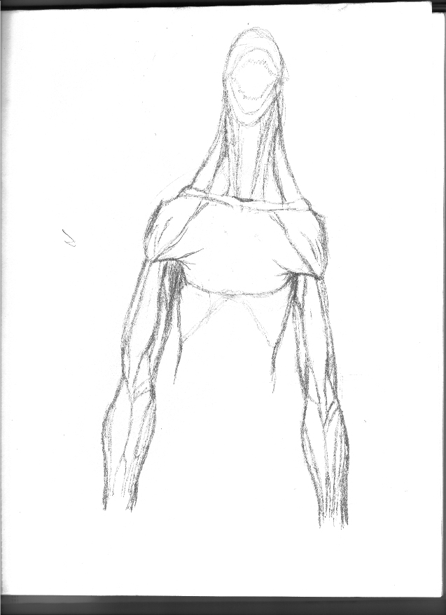
:) (Personally I like using pen, I suggest drawing with multiple tools, sometimes you get a different style out of each. Different papers are nice too, sketch books have a bumpy texture and when scaned it shows up on computer... Unless you crank the contrast which makes the pencil smears show up more and the pencil lines too dark.. *This is why i recomend colored pencils they are less sensative to the scanners contrast and allow you more flexability.)

Example:
178767-albums2501-picture22270.jpg


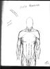
This of course was done with a wacom tablet, but notice how I did softer lines and shapes before laying in the detail.
Hair can be messy, leave some random lines or shape lines in it adds to volume when coloring or shading.


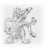
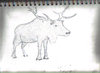
EDIT: I like your hydra BTW
 
Last edited:
Level 9
Joined
Jan 17, 2009
Messages
372
@XDogg
2 reasons why my drawings are so smeary
1.) I am left handed and I have a bad habit of dragging my hand across the paper
2.) the eraser I use is smeary and down to the rim of the metal on the pencil

thanks for feedback and will try out your suggestions
 
Level 11
Joined
Aug 22, 2009
Messages
152
@XDogg
2 reasons why my drawings are so smeary
1.) I am left handed and I have a bad habit of dragging my hand across the paper
2.) the eraser I use is smeary and down to the rim of the metal on the pencil

thanks for feedback and will try out your suggestions

not a problem i understand totally, i have been there through trial and error.. You asked for suggestions so I'm just telling you what helped me.
:thumbs_up:

I really suggest getting a wacom tablet with xmas money or birthday for anyone who likes to do art. (They are so great) I tried using the mouse again and it sucks so bad. (the bambo series are about 100 dollars... they are the slimed down version without all the fancy features. )
 
Level 9
Joined
May 23, 2009
Messages
422
Mistakes in your newest human drawing:

______________________________________________________________

1) The upper arm muscles are not proportional to the lower arm
muscles.

l2) Why are the six pack so stretched out?

l3)
Why is the buttock muscle on the both legs so fat?
______________________________________________________________

 
Level 9
Joined
Jan 17, 2009
Messages
372
Mistakes in your newest human drawing:

______________________________________________________________

1) The upper arm muscles are not proportional to the lower arm
muscles.

l2) Why are the six pack so stretched out?

l3)
Why is the buttock muscle on the both legs so fat?
______________________________________________________________


What do you mean top arm is not proportional to bottom arm? Please be more specific so I know what to fix. I tried to do top half of body from memory but I guess I need more practice before I do that.

Are you sure abs are stretched? I thought they ended at the end of the hip

there is no butt muscle in that drawing it is front view.

Overall thanks fir feedback, I appreciate it.
 
Level 9
Joined
Jan 17, 2009
Messages
372
i made a monopoly guy for fun, i colored with mouse but it is my hand is unsteady, anyways it scaled down very nice and i made it my avatar.
NOTE: i used a reference picture for this.
 

Attachments

  • Monopoly-1.jpg
    Monopoly-1.jpg
    80.8 KB · Views: 5,841
  • Monopoly copy.jpg
    Monopoly copy.jpg
    81.7 KB · Views: 551
  • Monopoly.jpg
    Monopoly.jpg
    21 KB · Views: 121
Status
Not open for further replies.
Top