• 🏆 Texturing Contest #33 is OPEN! Contestants must re-texture a SD unit model found in-game (Warcraft 3 Classic), recreating the unit into a peaceful NPC version. 🔗Click here to enter!
  • It's time for the first HD Modeling Contest of 2024. Join the theme discussion for Hive's HD Modeling Contest #6! Click here to post your idea!

My Heroes of the Storm art Contest Entry

Status
Not open for further replies.
Level 8
Joined
Feb 3, 2013
Messages
277
hots_art_contest_by_bambam7229-d8xyst3.jpg


My hots art contest entry on deviant art.
If you weren't aware, there is an art contest on the deviant art website to promote the new game by blizzard. The objective is to paint a battle between a minimum of 2 of blizzard's characters fighting each other.

This has taken me about 3 weeks worth of effort and I've pushed it as far as I can go.

Please visit my deviant for more and support :> I will update as much as I can.
my Deviant

Thanks for your time :>.
 
Level 15
Joined
Dec 21, 2013
Messages
910
I thought no one in here will join that 0_o
There are some perspective problem but I am not really sure where. And guess it need more shadow. And Mage in front should be larger. Overall, it looks good and detailed :)

edit:
down
That, PeeKay, I want to say some of these too but I think it will be rude because I have bad English. lol
 
Last edited:
Level 49
Joined
Jan 12, 2010
Messages
1,771
I don't wanna be rude, don't wanna insult you or somehow assert myself or... you know.

I wanna give you little portion of sober criticism.

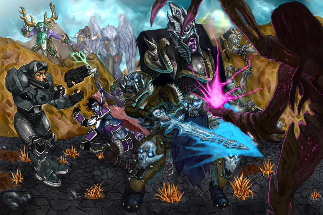
From the far - image looks messy and a bit random. There is no solid environment where everything happens. Things, happening on the image, have no affect one to other. And i mean shadows, lightings, reflections for example. You put some effort in shading Marine face, but there is no one crisp shadow on the floor. No one local light reflection from ur lightings. Next time start your work from enviroment, put effort in details, make it eyecatching and interesting. Your tufts of grass has any destination? Any art meaning? Or they are placed totally randomly in some spaces between legs\hands and other "intresting" items? Same about sky, about the floor (way too random) and hill texture. Totally no shadows and too random texture. Without shape.

The second your critical mistake - your character's anatomy is really broken off. Most has no neck, poses are static and unimpressive.
For example Marine falls, like he was paralized and lost balance. Lich King's pose is totally unnatural. Try to make this motion urself, i mean chop with twohanded sword. You will see the difference. Every pose has some static looking, and that makes this image too static, undynamic. There is no blood and drive.

Air and environment perspective. I already said some words about environment quality, but there is something more - space between characters and perspective. The point is that the thing from far has much less saturation and less details. Same about reflexes and lights. From the far object is mostly contour, but not 3D object. So, these refleces on Furion and Pudge - just drag unnecessary attention.


And the last thing, whih makes this image really unnatural. There is totally no horizon line. There is no object on image, which is higher than the horizon line. That means - perspective do not exist on the image.

And i am sorry if my words hurt you.
 
Level 8
Joined
Feb 3, 2013
Messages
277
Thanks for the kind words everyone :>

@ Peekay
The lightning is diffused, I can make it so there is some hard cast shadow, but mehhh next time. Horizon line is high up and camera is way far back allowing a relatively flat view even for a rather high viewing angle. Just because there is nothing above the horizon line doesn't mean there isn't perspective lol - where'd you get this rule? But then again my perspective and lightning is a little ambiguous, so I see where it's coming from.

I disagree that my characters have awful posing or bad anatomy. The character's have all been fleshed out naked before any equpiments and to say that they don't have a neck would be uh.. misleading since they're all bending over and/or wearing something over their neck area. And Jim has by far the best pose in the image, because it's the subtle transition before he's about to get knocked out and being completely knocked out. It's just after Sylvanas has knocked his gun out of his hands and threw him off guard. To say that he looks like he's losing balance are the biggest compliments to me as far as Jim's posing goes. Buuuuut, My characters' kinda do have similar poses so I'll give you that one.

You're staring way too intensely if you think there isn't any environmental perspective, look at how things are gradually fading into the lighter and similar values. The bright lines outlining the some of the characters towards the back are a little strong I do agree. Should've toned it down a little. Also yes you are right some things in the background are a little over rendered.

No offense taken - thanks for your thoughts.
 
Level 49
Joined
Jan 12, 2010
Messages
1,771
If you will give me permission, i will make some graphic examples of what i am speaking about, cuz ur reply makes some sense that you not correctly understand what i wish to tell you, or (that is also possible) my inglesh (sic) is so bad, that i was not able to explain correctly what i thinking about. So, if you give me permission and some time i gonna show you some thingzzzz :D
 
Status
Not open for further replies.
Top