fladdermasken
Off-Topic Moderator
- Joined
- Dec 27, 2006
- Messages
- 3,688


Castles/Cathedrals
Participants are to depict a scene with its primary focus being a cathedral/castle in any shape or form.
Welcome to the poll for Terraining Contest #16! Please read through the rules before voting!
[highlight]
I have made an error in the poll regarding Forsaken's entry. THIS is his actual entry, not the one listed in the poll
Sorry for the inconvenience
[highlight]Sorted by Kwaliti, the poll is now corrected

- Each user can only vote once in the poll.
- You cannot vote for yourself. If a voter has the same IP as the author then the vote will not be counted and it may result in the disqualification of the entry.
- You cannot create multiple accounts to vote for an entry in the poll. If a voter has been found to be using multiple accounts none of the voters votes will count in the final result.
- You cannot bribe users for votes. Contestants who break this rule will be disqualified and given negative reputation.

- First Place: 50 reputation points and your entry on an award icon
- Second Place: 30 reputation points and an award icon
- Third Place: 15 reputation points and an award icon

APProject's Submission
Chen's Submission
Edge45's Submission
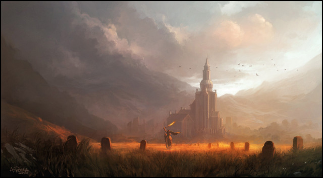
fladdermasken's Submission
Forsaken's Submission
Heinvers' Submission
MasterTrainer's Submission
median's Submission
Splub's Submission
Stryderzero's Submission
Chen's Submission
Edge45's Submission
fladdermasken's Submission
Forsaken's Submission
Heinvers' Submission
MasterTrainer's Submission
median's Submission
Splub's Submission
Stryderzero's Submission


Creativity | Includes how the theme was interpreted and portrayed. Note that there's a fine line between creative and completely offbeat. | /15 |
Detail | Measurement of detail in design and overall detail balance. Impurities include rough edges, deficiency in execution, and general disorder. | /15 |
Technique | Executional quality, techniques, tricks and overall terraining capacity, e.g. tile brushwork, constructions, lighting, doodad placement etc. | /15 |
Aestethics | Overall appearance of the final entry as a whole, e.g. an entry can lack both detail and technique but still have an overall nice composition. | /15 |

Inviting your friends to vote for you, bribing random members with rep and otherwise cheating with the VB poll system will get you DISQUALIFIED, BANNED from future contests, -REPPED, and possibly INFRACTED. So don't do it!
This includes, but is not limited to, sending PMs out to various users, getting other people to send those PMs, advertising this contest on other sites with the intention to gain more votes (whether it is explicitly stated or not), and so on. If you are suspected of cheating, the staff will notify you and interrogate you (hopefully) over PMs. <3
This includes, but is not limited to, sending PMs out to various users, getting other people to send those PMs, advertising this contest on other sites with the intention to gain more votes (whether it is explicitly stated or not), and so on. If you are suspected of cheating, the staff will notify you and interrogate you (hopefully) over PMs. <3
Last edited:


")


